Meghan Markle's logo rejection presents a golden design opportunity
The USPTO may have done her a favour.

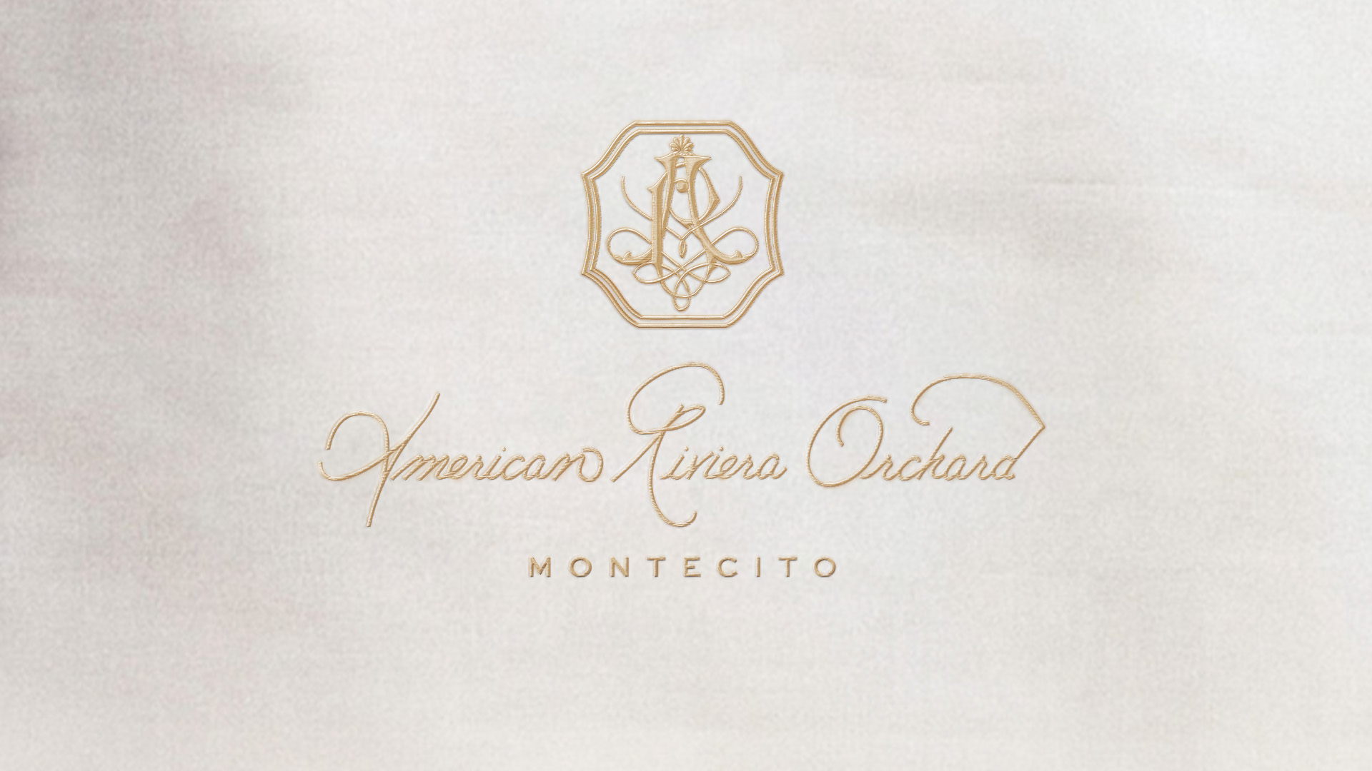
Meghan Markle's latest logo trademark application for her lifestyle business American Riviera Orchard has been rejected by the USPTO, shortly after the rejection of a trademark on the name itself. But unlike with the name, the logo issue really isn’t going to be a massive setback for her brand.
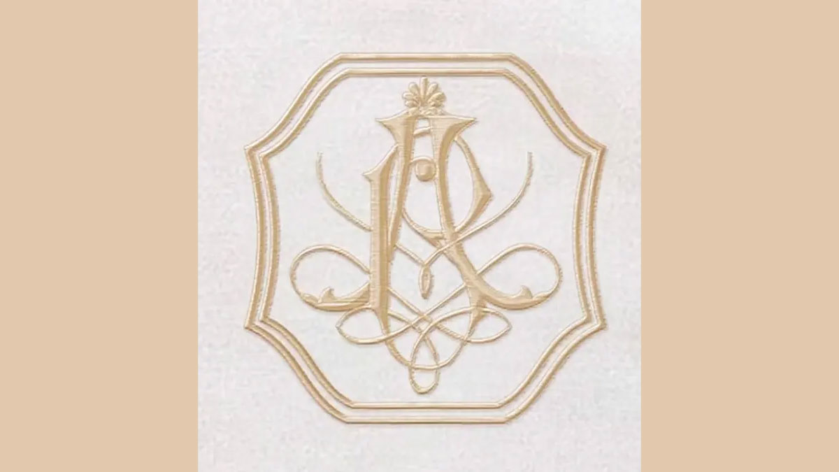
It's merely an issue with the description that has held up the approval of the logo. The filed description was deemed to be "inconsistent with the mark on the drawing". The application describes a letter 'O' being central to the design, and the trademark office thinks the letter is too over-stylised to be visible enough to be included in the trademark application.
This means the team behind the design simply needs to resubmit a small part of the description of the logo for it to (potentially) be approved. However, I wonder if the rejection reason highlights an issue with the logo design itself – it could present an opportunity for a tweak.
Article continues belowWhen the logo was released, we agreed with fans that it was a delightful calligraphy logo (drawn in Markle's own hand). I'm not here to disagree, but I do think that the logo could cause some issues when being placed in different situs (a key consideration for the best logos ever made). As the rejection reason hints at, the design is incredibly intricate, which could make it a little hard to decipher

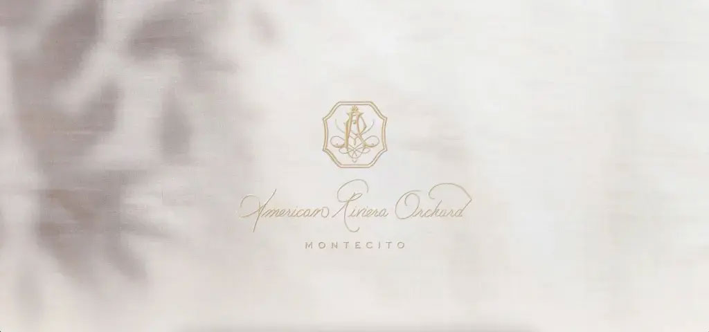
I am not a big fan of minimalism, in fact I wish logos had more personality, detail and illustrative style in general these days so I'm into it for that. But this logo would be a nightmare to place in a range of situations. Imagine it in flat digital form without the texture of the stitch effect, or on a small scale like an app icon or even on a jam jar on a shelf. In fact, I think it's hard to understand in situ on the website itself in certain ratios – as pictured above. There are so many lines and weights it's difficult to see what the separate elements are meant to be – and there are distinct elements included in the design, as follows:
“The mark consists of a double lined octagon enclosing the stylized and overlapping letters ‘AR’ and incorporating decorative and looping lines. The latter ‘A’ contains a stylized flower at the top of the letter,” says the statement from the trademark office.

Now that you have the description, can you see each part in the version above? And putting the consumer first, without that description, does it tell a story without careful study? And what about at a distance?
Sign up to Creative Bloq's daily newsletter, which brings you the latest news and inspiration from the worlds of art, design and technology.
I think the bones of the logo are beautiful, there's no doubt, but it needs to be simpler to truly make an impact, especially from a distance. This rejection could give the design team a chance to rethink and unclutter slightly.
To compare this lovely unminimalist design to undisputedly great examples of minimalism, you'll have to go back in time before flat design was king. Check out our best logos by decade articles to do just that.

Georgia has worked on Creative Bloq since 2018, and has been the site's Editor since 2023. With a specialism in branding and design, Georgia is also Programme Director of CB's award scheme – the Brand Impact Awards. As well as immersing herself with the industry through attending events like Adobe Max and the D&AD Awards and steering the site's content streams, Georgia has an eye on new commercial opportunities and ensuring they reflect the needs and interests of creatives.
