Branding has always been an integral part of being a band or musician. Now, the industry is more crowded than ever before, with Spotify alone adding over 40,000 tracks a day. This means an eye-catching and captivating campaign extends far beyond album artwork.
Branding campaigns for musicians need to work across video content, merchandise, social media, band logos and more. A musician's branding needs to be synonymous with the its music and members, instantly recognisable and above all, timeless. These well-known and indie acts offer a range of examples when it comes to nailing a musician's branding campaign, and they all teach us something slightly different about the art of branding.
For more on branding in general, see our post on logo design and check out our favourite style guides.
01. Taylor Swift


As one of pop’s biggest stars, Taylor Swift is one of the most influential artists out there. She has consistently nailed her branding campaigns, from 1989’s polaroid-heavy nostalgia, to the villainous Reputation era.
Reinventing herself for each album release has become a mainstay for Swift and that Reputation branding campaign, created by boutique agency ST8MNT is a masterclass in marketing. Deleting her entire Instagram feed, Swift then teased fans with images of a snake that flipped her previous bad press as a sneaky back-stabber into someone who was unapologetic, ruthless and inspiring. It’s certainly one way to reinvent yourself.
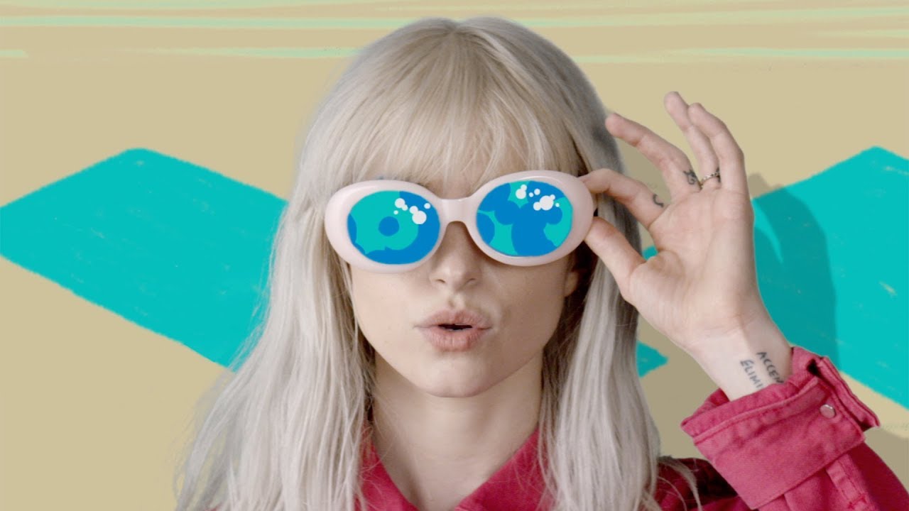
02. The 1975


British indie band The 1975 show just what you can do with a simple shape.
Creative director, artist, graphic designer and photographer, Samuel Burgess Johnson is responsible for most of their designs, which often include a rectangle surrounding their name across a multitude of their releases – proving that keeping things clear and concise can work wonders.
The shape has become synonymous with the group, with fans tattooing the shapes on their bodies and the band regularly using it for merchandise and tour imagery. Although their most recent release A Brief Enquiry Into Online Relationships seemed to stray from the rectangle, eagle-eyed fans pointed out that by connecting the squares, you could make out an array of rectangles.
03. Paramore
If you’ve been a band (or perhaps a studio or brand) for over 10 years, it’s important to keep things exciting – especially if you’ve had a reshuffle of members. Paramore’s 2017 release After Laughter completely reinvented the band’s image from pop-punk kids to a glossy, 80s-inspired group.
Created by LA based designer Scott Cleary, After Laughter used bold duotones, clashing patterns, and zine sensibilities to completely transform Paramore's image (much to some die-hard fans dismay). This new branding extended throughout their videos and merch, with the band also donning bright and bold jumpsuits in press imagery. Juxtaposing colourful imagery with an album that comments on mental health issues and isolation is a brilliant move.
04. Slowthai
i’ve got different billboards all around london. find em take a picture and send it to me 🇬🇧 pre-order ‘Nothing Great About Britain’ here: https://t.co/jdnMc3uleH pic.twitter.com/3rCOMXv1x8April 3, 2019
Northampton’s Slowthai is a perfect example of grassroots branding done right. With an album titled Nothing Great About Britain, the grime artist had billboards placed all over the UK with facts about the country’s problems including statistics about climate change, homelessness, the gender pay gap, hate crime, mental health and more.
Encouraging fans to locate and send him pictures of the various billboards in London is a great way to engage with listeners and create a buzz around an album, weeks ahead of its release. By placing the name of the album at the bottom of each billboard, the cryptic message would intrigue just about anyone. The lesson here? Where you can, seek to engage and challenge your audience.
05. Christine and the Queens


Here's another great example of an album title doing the talking for you, French artist Christine and The Queens decided to (sort of) change her stage name. Christine and the Queens is very much a character that the pop star adapts as artistic expression but for her second album, she evolved into Chris: a fluid identity.
The album, also titled Chris, was first teased with a crossed out Christine and the Queens logo, prompting an immediate marketing buzz. The scribbled typography went on to cover the artist's merch and encouraged a message of being yourself no matter what. It just goes to show that if you're big enough and you do it right, you can survive a name change.
06. Ariana Grande


Mega-star Ariana Grande followed up her 2016 release Dangerous Woman with 2018’s No Tears Left To Cry, teasing fans with upside-down imagery across her social media accounts.
Created by SB Projects’ art director and lead designer, Jessica Severn, this upside-down branding extended throughout Grande’s video for the lead single while merch was adorned with upside-down portraits of the singer. It makes a case for literally flipping an image for a simple and strategic campaign that works – as Desigual did recently with its logo. The singer also adopted her own Instagram filter for the branding campaign, which is a sure-fire way to engage fans and intrigue others.
07. Ed Sheeran


Back in 2015, Ed Sheeran announced via his social media platforms that he was taking a break to travel the world and see everything that he’s missed. Exactly one year after that, Sheeran returned to Instagram, posting a simple plain light blue square. Of course it caused a stir and marked the beginning of the branding campaign for his album Divide.
It took the singer almost an entire month to post again, this time officially announcing the record. This use of one bold colour along with a simple divide symbol made this one of the singer’s most successful branding campaigns. The campaign was created by UK-based agency Adult Art Club, with loose watercolour illustrations from Kasiq Jung Woo and a typography collaboration with illustrator Charlotte Audrey.
Read more:

