Is Desigual’s new backwards logo a step forwards?
And how are we supposed to pronounce it?

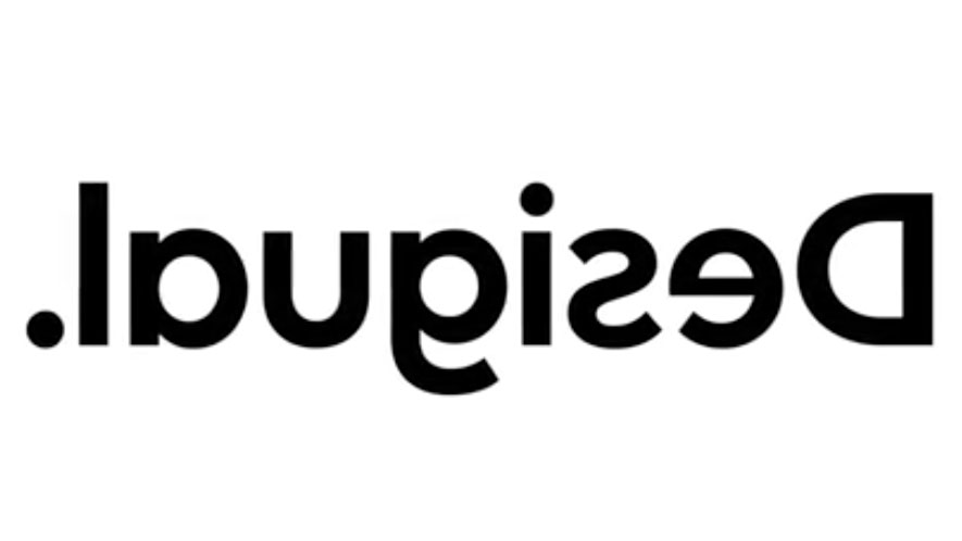
Spanish clothing label Desigual has made branding history by claiming to be the first company to flip its logo backwards. The decision to turn its lettering around channels the label's outlandish streak, which can be seen in its range of trendy and vibrant clothing.
Shoppers familiar with the brand will already know that the previous Desigual logo wasn't afraid to experiment with its lettering. Before the whole word got flipped around, the letter 's' in was already displayed back to front.
This was a clever and subtle choice. The letter 's' is easy to read when it appears backwards so the name remained legible. Our guide to logo design encourages designers to reflect a brand's personality in their use of typography, but with the whole design flipped to appear as 'lɒυϱiƨǝꓷ', has the label gone too far?
Perhaps not. When Desigual revealed its new logo on its Instagram page, people weren't put off. User samanthaturmaine commented "can't wait to get some new stuff!" while seforadivino replied "the new logo gives more identity to the brand! Beautiful, creative, simple and direct." High praise indeed.
We proudly introduce you to our new logo. . . #Desigual Desigual
A photo posted by @desigual on Jun 13, 2019 at 10:01am PDT
In its Instagram replies, Desigual also expanded on the thinking behind the new logo: "we changed the logo because we want to be more faithful to what we are. Desigual means creativity. Desigual means seeing life from another point of view. Desigual means inspiring people to take risks and think differently, to go outside their comfort zone."
"We want to be 100% Desigual," it adds. "What’s more representative of our intentions than to take our own logo, something with pre-established norms, and turn it completely around?"
In a statement picked up by WWD, Desigual's chief marketing officer, Guillem Gallego, sheds even more light on the decision. "The reason why we flipped the 'S' was because it stood for embracing difference and making a statement, so we're going to do this to all the letters and be the first brand ever to flip its logo 100 per cent backward."
Sign up to Creative Bloq's daily newsletter, which brings you the latest news and inspiration from the worlds of art, design and technology.
Makes sense. But we can't help but wonder, how are people supposed to pronounce the new name? Should they start with the 'l' and read from left to right as usual? Luckily, Desigual was on hand to reassure people that it's still pronounced the same as it was.
A photo posted by @desigual on Jun 16, 2019 at 1:30am PDT
Desigual isn't the first company to flip its lettering around though. American food chain the International House of Pancakes (IHOP) has irked social media users as it repeatedly teases upside down typography rebrands.
While IHOP annoyed people though, Desigual seems to have struck gold. Shoppers are happy, the brand's well represented, and it now has a completely unique design. The new logo will also be accompanied by a revamped website, a new retail concept, and a capsule collection of logo T-shirts.
And if you miss the old logo, you can always look at the new design in a mirror, or read it through the shop's window display glass to see the previous version.
Related articles:

Dom Carter is a freelance writer who specialises in art and design. Formerly a staff writer for Creative Bloq, his work has also appeared on Creative Boom and in the pages of ImagineFX, Computer Arts, 3D World, and .net. He has been a D&AD New Blood judge, and has a particular interest in picture books.

