5 logo design fails (and what you can learn from them)
Bad logo design can have catastrophic consequences for both client and designer. We look at five redesign projects that got it wrong.
Sign up to Creative Bloq's daily newsletter, which brings you the latest news and inspiration from the worlds of art, design and technology.
You are now subscribed
Your newsletter sign-up was successful
Want to add more newsletters?
Good logo design is the foundation upon which a brand builds its whole identity. Bad logo design mean a brand's identity is unsound from the bottom up. And when a bad logo design becomes a logo design fail, there are often some pretty serious consequences for both client and designer.
We all saw Gap's disastrous 2010 redesign (it lasted a week). And things can be a lot worse – Google the logo for the Catholic Church's Archdiocesan Youth Commission. But these are extreme cases. What we've listed below are logo redesigns that are just that little bit off. Logos that don't feel quite right for some reason. Designs that fail to improve on the original, in my opinion at least. Below, we look at why these logo designs are bad and what you can learn from their mistakes.
And if you'd like to look at the other side of the coin, don't miss our celebration of the logo redesigns that got it just right.
Article continues below01. Cardiff FC

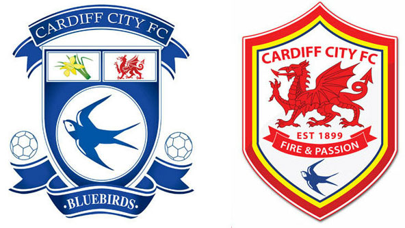
Football fans do not like change. From the name of their team's stadium to the pies served at halftime, any change big or small almost always goes down very badly. Even changes for the better – like Juventus's recent logo redesign – take a while to grow on fans. So can you imagine the reaction from Cardiff fans, the Welsh side known at the Bluebirds, when its new owner Vincent Tan decided the club needed a new badge in a new colour. The 2012 rebrand didn't last long. Because of pressure from fans, Cardiff re-redesigned a new blue badge in 2015.
The lesson here is that you can't design in a vacuum. You have to seriously consider how your logo will be received by the people its intended for. This is even more important when those people are diehard Welsh football fans.
02. Trvl Channel

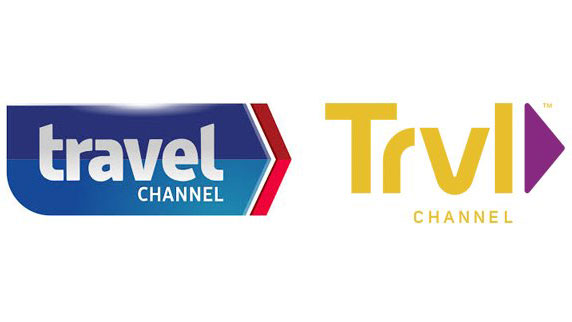
One commenter neatly and devastatingly summed up this redesign on its release: "I know attention spans are getting shorter but this is ridiculous." The Travel Channel logo was in desperate need of a refresh. Nobody would deny that. It look flat and dated. But what it got was a redesign the fails in two fundamental ways.
Firstly, it looks bad. What would you call that colour? Off-beige? Watery mustard? And, secondly, dropping the vowels is a reductive and cringe-worthy way of 'updating' any brand name. ("Do you know what younger audiences like? No vowels.") The Travel Channel – like the Sci-fi Channel, which rebranded to SyFy – had a good, solid, simple name. It said what it did. The lesson here is that less is not always more.
Sign up to Creative Bloq's daily newsletter, which brings you the latest news and inspiration from the worlds of art, design and technology.
03. Dunkin' Donuts

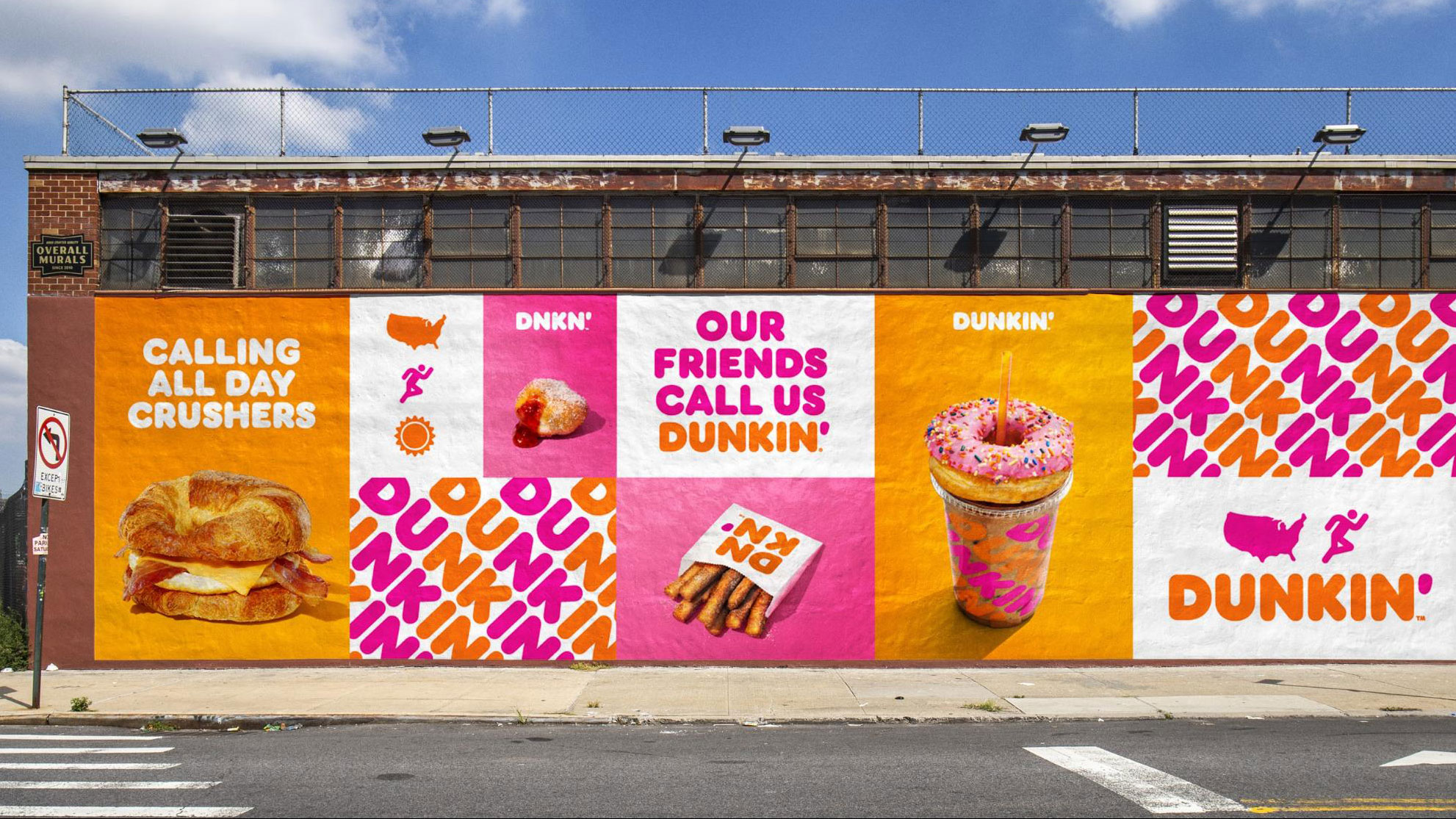
Dunkin' Donuts went one step further than The Travel Channel. It got rid of a whole word. Tony Weisman, chief marketing officer, said: "We are bringing the iconic name Dunkin’ to the forefront in a bold way that brings to life how we refill optimism with each cup and bring fun, joy, and delight to our customers each and every day."
The thing is: it doesn't really get more iconic than Dunkin' Donuts. The colours and lettering are instantly recognisable. The alliterative name is instantly memorable. Dunkin' Donuts tells you what the brand does. It creates a nice image. 'Dunkin'' alone doesn't do those things. (One customer said: "What is it exactly that one is dunkin’ if not a donut?")
There's a lot to be said for simplifying a brand identify. But not if you lose something important in the process. It was a bold move, fair enough. But the result is as almost as bewildering the idea of "refilling optimism".
04. Weight Watchers

This Weight Watchers redesign by Pentagram combines the worst bits of the two above projects. The brand had a solid logo built around a clear, concise name. Changing that name to WW fails in a number of ways. Everybody's going to keep calling it Weight Watchers, no matter what. WW is a tongue-twister and, ridiculously, it contains more syllables.
As for the logo, it's smart enough. But it offers no clue as to what the brand actually does. Replacing a recognisable, memorable name with a nondescript, forgettable logo is dangerous for any company. This project required some serious thinking about how the brand could move away from the negative idea of 'watching weight'. That was always going to be tough, if not impossible. Perhaps the only real solution was a complete name-change. The lesson here: not all logo redesign jobs are created equal.
05. NYC Taxi

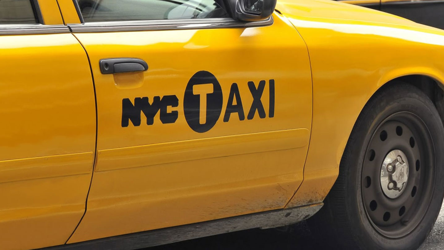
There are few things more iconic, more recognisable than New York City's yellow taxis. Songs have been sung about them. Films made about them. TV shows set in them. Design wise, it's pretty simple: take a car, almost any car, paint it yellow, stencil the words N. Y. C. Taxi on the side in crude letters, and that's that.
Transforming that crude stencilling into a more polished logo would seem like a dream job for any agency. But in 2007 it turned into a bit of nightmare for not one but two agencies – Smart Design and Wolff Olins. This is what the city ended up with, a kid of hybrid of several designs, with the words set in a custom typeface inspired by the computer-generated letters that used to be on taxi driver's licenses.
It didn't go down well: "I am a little confused by the overall aesthetic of the new graphic, which seems to be intentionally crude and lumpy, more Checker than Crown Vic, I guess," said Pentagram's Michael Bierut. The lesson here: if two high-profile agencies couldn't get it right, then perhaps the redesign wasn't needed at all.
Read more:
Gary Evans is a freelance journalist and travel writer. He is a former staff writer for Creative Bloq, ImagineFX, 3D World, and other Future Plc titles.
