Yesterday the leading name in the weight loss industry, Weight Watchers, revealed a slimmed down rebrand and new logo design that sees its name change to WW. But with the new initials not standing for Weight Watchers or the rebrand's slogan 'Wellness the Works', the revamp has left members and designers confused.
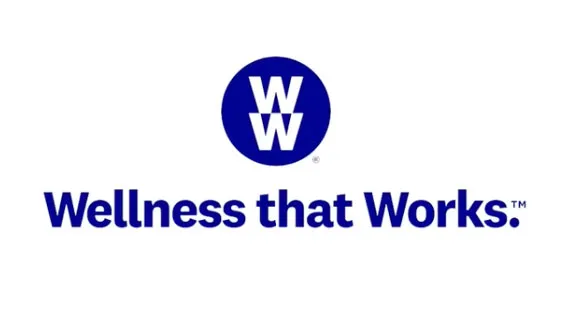
The decision to trim back the identity to just WW comes as part of a shifting focus for the company. Instead of concentrating on weight, WW wants to expand its focus to include health and wellness.
Weight Watchers is now WW. We have a mission: to inspire healthy habits for real life—for everyone. We’ll always be the global leader in weight loss. Now we’re becoming the world’s partner in wellness. Learn more: https://t.co/mtCRV10xx2 #WeAreWW pic.twitter.com/2uNqaNYberSeptember 24, 2018
The company's chief executive Mindy Grossman explained that its new logo, which sees two letter 'W's stacked in a purple circle, is emblematic of this gear change. "That marque represents our heritage and history and what we are going forward."
But what is that exactly?
So far 2018 has been a good year for the company formerly known as Weight Watchers, with big name backers like Oprah seeing its share price surge. However the recent rebrand has left a bad taste with members and designers.
"Guys, let's rebrand!""Cool, what should we do?""No idea. Just make sure the new name takes longer to say than our old one, has no meaning, and that we don't brief our chief exec on how to talk about it." Absolute mic drop from Weight Watchers here. https://t.co/quVCSLK52ISeptember 24, 2018
Okay, let's be honest here. That new #WeightWatchers rebrand is ridiculous. They don't actually expect people to call it #WW do they? Or did they just think nobody would say the name of the company out loud? "DOUBLE YOU DOUBLE YOU" 🤦♂️ #RebrandFail pic.twitter.com/dsF4UhgemySeptember 24, 2018
Critics have also been keen to point out that the decision to drop the word 'weight' could be to do with a backlash surrounding the word that was sparked by the controversial #wakeupweightwatchers campaign that targeted teenagers.
On top of this, the name WW is not only awkward to pronounce, it's also confusingly close to WWF and WWE, two companies that already had to battle it out over who could lay claim to their preferred initialism. We also found that when said out loud, WW taps into the tongue's muscle memory, resulting in the urge to add 'W dot' at the end, or maybe that's just us.
Related articles:

