5 logo design terms you should know
Make sure you know your logotypes from your logomarks.
When creating a new logo design for a client, it's important to define the requirements of the brief as clearly as possible. To make sure everyone's on the same page, it's worth brushing up on some key terminology.
Everyone knows what a 'logo' is, surely? Well, yes, in terms of it being some kind of visual manifestation of a brand's identity. But beyond that, the term doesn't really give away any clues about what kind of logo is required (see our basic 5 types of logo for more on this).
Successful modern brands must consider many more touchpoints than their logo alone. But while a logo is not always the centrepiece of a company's identity, the design decisions involved are still fundamentally important.
Article continues belowRead on as we clarify five common logo design terms used by designers and clients, to minimise the risk of creative misunderstandings...
01. Logomark
Also called a brand mark – or 'marque' if you prefer – a logomark is all about communicating the essence of a brand through a graphic symbol. While this can be accompanied with the company name, the most powerful, memorable logomarks can stand alone as a visual shorthand for the brands they represent.
It takes confidence to represent your business with a symbol alone, and companies often take years to build up sufficient brand recognition to get away with it. Generally speaking, the simpler the better for a compelling logomark – and crafting a simple shape that can communicate complex brand values is no mean feat.
A useful exercise it to reduce your logomark to its simplest black-and-white outline form and see if it can still achieve brand recognition – famous logomarks that pass the silhouette test include Apple, Twitter and Nike.
Sign up to Creative Bloq's daily newsletter, which brings you the latest news and inspiration from the worlds of art, design and technology.
02. Logotype
In recent years, a huge trend in logo design has been simplification – and brands such as Burberry have stripped their logomark altogether in favour of a pared-back, all-caps logotype – also called a wordmark. Effectively, this is the polar opposite of a logomark, in which the company name is placed front and centre, with no accompanying symbol.
Typeface choice is paramount, and while Peter Saville's ultra-neutral sans-serif Burberry rebrand attracted criticism for stripping out too much character, other famous logotypes convey plenty of brand personality through their use of type – look at Coca-Cola or Disney, for instance.
Other notable examples of logotypes rely strongly on their distinctive colour palettes to make the brand association unmistakable – such as IKEA's blue and yellow, or Google's distinctive combination of blue, red, yellow and green.
03. Combination mark
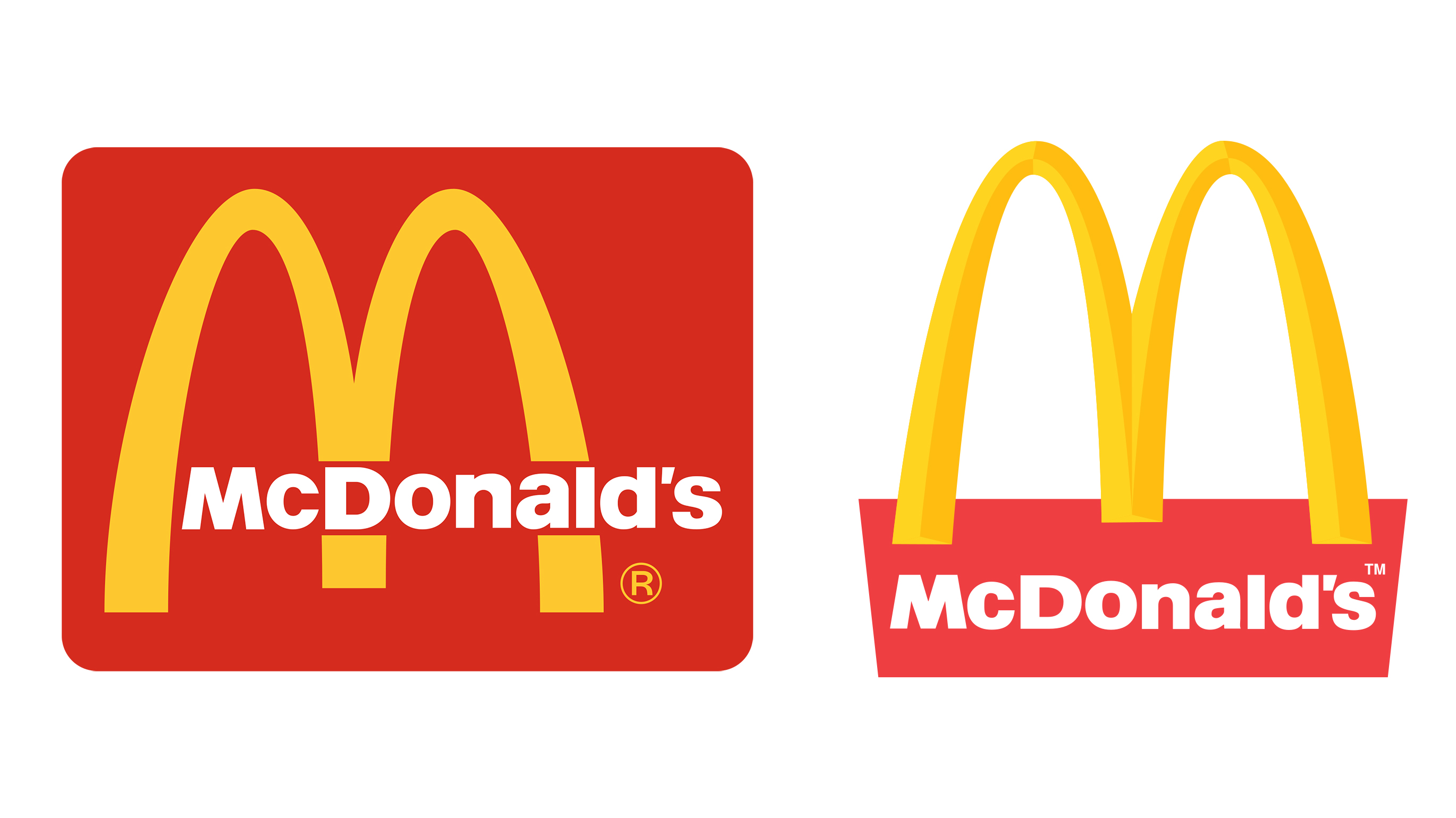
In practice, it's rare for a brand to exclusively rely on a logomark or logotype alone – and a 'lock-up' of the two elements is known as a combination mark.
In some cases, the typography is integrated with the symbol – Starbucks, for instance. Other brands provide the option to keep the two separate for different applications, and most brand guidelines provide a selection of different options of what to do (and what not to do), according to the intended usage.
Nike and McDonalds are two famous examples where the logomark can stand alone – the 'Swoosh' and 'Golden Arches' even have their own nicknames – but can also be locked up with a logotype. This, however, would never be seen in isolation.
04. Brand image
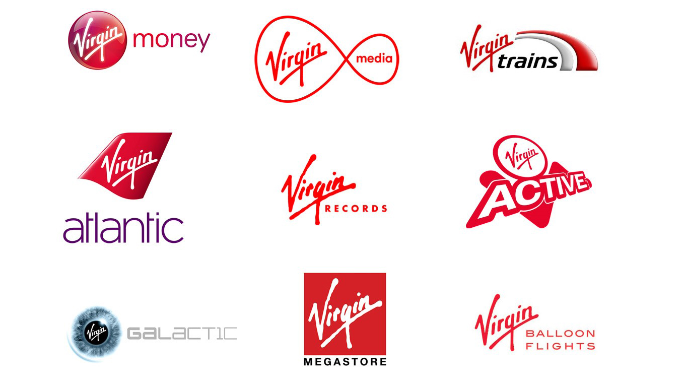
Modern branding encapsulates much more than a logo, and there are countless possible touchpoints that can help define a brand. Accordingly, the term 'brand image' transcends logo design – the choice of logomark, logotype or combination mark is only be a small part of the conversation.
Brand image is that intangible, emotional quality that brands constantly strive to improve in the minds of consumers, formed from a broad kit of parts, including the promises it makes and the actual experience it delivers - and crucially, whether the two match up. Besides graphic design, brand image can be defined by everything from tone of voice to customer service.
One great example of a brand that 'gets' brand image across an incredibly broad range of sectors is Virgin – over the decades, its risk-taking, authority-challenging, slightly cheeky attitude has translated across everything from record labels to airlines to communications to health clubs – with a distinctive customer experience weaved through it all.
05. Brand imagery
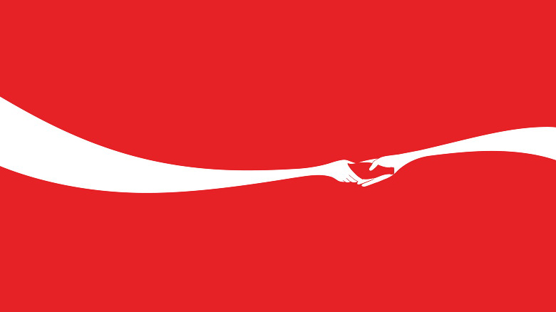
Brand imagery, by contrast, is a more concrete, objective entity: how a brand presents itself to the world. It can evoke heritage or innovation, communicate quality, or imply good, honest, no-nonsense value. It helps shape brand image, but is never wholly responsible for it.
By investing in strong brand assets, the result is a dynamic, versatile toolkit of parts that can command almost as much brand recognition as the logo itself. Arguable, there are some brands so strong they don't need a logo at all to create memorable campaign visuals – in the case of Coca-Cola, for instance, the 'wave' shape, the iconic bottle shape and the red-and-white palette may be simple, but are still unmistakably 'Coke' when combined.
Read more:

Nick has worked with world-class agencies including Wolff Olins, Taxi Studio and Vault49 on brand storytelling, tone of voice and verbal strategy for global brands such as Virgin, TikTok, and Bite Back 2030. Nick launched the Brand Impact Awards in 2013 while editor of Computer Arts, and remains chair of judges. He's written for Creative Bloq on design and branding matters since the site's launch.
