As the year draws to a close, it’s a good time to consider the biggest packaging design trends of 2017 – and predict the big packaging design trends of 2018.
Product packaging design is one of the most dynamic and interesting graphic arts niches. It is ubiquitous, yet it demands a high level of skilled design. It influences purchasing behaviour, and it has the potential to be truly beautiful art.
These elements are constants, but the rest are always changing to meet the wants and needs to consumers, and to stay with the swiftly flowing current of our culture.
What exciting packaging design trends can we expect in the new year? I teamed up with one of our top level designers here at 99designs, Martis Lupus, to share 10 top packaging design trends to look out for in 2018.
Opening image: Constantin Bolimond
01. Vintage

Vintage packaging designs are ideal for brands that want to appeal to consumers using an ‘old school’ approach. This kind of vintage look tells onlookers that your brand offers artisanal quality that stands in opposition to the modern-era factory age.
A vintage art label has an authentic feel and an exclusive vibe; it’s clear that this is a special product, something different and bespoke.
02. Hand-drawn

Graphic artists are talented, and most of their hand-drawn art looks pretty perfect. It takes a concerted effort to create packaging that looks ‘doodled’ and even deliberately childlike.
This is a trend in package design that appeals to everyone, though, because we all doodle, and we were all kids once. These kinds of spirited, cheery designs send us back to those days. They also suggest a pure, honest product.
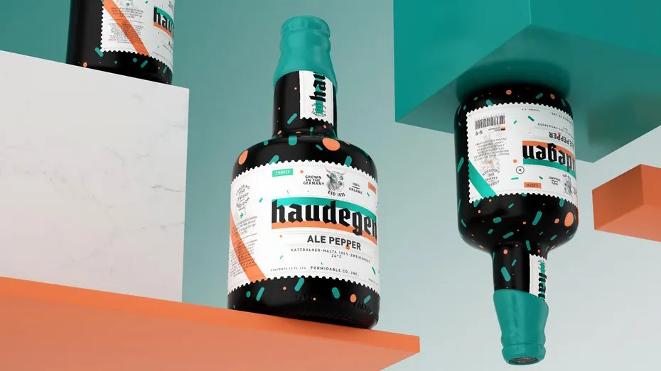
03. Unusual materials and shapes

Unusual materials and shapes in packaging design automatically grabs attention, but it does more than that. It also amuses, and it often suggests a high-end product without ever revealing anything about the product inside – after all, look at how much work went into the packaging.
Unusual materials and shapes can also communicate more specific messages that rely on context. For example, juice in boxes that look like fruit skin says “fresh” or “natural”; tissues in the same kind of boxes says “playful” and “silly.”
04. Photography

Photography enables the most photogenic products to sell themselves. It also makes it possible for brands to make more personal connections with consumers by linking a face, a place, or an item with a brand identity. Photography can also be used to create stunning, creative collages for a modern, funky look.
05. Movie poster packaging

We are, after all, a Hollywood-worshipping culture, and we love to be entertained. No wonder product packaging that looks like a movie poster is so appealing to us. Using a movie poster look on a package can instantly evoke suspense, action, romance, or other strong emotions in consumers, simply by association.
06. Feminine themes

Although there will always be packaging designs in both masculine and feminine styles, the feminine look in particular is making a comeback in 2018. Soothing, soft designs featuring pastels and gentler fonts are a welcome visual relief from the jarring colours and explosive fonts that have been big in recent years. They also evoke comfort, coziness and relief from stress – something we could all probably use right about now.
07. Relatable minimalism

Minimalist design is still at the forefront of the industry; that isn't going to change in 2018. What may be slightly more novel is an increase in relatability.
Minimalism works because it's simple, and as such the designer has to find a way to make us relate to the packaging – and what's in it – with the easy, broad strokes of our intuition.
Throw in some striking colour contrast and an appealing font, and you've got a minimalist package that everyone understands and relates to.
08. Metallics, shiny materials and holographic effects

Pearlescent and metallic materials and holographic foil stamping can render any ordinary box or bag into something that just looks special. This kind of shiny, flashy effect suggests high value and elegance to consumers, and the three dimensionality and depth these materials add to any package bolster this effect.
09. Brilliant gradients

Striking gradients from one shade to the next are coming back in 2018, adding an element of depth and shadow back into design, which has been dominated by flat design for so long. Colourful gradients add form and dimensionality to packaging, and a layer of complexity to these designs.
10. Big text

Although typically in design showing is better than telling, sometimes telling with words can work perfectly. Bold fonts, especially sans serifs that are easier to read, are usually what you see here, and they add simplicity and sometimes even humour to a package design. Paired up with the right colours, well-chosen words can work wonders for many products.
Countdown to 2018
Trends in product packaging design reflect larger artistic and cultural styles, changing tastes, and patterns in consumer spending.
They are the place where science and art meet, and despite the notion that packaging design is a “throwaway” design niche, this kind of work always produces some of the most interesting, compelling, and original design work.
Keep your eye out for these 2018 trends, and if you end up buying something just because of the cool package, join the club.
Related articles:
