What designers say vs. what they really mean
Designers on the truth behind the white lies they tell clients.
Sign up to Creative Bloq's daily newsletter, which brings you the latest news and inspiration from the worlds of art, design and technology.
You are now subscribed
Your newsletter sign-up was successful
Want to add more newsletters?
What designers say and what they mean are sometimes two very different things. Let's say you sit down for a meeting with a client. Fresh coffee, snappy small talk. The conversation flows. No awkward silences. You crack a joke or two. Then the mood in the meeting room suddenly shifts …
The client clears their throat, fidgets in their seat, and stirs their coffee continuously even though they take it black and without sugar. The client has this look on their face, a look you've seen on the faces of many clients over the years. Here we go, you think. Here it comes. The client says: "About your quote…"
This shit doesn’t just happen!
Craig Oldham
"What we probably all say," Craig Oldham says, "is this quote is an amalgamation of our time to create the work, manage it, come to meetings, feed back on it, produce it, and of course we have to factor in studio running costs as part of the fees as standard practice. There’s a lot to consider alongside just time taken."
Article continues belowOldham's new book, OH SH*T WHAT NOW?!, offers honest advice for new graphic designers. But when it comes to clients, you can be too honest. The Manchester designer says, "What we all mean: this shit doesn’t just happen!"
"We may not be suitable for your requirements"
Talking about money is always tricky. Mark Richardson – aka Superfried – recently created the branding for the Shark Conservation and Elephant Crisis funds – two animal preservation projects started by the Leonardo DiCaprio Foundation.
Richardson generally likes to talk straight. But he might say to clients: "Unfortunately I tend to develop complete brand identities rather than just logos, so we may not be suitable for your requirements." What Richardson really means is: "Your budget is completely insufficient!"
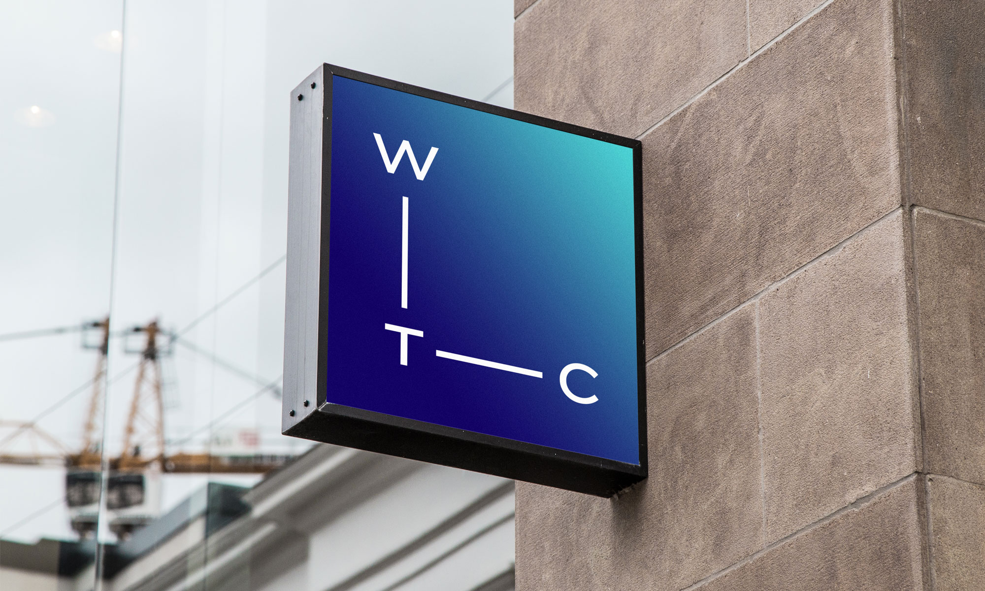
David Airey recently rebranded Wine Trading Company with a monogram based on the chemical formula for alcohol in its simplest form. The Northern Irish designer prefers to be 100 per cent honest with clients. It can save unnecessary hassle later.
Sign up to Creative Bloq's daily newsletter, which brings you the latest news and inspiration from the worlds of art, design and technology.
"If you disagree with clients, or if there’s something in a project you’re uneasy about, you need to be clear with those you’re working with – for the client’s sake, and your own."
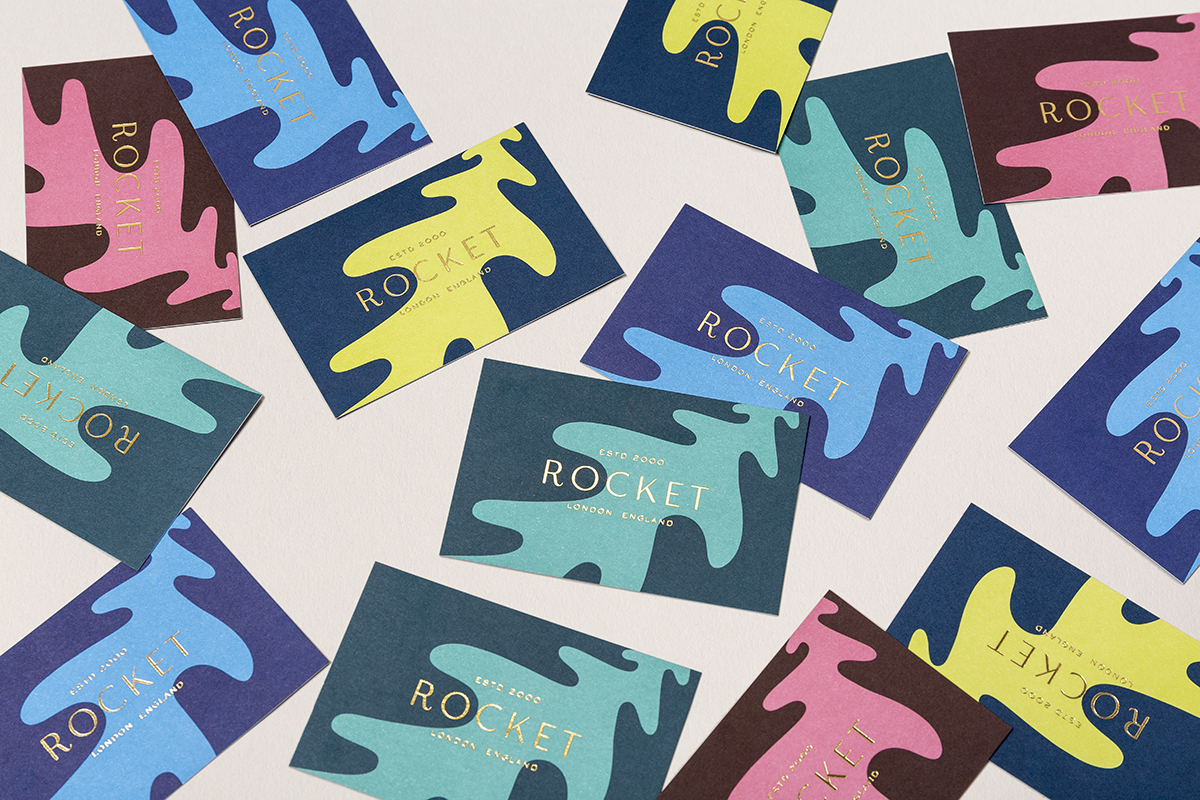
Caz Hildebrand agrees: "In our experience, honesty is generally the best policy." Hildebrand is creative partner at Here. The London studio designed the new brand identity for family caterers Rocket. The result is a riff on the rocket leaf symbol format of the company's previous identity.
"Some clients are quite contrary and will ask you for your preferred design and then choose a different option, but I have found that as long as you can genuinely get behind all the work you present to clients, it is easy to be honest and clear about what you think."
That doesn't mean clients can't contribute: "If they make a suggestion that will improve a design," Hildebrand says, "then it's important to acknowledge that and act on it. But if they are asking you to incorporate something that doesn't really fit with a design then it is always good to be clear about why you don’t agree. As long as you can make a compelling case for your reasons, things generally go right in the end."
"We can fix that!"
Honesty isn't always the best policy, especially during the early stages: "Normally," Marta Yarza says, "when we have the first meeting with a client, we tell them that their current brand is not that bad, but that we should do a complete twist on it."
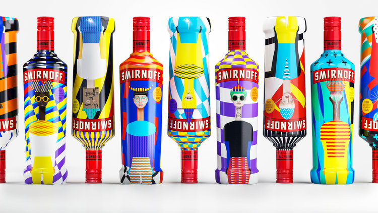
Yarza is creative director at Yarza Twins. This doesn't happen every time. The London studio has worked with brands that are already look pretty cool. Yarza Twins recently collaborated with HP and Smirnoff to create a limited edition bottle. The concept was diversity. Each bottle they designed is unique because of a HP plugin that easily allowed Yarza Twins to create millions of variations of 21 character designs.
But when Yarza talks about a "complete twist", what she means is: "it's really shit and that they really need help… but obviously, we don't want to offend them or make them feel bad."
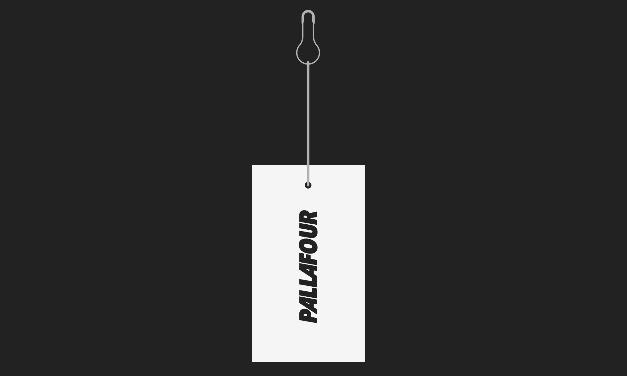
NotOnSunday founder Mike Willows might say to a client: "We can fix that." The London studio created the identity and branding for outdoors apparel company Pallafour. The work was 'inspired by the great outdoors and designed for those who love to explore and lose themselves.' When Willows says they can "fix it" he might really be thinking: "We're not quite sure how we'll fix it just yet, but we love a challenge!"
"Your current brand presents some opportunities"
Sometimes, you need to take something negative and spin it into something positive. Fredrik Öst finds himself saying: "Your current visual identity has some challenges but it also has opportunities." Öst is founder and creative director of Snask. He means: "Fuck everything you have and let’s do a full remake."
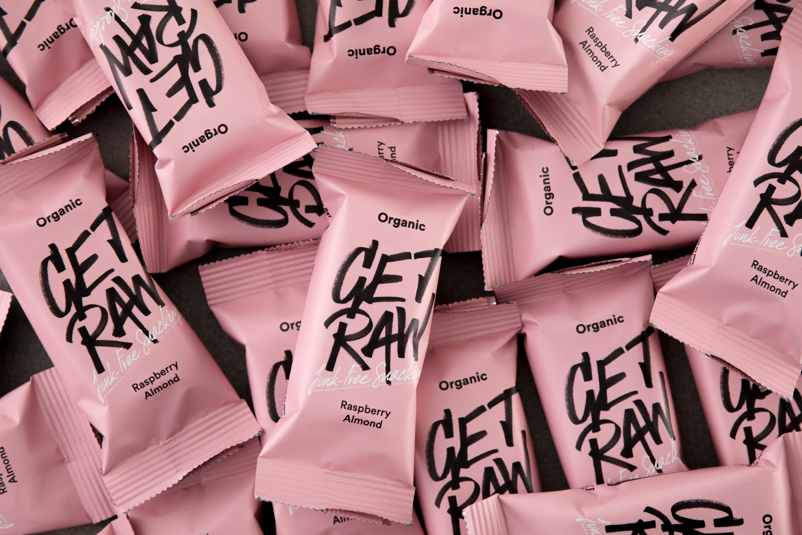
Take the work Snask did for health bar GET RAW. "They contacted us and asked us to do a full rebrand to modernise their visual identity and tone of voice," Öst says. "They used to look horrible."
The client is always right. But sometimes they need your help getting there. "It’s not about what we like or dislike," Sagi Haviv says to his clients. "It’s about what works."
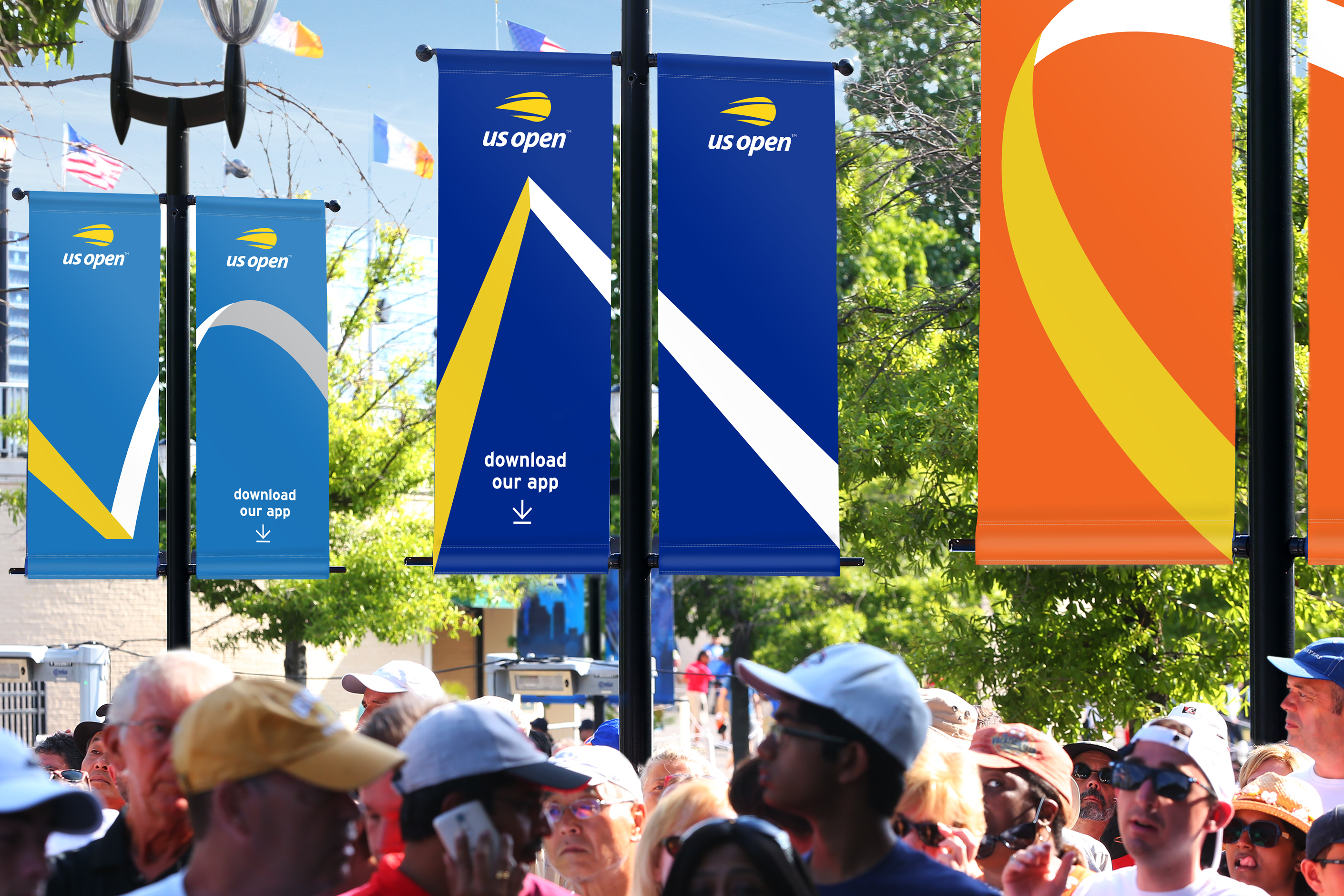
Haviv is a partner at Chermayeff & Geismar & Haviv. The New York design firm recently rebranded the US Open, one of tennis's four biggest tournaments, a year event viewed by millions round the world. He says clients sometimes make choices based "irrational, subjective preferences." When this happens, Haviv tries to "redirect" the conversation.
"Our experience is that the initial feelings and reactions about visual identity designs are meaningless because we are trying to establish something that can endure for many years and has the potential to become iconic."
Read more:
Gary Evans is a freelance journalist and travel writer. He is a former staff writer for Creative Bloq, ImagineFX, 3D World, and other Future Plc titles.
