What website do you wish you'd made yourself?
Sign up to Creative Bloq's daily newsletter, which brings you the latest news and inspiration from the worlds of art, design and technology.
You are now subscribed
Your newsletter sign-up was successful
Want to add more newsletters?
Remember when the internet was a creative frontier where people could express themselves in all sorts of ways? We'd forgive you if you don't because over the years large parts of the web have settled down into a pattern that's sure to drive clicks from users.
Not that this is a bad thing. In fact a website template is a useful way to get a practical site up and running in no time, as is a website builder. And there are plenty of creative sites out there if you know where to look (plus a bunch of top web hosting services to support a complex site).
To help you discover some of the internet's hidden gems, we asked experts for the sites that are so good, they've made them green with envy. Read on to be inspired, and get ready to get jealous.
Article continues below01. Oribi
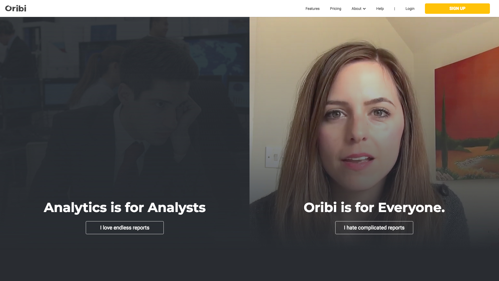
"I stumbled upon Oribi and its UI simplicity grabbed my attention right away, which rarely happens," says ecomm.design owner Catalin Zorzini.
"People develop ‘trends fatigue’ with websites that follow the same design ‘norms’. As designers, instead of trying to impress our colleagues, we should focus on being fresh, useful and relevant to our users. What I like most about Oribi is its use of scrappy visuals (as opposed to pixel-perfect illustrations), simple typography (instead of highbrow font pairings) and a down-to-earth feel."
02. Lonely Planet
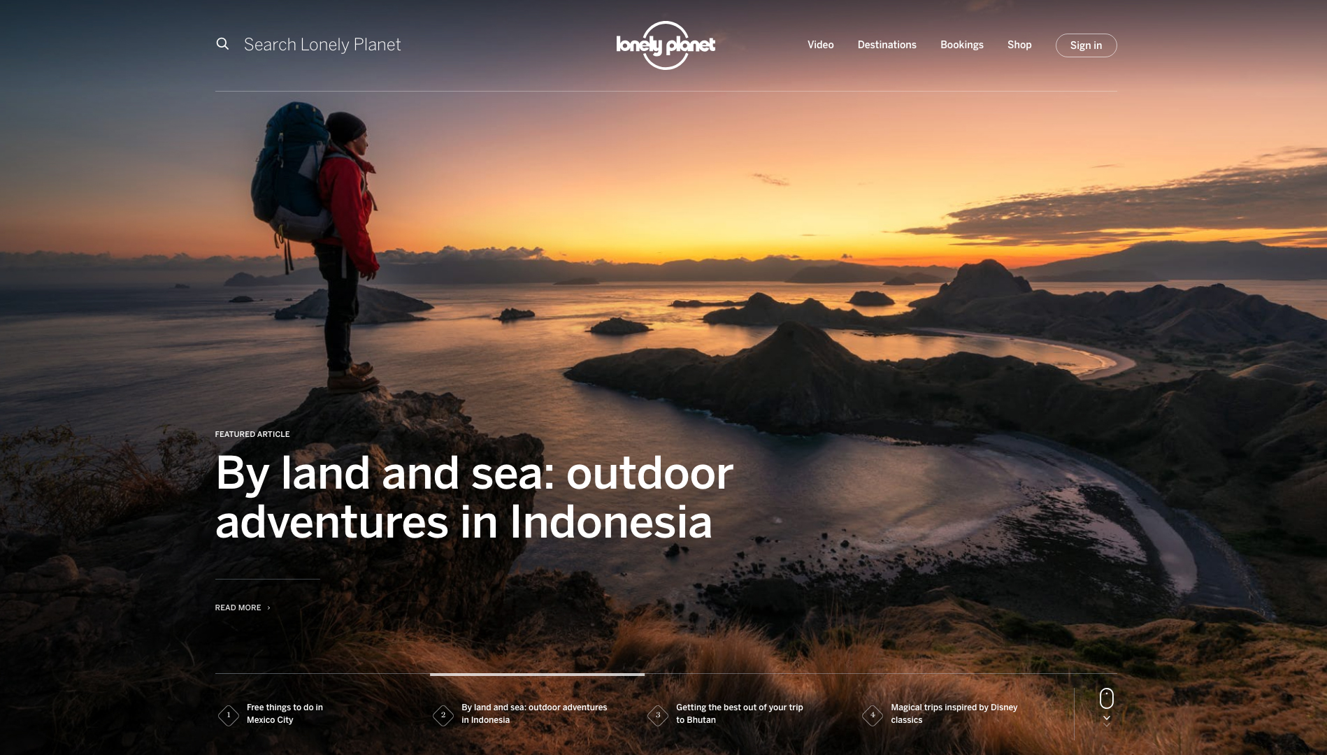
"I would have loved to have been involved with the current Lonely Planet site," says freelance UI and UX designer Mike Hince.
"This website is not only beautiful to look at but functional too. It combines stunning photography, video and typography without overwhelming the user. Every section has a clear purpose that draws you in and inspires you to start planning your travels. You can see the team's passion and skill in this piece of work, which is a true masterpiece of modern web design."
Sign up to Creative Bloq's daily newsletter, which brings you the latest news and inspiration from the worlds of art, design and technology.
If you've got lots of media files lined up for your website, keep them safe with decent cloud storage.
03. mica.edu
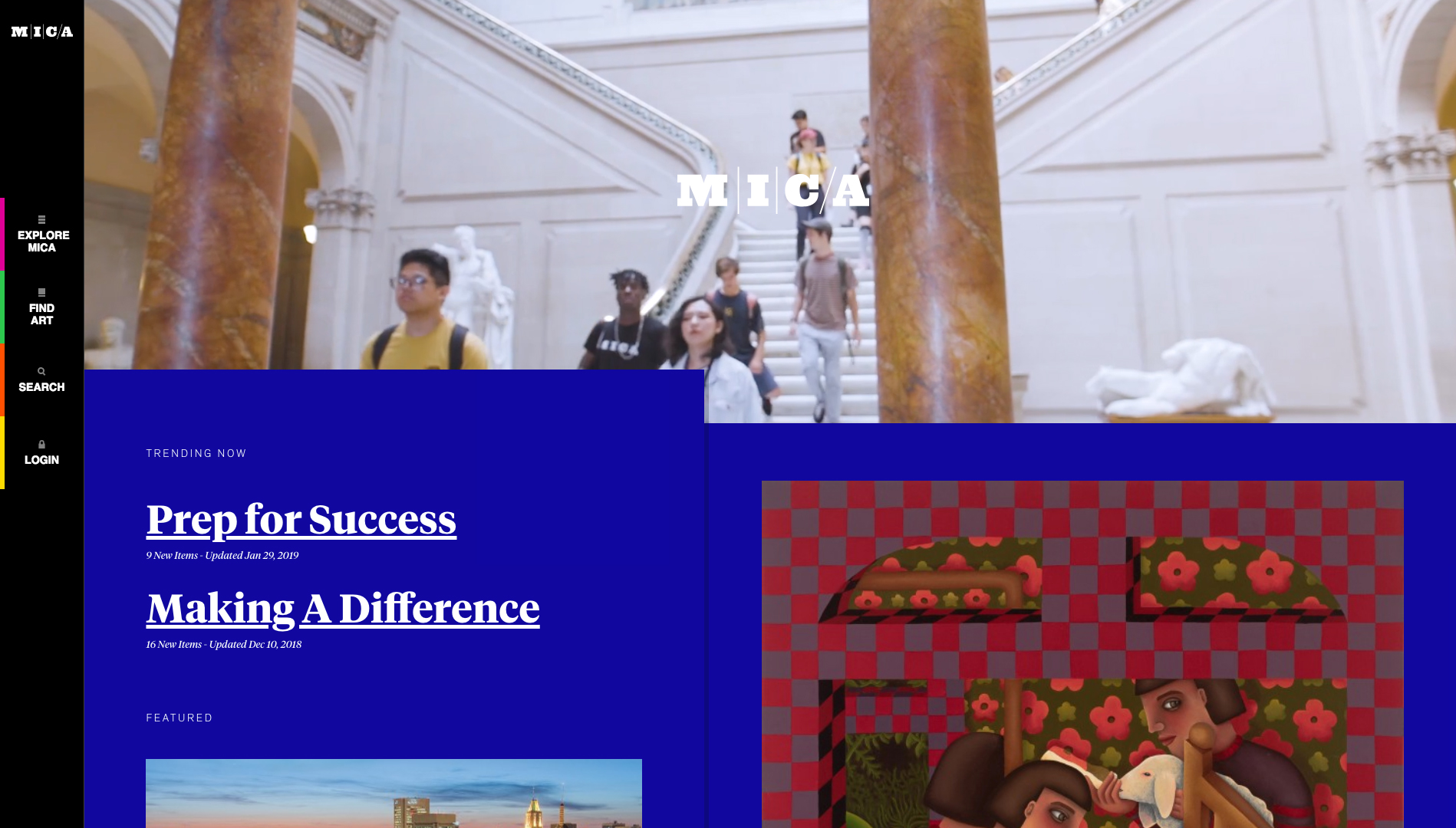
"I am really impressed with mica.edu, the redesigned website for MICA (Maryland Institute College of Art), which came to me via Jeffrey Zeldman on Twitter," explains senior Microsoft designer Inayaili de León Persson.
"Not many websites deviate from the standard template these days – big image banner at the top with call to action, followed by a simple three-column grid – so this site definitely stands out. I love how it plays with colour, type and an interesting grid. It has gorgeous little details that make it even more playful, like the animation of the link underlines on hover. I love to think that the designers and developers had fun experimenting and exploring all the different solutions together."
04. Erik Jørgensen
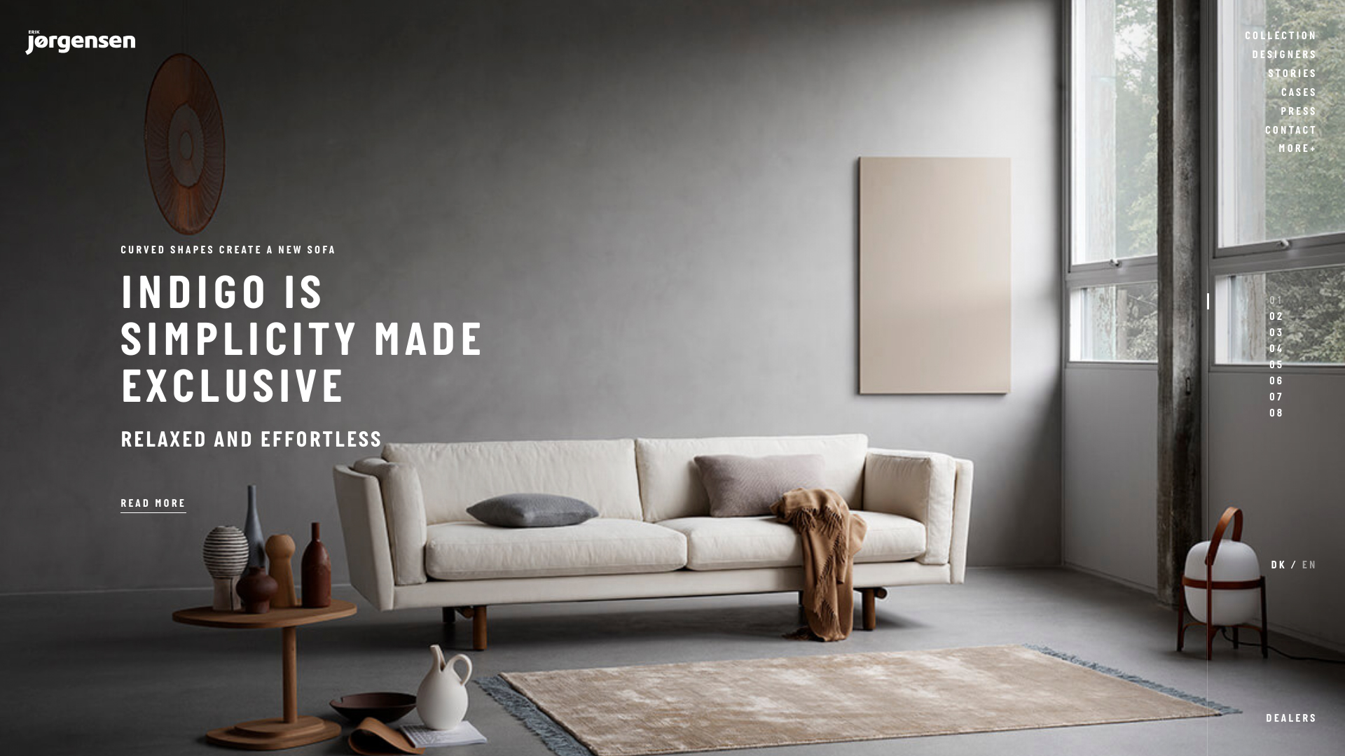
"My pick is the website of Erik Jørgensen Møbelfabrik, a Danish furniture manufacturer," reveals Jenny Johannesson, a senior designer at Ueno.
"I’m always a bit jealous of websites using scroll jacking because it can be a very hard sell. I love the colours and the simplicity but most of all I like the photography and its art direction. It feels highly stylised, with an interesting balance of sterile interior and intimate portraits. The detail animation in hover states and menus give me the impression that the team cared about everything."
05. melter.club
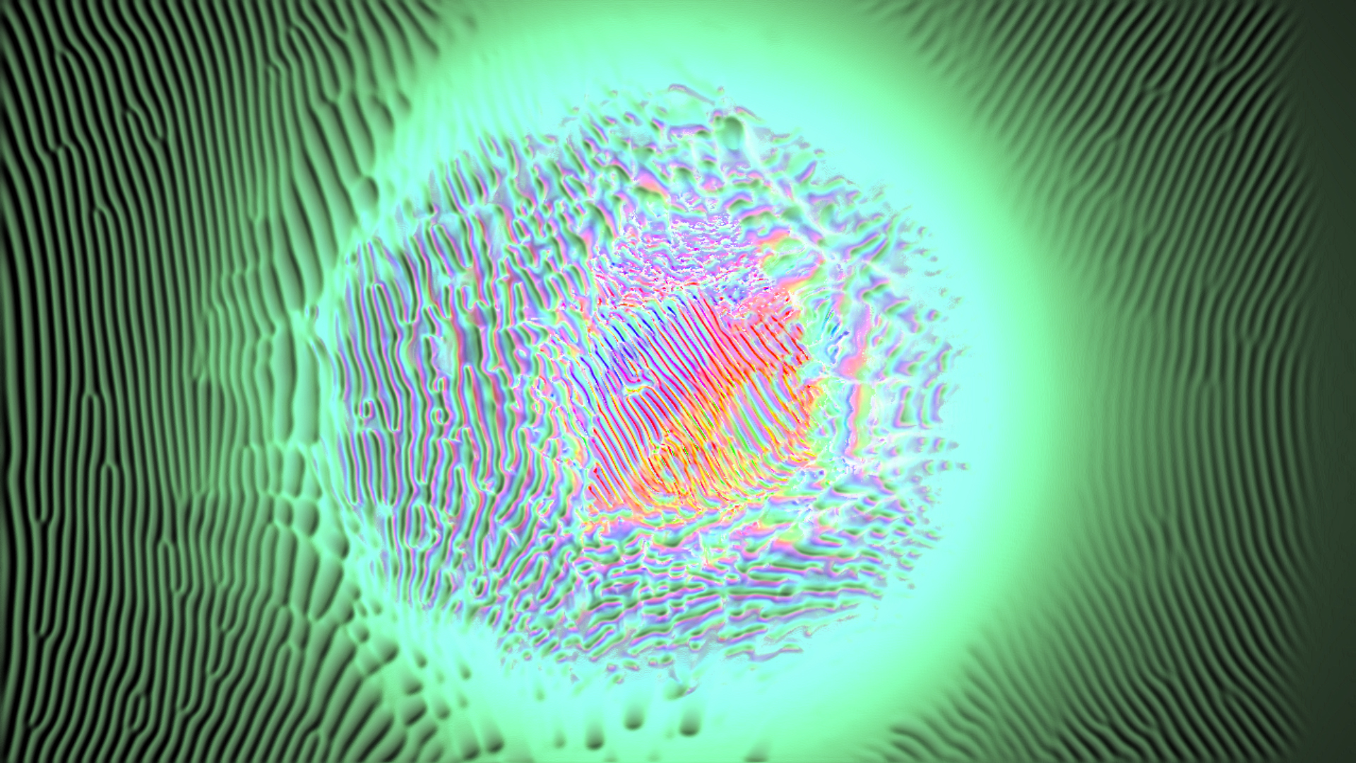
"Right now, people’s experiences of the internet are largely about being pestered by notifications, unwanted advertising, annoying newsletters and so on," says UI designer at This Place, Ben Buckley.
"Melter’s website reminds me that the web is much more than that. It’s difficult to describe but it’s basically a (quite trippy) series of interactive visuals that respond to how you move your mouse; you have to try it to really appreciate it. The internet is about interaction and this site is a beautiful example of human interaction, as well as pushing the boundaries of what the internet can do to give you an experience."
06. Adrien Lamy

"It’s intriguing to see what young talents are doing on the web and a great example is interactive developer Adrien Lamy’s personal website, which reeks with personality and creativity," says Andreas Chang, a visual designer at This Place.
"Unlike a lot of websites today, he doesn’t rely on flair to create a memorable experience. Rather, he uses common web elements like drop-down menus and hover states in unconventional ways to tell you who he is. Most of all, his personality shines through in his lighthearted, slightly tongue-in-cheek writing. To me, his website is a testament to simplicity, creativity and the strength of good content."
07. The Interview
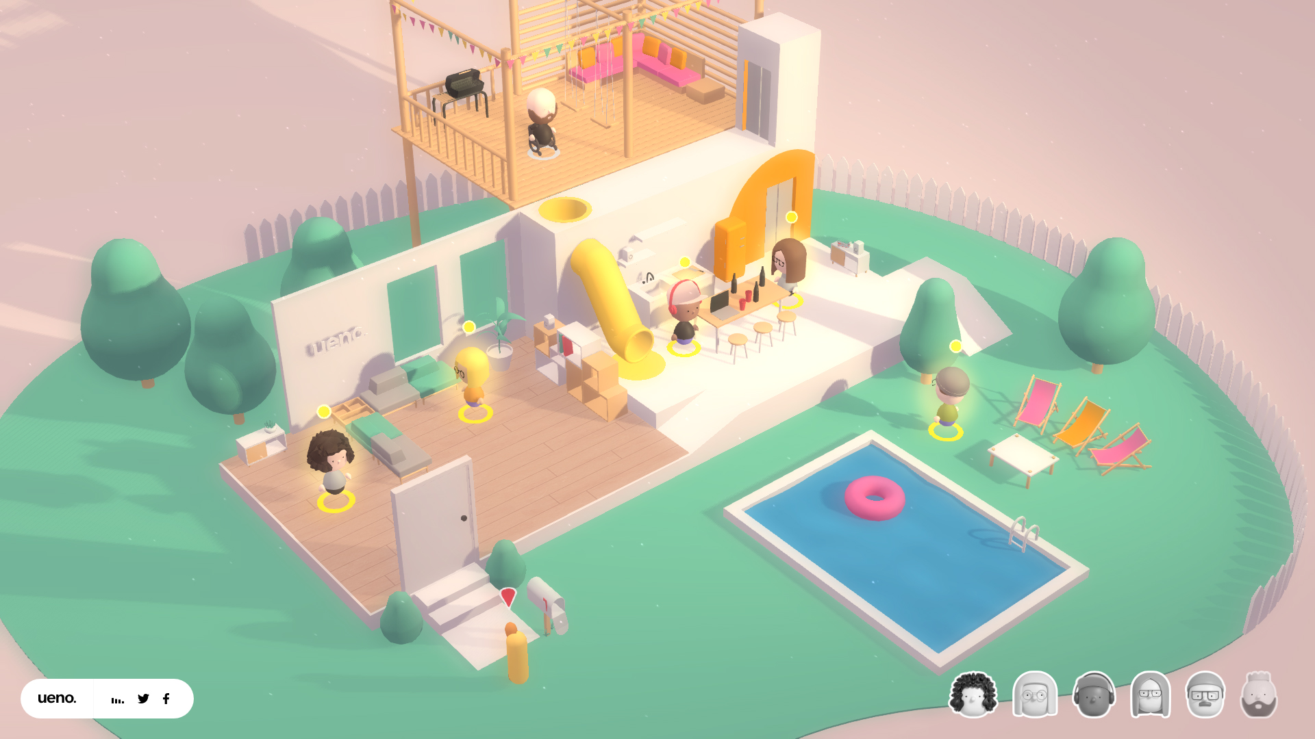
"I’m constantly impressed by how much people push the boundaries," says Sandip Patel, founder and CEO of Cage. "A perfect example of that for me is creative agency Ueno’s site The Interview, aimed at potential new hires."
"It’s a fast interactive game with 3D assets and animation; a chatbot experience that’s quirky but informative enough to tell you the folks at Ueno don’t take themselves too seriously. And all wrapped in a warm colour palette that’s fun and playful. Super jealous it’s not something I made myself!"
This article was originally published in net, the world's best-selling magazine for web designers and developers. Buy issue 315 or subscribe.
Related articles:


Tom May is an award-winning journalist specialising in art, design, photography and technology. His latest book, The 50 Greatest Designers (Arcturus Publishing), was published this June. He's also author of Great TED Talks: Creativity (Pavilion Books). Tom was previously editor of Professional Photography magazine, associate editor at Creative Bloq, and deputy editor at net magazine.
