Build adaptive layouts without media queries
Learn a simple, consistent and logical way to make responsive sites.
For a long time I was trying to reach a perfect visual composition on web pages. I've been having lots of pain with CSS breakpoints in my daily work and was never quite satisfied with common ways of handling the responsive layout. Recently, I discovered a very cool responsive web design trick that makes everything simple, consistent and logical, and I'm eager to share it with you.
This article is mainly about creative development, thus it's for both: front end developers who might find this technique useful, and web designers who should have a general understanding of web production and how to improve the final output. I assume you already know about CSS, breakpoints and media queries.
The traditional way

Portable devices are taking over the world. A variety of all kinds of devices are changing the way we create websites. By 'a responsive website' most people assume only desktop and mobile versions (sometimes desktop, tablet, mobile). This is how it works traditionally:
h1 {
	font-size: 80px;
}
.container {
	width: 980px;
	margin: 0 auto;
}

@media (max-width: 1023px) {
	h1 {
		font-size: 48px;
	}
	.container {
		width: auto;
		padding: 0 30px;
	}
}
In fact, usually the website layout we are seeing is not made for our device. For example, let's see how we adjust the font-size of <H1> title:

You see, our <H1> title has "font-size: 48px" on 320px and 800px width device, and "font-size: 80px" on 1024px and 2560px.
Of course, we can add more breakpoints, but the number of different devices are countless! This is going to make design specs very complicated and confusing, because it's hard to know which value is applied to which screen.

What we really need is this:
Sign up to Creative Bloq's daily newsletter, which brings you the latest news and inspiration from the worlds of art, design and technology.
Viewport units

The solution to this problem involves viewport units VW and VH. These are length units representing 1/100th of the width/height of the viewport (widely supported by browsers from IE9+).
We can use these to adjust the properties of a webpage according to its size. The situation will get a little better, but the pain is still the same:
h1 {
	font-size: calc( ( 80 / 1920 ) * 100vw;
}
.container {
	width: 80vw;
	margin: 0 auto;
}

@media (max-width: 1023px) {
	h1 {
		font-size: calc( ( 48 / 375 ) * 100vw;
	}
	.container {
		width: 90vw;
	}
}
We never know if it's too big or too small.
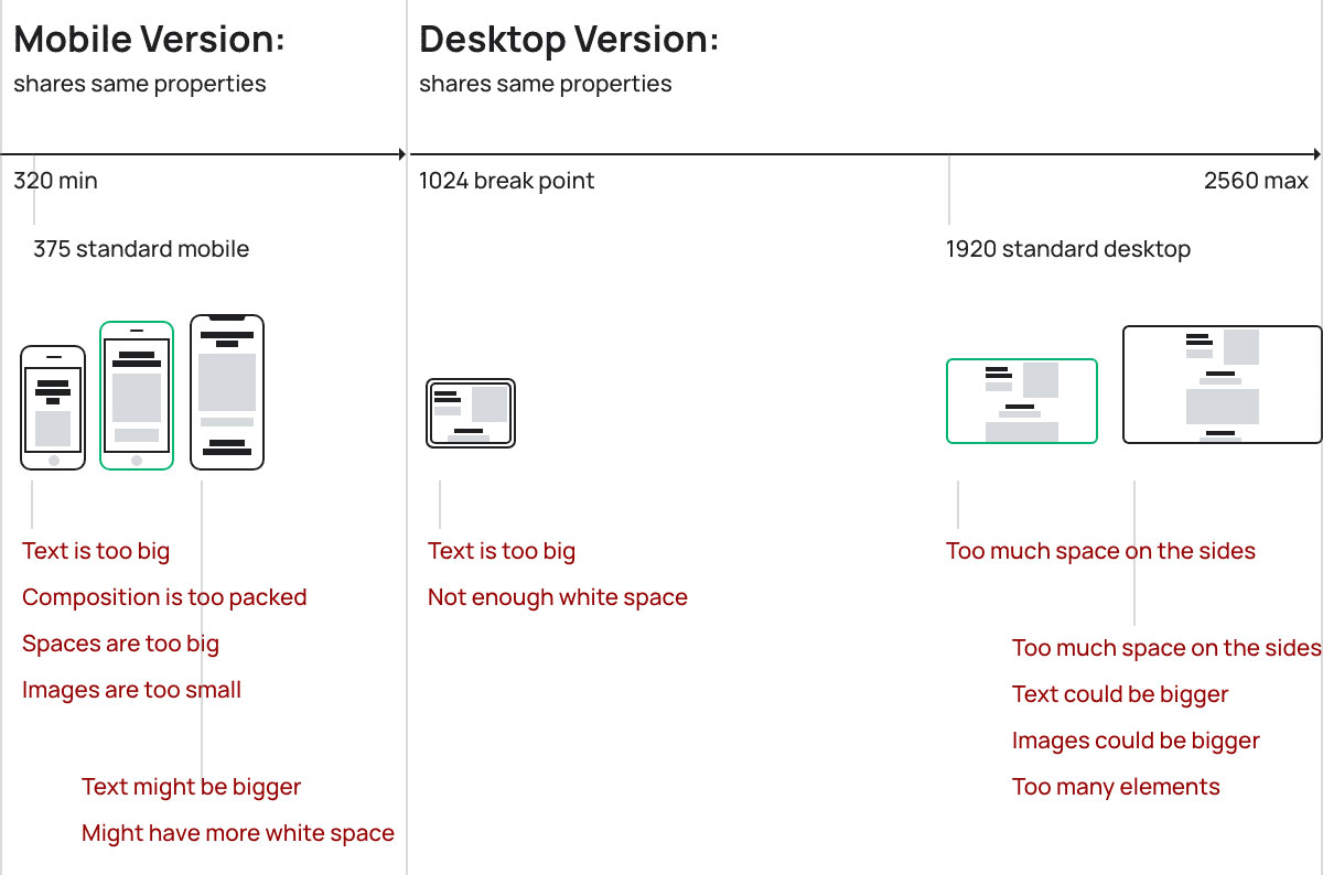
How can we build a true-adaptive layout system? How do we design a responsive website that works natively from 320px to 2560px?
Ideally, your mockup should explain the logic behind the layout, and how it adapts from a smaller resolution to bigger:
The solution

We want to continuously adjust properties from a small screen to a big one. No breakpoints and no media queries. What we want is one single value that works for every display.
A math function with two variables is the key. For example, if we want to adjust a title font size, the function should look like this:
1920x + y = 80
375x + y = 48
1920 - default desktop width in a design mockup (equals 100vw)
375 - default mobile width in a design mockup (equals 100vw)
80 - desired H1 title font size on desktop
48 - desired H1 title font size on mobile
These are the X and Y values:
x = (80 - 48)/(1920 - 375)
x = 0.0207
y = 80 - 1920*0.0207
y = 40.256
To use these values we will need the CALC CSS function to perform calculations on the webpage (widely supported by browsers from IE9+). We should count X * 100 times (because 1VW unit = 1/100th of viewport width).
We take our original function:
1920x + y = 80
375x + y = 48
Replace 1920 with 100vw:
100vw * x + y = desired value
Replace x and y with the values:
100vw * 0.0207 + 40.256 = desired value
We get the final CSS style:
h1{ font-size: calc(2.07vw + 40.25px)}Surprisingly enough, that finally works just how we wanted!
Just one property for all the displays. No need to overwrite the values again and again. You can adjust and calculate any kinds of properties: width, font-size, padding, margin, etc.
Let's try to build an actual layout using this technique:
But this approach has one disadvantage: it's hard to understand what value stands behind this CALC function. How can we simplify it?
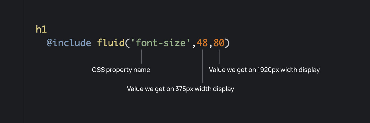
If you're coding HTML daily, you're probably familiar with SASS/SCSS pre-processors. Here's a little help for you: let's make a "mixin" and make all these calculations happen automatically, and still keep our original values.
It's the same function as described above, but made as a SASS mixin:
$display-wide: 1920
$display-narrow: 375

@mixin fluid($property, $minValue, $maxValue)
  $x: ($maxValue - $minValue)/($display-wide - $display-narrow)
  $y: $maxValue - $display-wide * $x
  #{$property}: calc(#{100*$x}vw + #{$y}px)

h1
  @include fluid('font-size',48,80)

.container
  @include fluid('width',315,1580)
@include fluid('padding',30,60) 
This technique provides a very sophisticated solution to finally build truly responsive web-layouts. It supports most of the browsers, secures your project to be correctly shown to a visitor, simplifies your styles structure, and most importantly makes your web layout consistent and logical. I hope it can help you launch some astonishing web projects.
Related articles:

