Design a responsive site with em-based sizing
Use relative CSS units to build designs with simpler code.
You've probably heard that you should use relative units for font size. This is a good rule for accessible web design; if the user changes their browser's default font size, this enables your page's text to resize accordingly. You may have taken this advice and made the switch. Perhaps you got out your calculator and converted your site's font sizes from absolute px units to ems or, more likely, rems.
But if that's where you stopped, you are missing out on a lot of the flexibility and power that ems bring to the browser. The em unit is not simply a replacement for the familiar px; you can use it for more properties than just font-size. If you do, some of its other benefits begin to emerge.
By consistently using ems, you can design components on the page that respond automatically should the font size change. Then, with a clever trick for a responsive font size, you can produce an entire page that adjusts dynamically based on the viewport width of the browser. Let me show you how to leverage the 'relative' behaviour of ems to create designs that are scalable and responsive.
Article continues belowFont size units
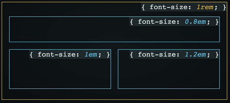
Using ems for font size can be tricky. The exact value is determined by the element's inherited font size (i.e. the font size of the parent element). This gets complicated when you start nesting elements more deeply. If an element has a font size in ems, its parent has a font size in ems, and its parent has yet another. You will have to multiply all these values to determine the actual computed value of the child element.
This means that placing the same module in different containers might change the meaning of em. The module will be unpredictable.
To avoid this, we typically use a different relative unit for font size: rems. A rem (or 'root em') is based not on the inherited font size, but on the font size of the page's root element, <html>. This means its value is the same throughout the page. It is more predictable than, and often preferable to, regular ems.
Building a module with ems
Let's use relative units to build a module. However, we're not going to follow the common approach. Instead of using rem for everything, we will use it only once: on the top-most element of the module. This will establish a known font size for the module, rather than it being based on an unpredictable chain of em values above it in the DOM. It means we can easily scale the size of the module by overriding a single value.
Sign up to Creative Bloq's daily newsletter, which brings you the latest news and inspiration from the worlds of art, design and technology.

After we establish this known font size, we are safe to use regular ems throughout the module. Use it not only for any font sizes on the sub-elements, but also for most other properties, including padding, margin and border-radius.
We'll build a panel with a heading and a body. The markup looks like this:
<div class="panel">
  <div class="panel-heading">
    <h3>Behold the power of ems</h3>
  </div>
  <div class="panel-body">
    Consider the ways you can leverage relative
    units for dynamic sizing of your modules.
  </div>
</div>
Let's style the outer container. We'll set the font size at 1rem to establish our local em value. We'll then define the border-radius using ems. I typically like to use px for border, though, to get a nice fine line.
.panel {
  font-size: 1rem;
  border: 1px solid #678;
  border-radius: 0.3em;
  overflow: hidden;
}
Next, style the inner elements. We'll use ems for padding. Then we'll increase the font size of the heading to 1.25 times our local em value, producing a 20px computed size.
.panel-heading {
  padding: 0.6em 1.2em;
  background-color: #cde;
  border-bottom: 1px solid #678;
}
.panel-heading > h3 {
  font-size: 1.25em;
  margin: 0;
  letter-spacing: 0.03em;
}
.panel-body {
  padding: 0.6em 1.2em;
}
You can multiply the padding values by their font size to determine their computed values (9.6px vertical and 19.2px horizontal). Truthfully, though, it doesn't matter. Try to not get bogged down with pixel-perfect measurements. This may feel awkward, but press on. The more you use ems, the more you will become familiar with them as a unit in their own respect.
Dynamically scaling the design
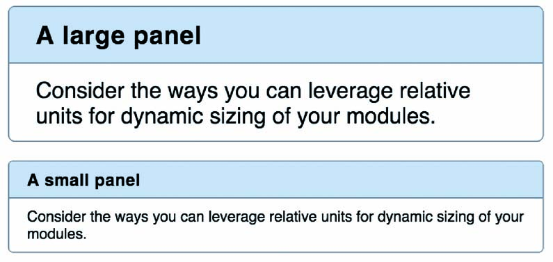
When we create reusable modules like this, we often find we need a few variations. Say we wanted to create a larger version. If we were using px for everything, this would mean increasing the font size, the padding, the border-radius and so on. However, because we have defined everything in relation to one rem-based font size, we need only to change that value, and the entire module will respond:
.panel--large { font-size: 1.2rem; }We simply add this class to a panel to make it larger: <div class="panel panel--large">. This will change the local definition of an em, and thus the border radius and padding change as well, along with the font size of its child elements. With a single declaration, we've resized every part of the module.

Likewise, we could create a small version:
.panel--small { font-size: 0.8rem; }By grounding the module using a top-level font size in rems, we've made it stable and predictable. By defining everything else within using ems, we've made all of its component parts scalable.

This is a powerful pattern. You can use this approach for anything on your page, from drop-down menus to social media buttons. Ground the module with a rem value, then use em for virtually everything else from paddings to positioning to icon sizes.
Making it responsive
Let's push the principle one level further. We've sized the module (and theoretically all other modules on the page) using rems and ems. This ultimately means their size is based on the root element's font size. Then, we can adjust this single value to make the entire page respond in turn.
Let's bring in another relative unit: vh. This unit's computed value is derived from the user's screen size; it is equal to 1 per cent of the width of the viewport. If we use the vh unit to define the root font size, it will automatically scale responsively, sans media queries. Set the font size on the root to 2vw:
html {
  font-size: 2vw;
}
Unfortunately, the effect is a bit too strong. On an iPhone 6, for instance, this will compute to 5.5px, which is too small. Likewise, it's unreasonably large on bigger screens. To soften the effect, we can make use of CSS's calc() function:
html {
  font-size: calc(0.6em + 1vw);
}
Now the font size is derived partly from a stable value, and partly from a responsive one. This produces a much better effect. The 0.6em behaves as a sort of minimum font size. Now the root em will scale fluidly from about 13px on smartphone to 21px on an average desktop screen.
With your page made up of scalable modules, each grounded to the rem value, and they too will scale with the viewport. The page is structured with a three-tier hierarchy; you can change the size of the entire page, an individual module, or a single element by making a simple edit to the font size. Trust the ems and rems, and the browser will take care of the work for you.
You may still need to add the occasional media query to control line wrapping and some other responsive concerns. But this small bit of code combined with a habit of using ems and rems will get you a lot of the way there.
This article was originally featured in net magazine issue 288; buy it here
Related articles:
