5 ways to use imagery to create better branding
Tried-and-tested ways to choose the right visuals for your designs.
There’s something quite magical about branding. When done right, it can transform something that’s on the face of it quite generic, like a fizzy drink or a shampoo, into a ‘lifestyle choice’ that makes the buyer feel good about their purchase beyond its basic functionality.
In short, branding is all about making an emotional connection that transcends the mere physical nature of the product or service.
And there’s nothing better for forming that instant, subconscious connection than a powerful image. Because while text takes a few seconds to process, images instantly impact the subconscious, which is much more influential on our choices than we often realise.
Article continues belowSo whether you’re designing a website, a poster, a print ad or a social media campaign, choosing the right imagery is key. Here are five ways to make sure you choose well.
01. The direct gaze
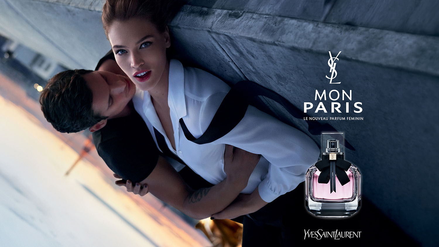
Flick through the pages of a magazine like Vogue and you’ll soon notice that most of the adverts from clothes, fragrances and accessories feature models looking right at the camera. And that’s no coincidence.
The fashion and beauty industry knows that its buyers make choices for deeply personal reasons, and that in the real world, eye contact is an important element of making people trust and like you. (For example, research by the University of Aberdeen shows that you are more likely to think other people in a photo are attractive if they are looking straight at you and smiling.)
So although a still image may seem like a poor substitute for real-life human interaction, the use of face-on images can be a powerful way to get attention and build a feeling of rapport between your brand and its audience.
Sign up to Creative Bloq's daily newsletter, which brings you the latest news and inspiration from the worlds of art, design and technology.
02. Colour
Much of the work of branding is centred around drawing up personas (the nominal audience for your brand) and creating imagery that will stimulate, excite and engage them.
But that only gets you so far.
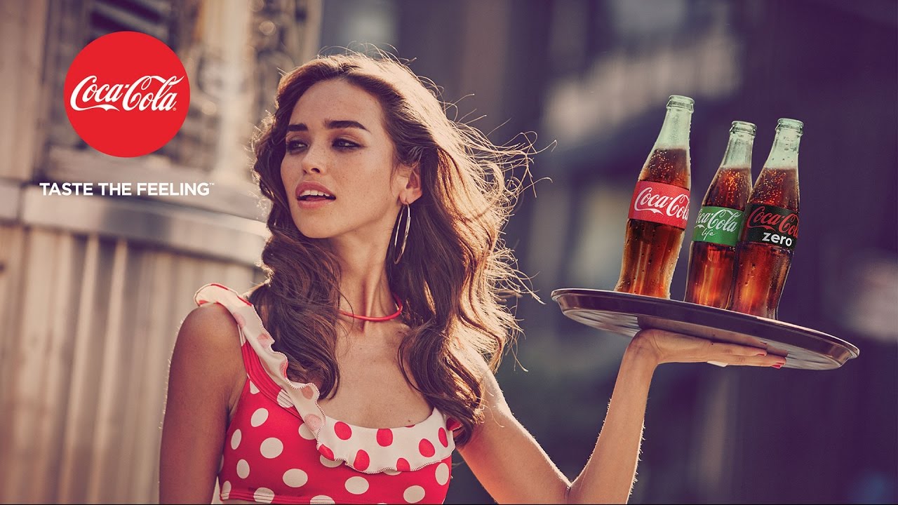
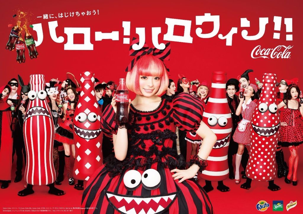
Consider Coca-Cola. Its advertising campaigns have long been associated with fun, youth, health, beauty and sexiness. But so are those of its competitors. So how do you differentiate yourself, without going too niche and alienating part of your target audience?
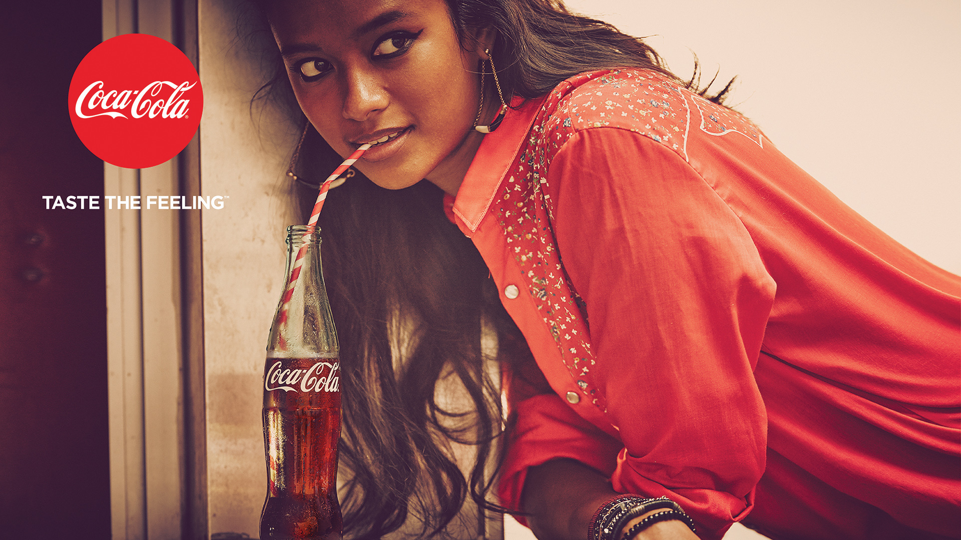
One way is to use visual cues that are distinct to your own images, and that people will subconsciously or consciously come to associate with your brand. The most obvious way to do this is using colour.
So while Coke’s imagery varies hugely around the world, it will always be consistently centred around a red and white palette.
To see how other brands have used colour combinations to define themselves visually, check out our article 21 outstanding uses of colour in branding.
03. Simplicity
The simplest designs are often the most effective, and that applies just as much to branding imagery as to anything else.
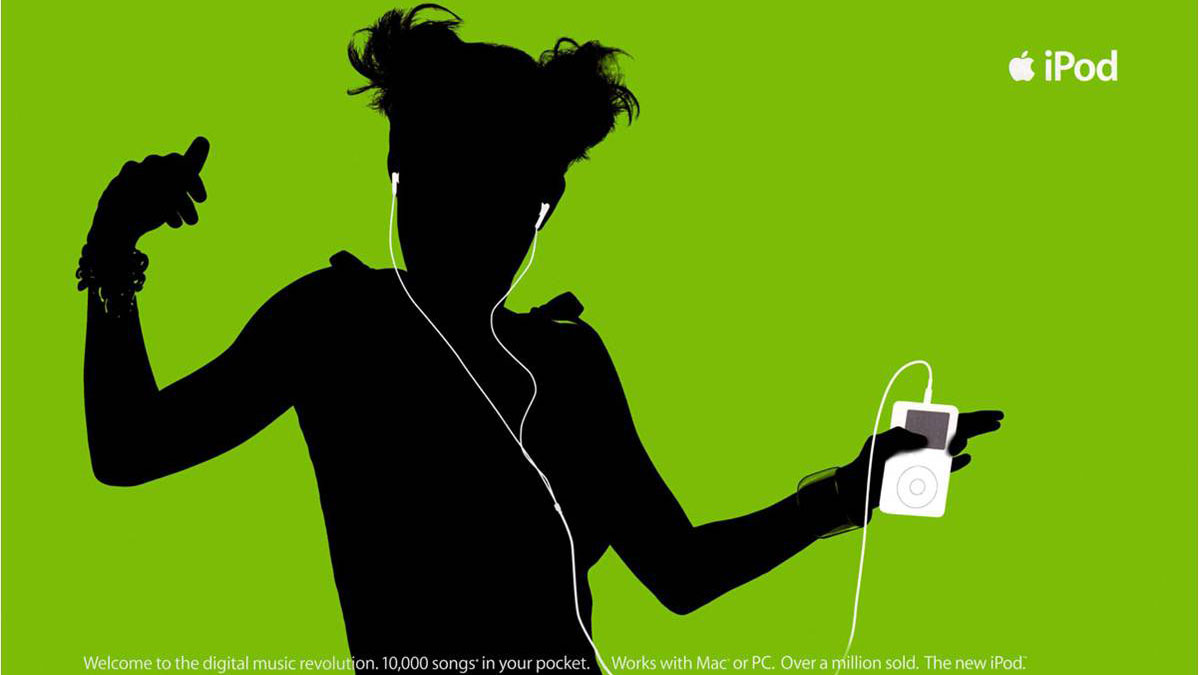
The simpler your imagery, the more it has the potential to become iconic, to work on a global scale, and to be flexible enough to scale well across different media, including print ads, television commercials, billboards, posters, wrap advertising and social media.
A great example is the iPod silhouette campaign of the early 2000s, the brainchild of then TBWA\Chiat\Day art director Susan Alinsangan. This centred around silhouetted characters against brightly coloured backgrounds who were listening to music on their iPods.
Steve Jobs initially didn’t like the idea, as it didn’t show the iPod in detail or explain what it did. However, as his ad team explained, the campaign didn’t necessarily need to do all that: it was about connecting on a deeper level, and conveying the idea of the iPod as the choice of a new generation.
The energetic silhouettes and day-glo colours of the imagery met those needs beautifully, and once Jobs had relented, it became a hugely successful campaign for Apple.
04. Association
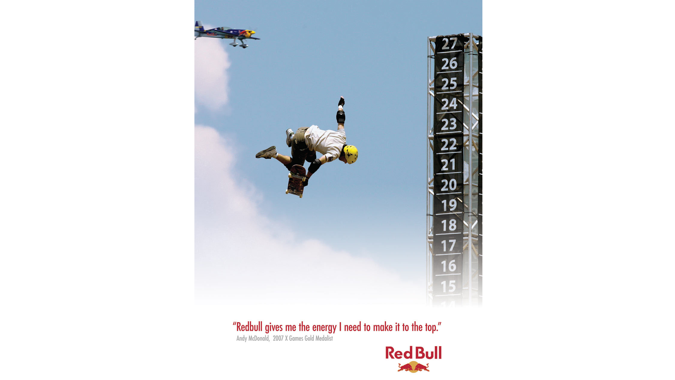
The imagery you choose for your campaign needs to be something that appeals to your target audience. But importantly, it doesn’t necessarily need to represent them or their use of the product accurately. It’s sometimes better to focus on choosing imagery that promotes associations with other things. Red Bull offers a great example.
If ever a product needed strong branding, it’s Red Bull. None of its ingredients are patented or secret, and the drink itself is easy to copy. Yet Red Bull has between a 70 to 90 percent market share in over 100 countries worldwide… and that’s almost completely due to its superlative branding.
A major theme of its brand imagery is an association with the adrenaline-packed extreme sports and stunts that it often sponsors and features in campaigns. In truth, few Red Bull drinkers are ever going to go snowboarding, sand surfing or the like.
But making an association in people’s minds between the product and its brand values (positivity, determination and living life to the full) has worked brilliantly for Red Bull. Even though most people are in reality more likely to drink it in the pub or on the sofa.
05. Testing

You’ll have a good idea what kind of images are going to work with your target audience, but you can never be entirely sure. So the practical way to see if your instincts are broadly correct is to harness the ‘wisdom of crowds’ and run some A/B testing (aka split testing).
This basically involves serving up two different versions of a design to your audience - whether that’s on your brand’s website, newsletter or social media channels - and using analytics tools to check which performs best in terms of your client’s goals (eg clicks, likes or conversions).
The results can often be quite surprising, and can shake your cosy assumptions about what images will resonate with customers. This Pixel Pixel blog post explains how to set up an A/B test on your website in a few minutes using Google Analytics Experiments.
Related articles:

Tom May is an award-winning journalist specialising in art, design, photography and technology. He is the author of the books The 50 Greatest Designers (Arcturus) and Great TED Talks: Creativity (Pavilion). Tom was previously editor of Professional Photography magazine, associate editor at Creative Bloq, and deputy editor at net magazine.
