6 dos and don'ts for using images in agency projects
The golden rules when it comes to brand imagery.
Sign up to Creative Bloq's daily newsletter, which brings you the latest news and inspiration from the worlds of art, design and technology.
You are now subscribed
Your newsletter sign-up was successful
Want to add more newsletters?
How do you go about choosing imagery for your brand? This will largely depend on things like the nature of the product, the company’s business goals and the intended audience.
So to a large extent, the more research you do into these things, the better equipped you’ll be to know what kind of imagery will work.
There are, however, some general dos and don’ts that apply to pretty much all branding projects. Here we talk you through six of them, and provide examples of each.
Article continues below01. DO be eye-catching
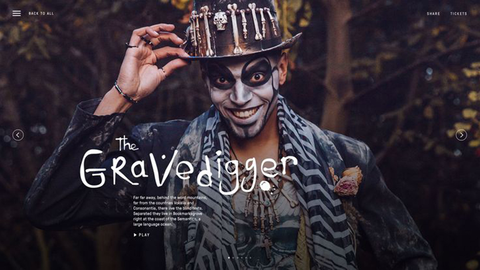
Right now, we’re living through a time when it’s never been more challenging to gain attention.
Once upon a time, print and TV were the respected gatekeepers channelling all the eyeballs into just a few places; all advertisers needed to do was pay for space.
Now, our eyes are darting everywhere, from print to digital, apps to social media. It’s all so cluttered and so, where we haven’t yet managed to install ad-blockers, we’ve installed virtual ones in our own mind, mentally filtering out anything that doesn’t grab us immediately.
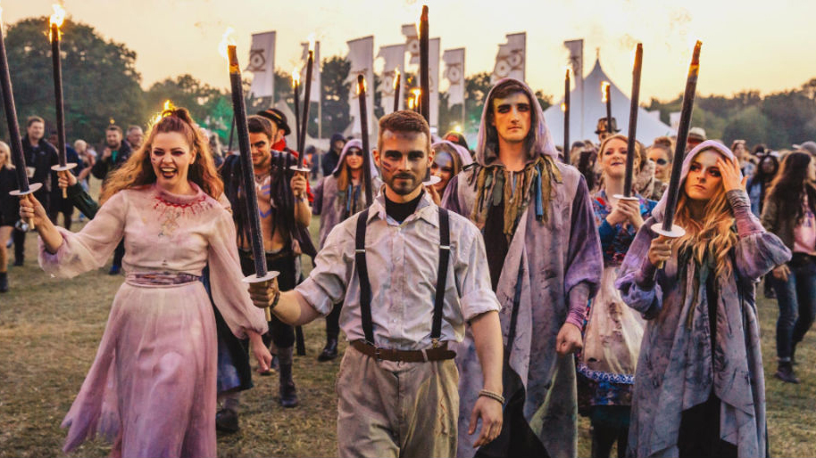
Nowadays, then, any branding needs to work hard to generate excitement, and any imagery you use must be instantly alluring for your campaign to succeed. The visual identity for the Lost Village Festival in Lincolnshire by Only Studio takes that idea and runs with it.
Sign up to Creative Bloq's daily newsletter, which brings you the latest news and inspiration from the worlds of art, design and technology.
These colourful and dramatic shots have an instant impact and immerse the viewer in what looks like an unforgettable experience. You can see more of the branding on Only Studio's site.
02. DON’T be predictable

If you really want to get attention, here’s a simple technique: think about the kind of images people will expect to see, and then produce something very different.
Because disrupting people’s expectations is a key way to make your imagery look authentic and to generate an emotional response.

LIFE showed just how this is done with its campaign for GSK’s health nutrition brand Gen P.
It used fitness photographer Paul Calver to capture strong, athletic models taking part in a live resistance training session; and the results are far removed from the average health or fitness campaign. Check out more of the images on the LIFE site.
03. DO get creative with collage
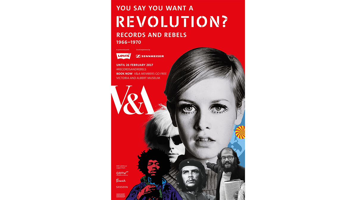
It may be an old-fashioned technique, but right now the art of photo collage is making a big comeback in the design world. And when done right, it can be a brilliant way to combine multiple and varied images, and to evoke a flurry of complex emotions in the viewer.
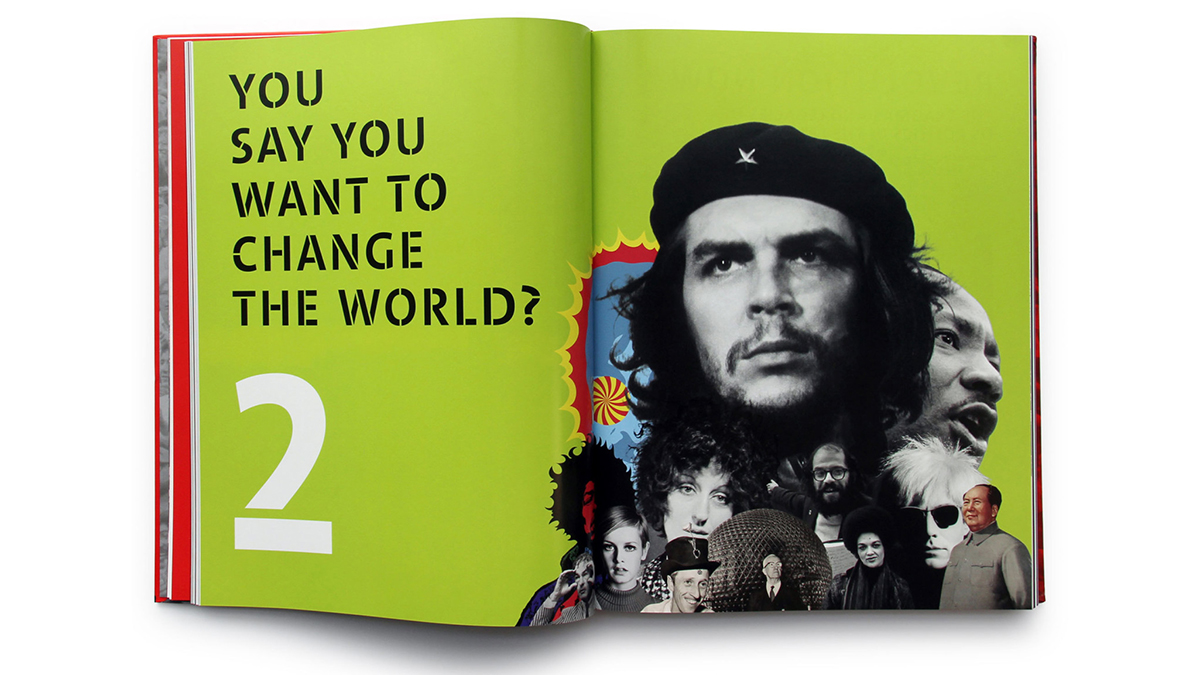
Johnson Banks, for example, made great use of photo collages in its branding for the Victoria & Albert Museum’s 2016 exhibition You Say You Want a Revolution?
The exhibition covered a huge range of themes and multiple revolutions, both cultural and political. Photo collages offered a great way to encapsulate all of this visually, and to create a coherent identity for the show. You can see more of the designs on the Johnson Banks site.
04. DO consider illustration
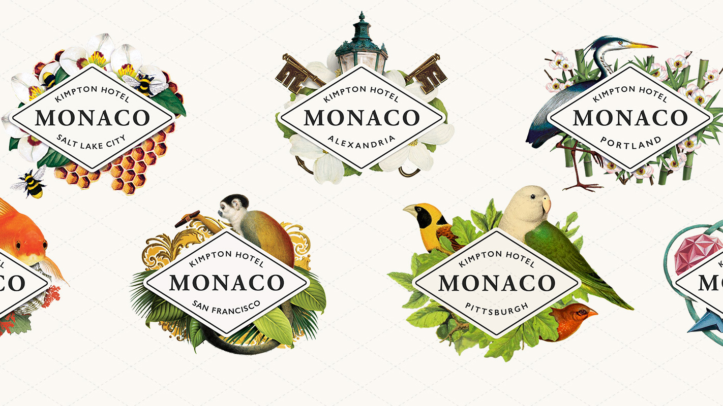
Think images, and it’s natural to think photography. But precisely because of the ubiquity of this type of imagery, you may be able to make more impact with illustration.
After all, in the iPhone and Instagram era, everybody can take a half-decent picture, but a beautiful painting? Technology has not (yet) made that possible at just a touch of a button.
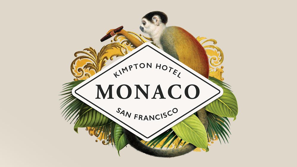
Fine showed just how much the right illustrations can elevate a brand in its identity for boutique hotel chain Monaco.
Based on the theme of the quirky globetrotter who collects design inspiration wherever they go, Fine commissioned a series of richly diverse illustrative identities that convey the high-end nature of the brand while appealing to the individualist. You can see more of the images of the identity on the Fine site.
05. DON’T overcomplicate
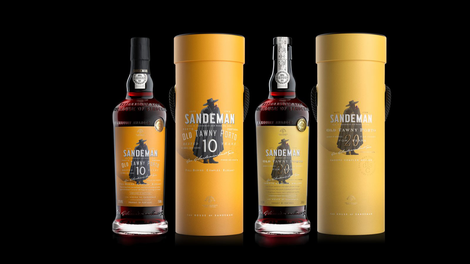
Sometimes the most effective imagery is the most subtle. Whether you’re using photography or illustration, always consider whether less may be more. The simplest silhouettes and most basic shapes can transmit a powerful feeling to people’s brains, fast, so they’re always worth investigating.
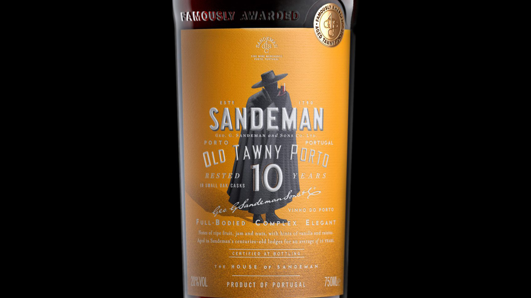
Check out Stranger & Stranger’s redesign of Sandeman’s tawny ports. While the aim was to give the brand a modern-looking refresh, the team was keen to keep the iconic cloaked and hatted figure as the central image of the brand. Because sometimes, the best brand imagery really is the one you’re already using. You can see more of the new designs on the Stranger & Stranger site.
06. DO focus on colour
As we’ve often noted in the past, a series of top brands have successfully managed to ‘own a colour’, such as Coca-Cola’s red and Tiffany’s distinctive blue.
But it can also be effective to focus a single campaign on a specific colour, particularly when the overarching theme of the campaign supports it.
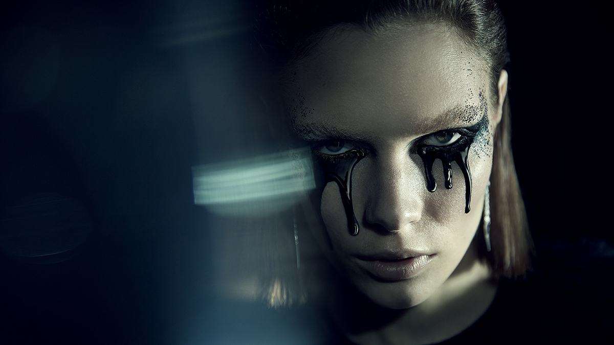
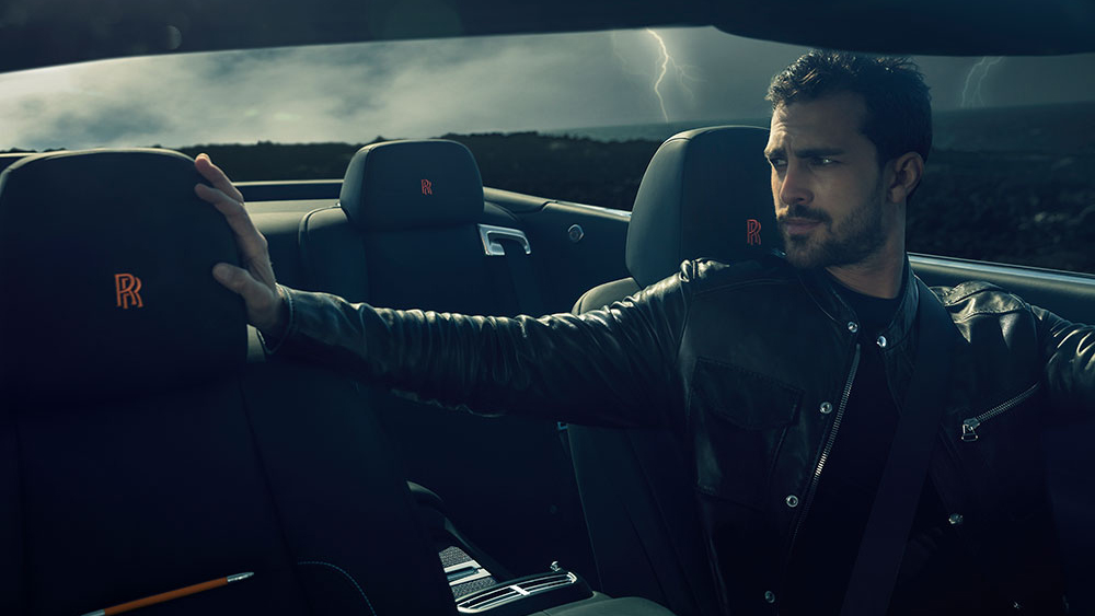
A good example can be seen in AKQA’s campaign for Rolls Royce Black Badge. This modern sub-brand Black Badge is the disruptive alter ego of the traditional Rolls Royce marque, and so called for an audacious and theatrical succession of images.
The use of a black theme played nicely into these arresting photographs, and you can see the full series on the AKQA site.
Liked that? Then read these:

Tom May is an award-winning journalist specialising in art, design, photography and technology. His latest book, The 50 Greatest Designers (Arcturus Publishing), was published this June. He's also author of Great TED Talks: Creativity (Pavilion Books). Tom was previously editor of Professional Photography magazine, associate editor at Creative Bloq, and deputy editor at net magazine.
