Editorial work is a staple for many illustrators, allowing artists to stretch their creative muscles and tackle a broad range of thought-provoking subject matters. The beauty of illustration means that even the most abstract, surreal and complex themes can be brought to life in a bespoke way that photography can't replicate.
While media has naturally migrated from print to online platforms, editorial illustration is still a booming business. If you're looking to break into the industry, you'll need a strong design portfolio and a keen eye for current illustration trends so keep on reading for some creative inspiration.
What is editorial illustration?

Editorial illustration is custom artwork created for publications such as newspapers, magazines, books and online articles. They add visual intrigue to written work, acting as supporting imagery that often relates to the theme of the piece. While editorial illustrations help to engage the reader, they can also add a sense of depth and perspective, bringing the words to life through thought-provoking visuals.
How to become an editorial illustrator
The most important step to landing a job in editorial illustration is to have a strong portfolio. In our digitally connected world, it's easier than ever to create an online portfolio, but don't neglect the value of having a physical version.
"As an illustrator, it is really important to focus your portfolio on the area that you most want to work. Clients are inherently risk averse, to a large extent they want to know what they are getting. You need to have at least 10 good editorial pieces in your portfolio," says illustrator Anna Wray.

While you can make use of social media, don't neglect traditional networking options. The Association of Illustrators (AOI) sell 'The Editorial Directory' – a collection of clients curated in a reference book for illustrators sending out samples of work. Don't be afraid to contact publication art directors directly and attend events where you can build up your network.
Flexibility is also a key component when searching for editorial illustration work. being able to shape your style around a brief is integral to making sure clients are content and more likely to come back. It's worth demonstrating a diverse array of work in your portfolio to demonstrate your adaptable skills as an artist.
5 inspiring editorial illustration examples
01. Justin Metz: Donald Trump's Circus

Editorial illustration is often used as a striking and thought provoking visual tool and this detailed piece created by illustrator Justin Metz is a prime example. Created during 2024's presidential campaign, the provocative cover features a whip brandishing trump atop a vintage circus carriage, inbound for the capitol.
Made for The Atlantic's 2024 October issue surrounding the "antidemocratic actions" of infamous Republican leader, Donald Trump, the piece has an almost fairytale like quality. To create the piece, Justin took inspiration from "the visual language of old Ray Bradbury and Stephen King paperbacks," with Bradbury's 1962 classic 'Something Wicked This Way Comes' being a notable inspiration.
02. Calum Heath: Cyber Bullying

Editorial illustration can represent powerful, emotional and also quite abstract concepts, as this piece by London-based illustrator Calum Heath demonstrates.
Heath specialises in editorial work, with clients including The New Yorker, the Guardian and MixMag. This piece for VICE, one of his favourites to date, accompanied an article about cyber bullying.
In a clever symbolic twist, it transforms familiar Facebook 'Like' icons into foreboding shark fins, circling a girl. "The drawing was originally from life – an observational sketch of my younger sister on her phone," he explains. "I re-contextualised the drawing to make her seem isolated and in danger."
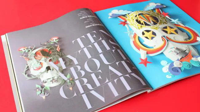
03. Helen Musselwhite: 10 Myths of Creativity
Papercraft illustration has enjoyed a huge resurgence over the last decade or so, with leading proponents such as Owen Gildersleeve, Yulia Brodskaya, Helen Friel and Helen Musselwhite flying the flag with style.
Used in an editorial capacity, papercraft can add an incredible amount of depth to an article, although commissioners need to be clear and confident with their feedback at an early stage, and sign off roughs before the build begins, as even the smallest tweaks at the end can be a real challenge.

One of Musselwhite's standout pieces, 10 Myths of Creativity, illustrated an article in the Royal Academy of Dance’s magazine Dance Gazette that explored popular myths surrounding the creative process.
She created a series of intricate paper skulls, using various weights of paper, to represent two extremes: “That lightbulb moment when you know you’ve nailed it, versus the crushing feeling of despair and insecurity when the creative juices aren’t flowing and you feel you’re on the edge.”
04. Simon Pemberton: The Blackest Isles

Sometimes editorial illustration is as much about capturing the mood or emotion of a particular scene or place described in the copy, as it is about depicting it faithfully – which a photograph could do.
A winner at the V&A Illustration Awards 2015, Simon Pemberton's stormy, evocative illustration for the FT Weekend magazine accompanied a feature about the Shetland Isles, and perfectly captures the icy cold and thunderous skies during a stormy boat journey.
This extract from the article sums up what Pemberton was trying to achieve: “Last night… the ship bucked and tossed as if we were on a fairground ride... the gale has dropped outside and it has started to freeze. Weather is everything in Shetland… we always know which way the wind is blowing.”
05. Eva Bee: The Day My Brother Was Taken


