Behind the scenes on seven superhero logos
Branding lessons from Earth’s mightiest superheroes.
Sign up to Creative Bloq's daily newsletter, which brings you the latest news and inspiration from the worlds of art, design and technology.
You are now subscribed
Your newsletter sign-up was successful
Want to add more newsletters?
Superhero logos are surely a dream brief for any designer: create a badge to be emblazoned large on the chest of a courageous crime-fighter. Dream up a brand to truly strike fear into the heart of villainous wrong-doers. And design a marque to spruce up any secret hideout to make it the envy of fellow superheroes the world over.
Unfortunately, it’s not the kind of brief that comes along too often in real life, so most of us must be content with cladding fictional superheroes from page and screen.
But even fictional superheroes can teach us a thing or two about great branding. Read on to discover the art, craft and history behind seven of the most iconic, memorable superhero logos sported by the world’s greatest crime-fighters – and what branding and logo tips you can learn from them...
Article continues below01. Superman

The original superhero, DC Comics’ Superman made his debut comic appearance in 1938, sporting a distinctive ’S’ logo created by Jerry Siegel and Joe Shuster. At that point it resembled a simple red-and-yellow police badge, or shield, but after various iterations the creators settled on a large ’S’ inside an inverted pentagon.
Its primary red and yellow palette is bright, strong and confident, but the colours can also be seen to represent the character’s backstory: Roa, the sun of Superman’s home planet Krypton, is red; while Earth’s yellow sun gives him his power.
The logo’s bold, masculine ‘diamond’ form – especially when emblazoned across a muscular torso – also conveys courage, strength and durability. In 1945 it was the first superhero logo to be officially trademarked, kicking off a lucrative market for merchandising and licensing – notably T-shirts. This trend was later followed by Batman, Wonder Woman, Green Lantern, Spider-Man and more.
Superman: The Movie elaborated the ’S’ into a coat of arms, or family crest - and according to 2013’s Man of Steel, it is not in fact a letter at all, but the Kryptonian symbol for ‘hope’.
Sign up to Creative Bloq's daily newsletter, which brings you the latest news and inspiration from the worlds of art, design and technology.
02. Captain America

Captain America may be an enhanced supersoldier, but unlike Superman, he is very much from Earth. And his unconditional love of his country of origin makes the colour palette of his logo, and associated costume, something of a no-brainer.
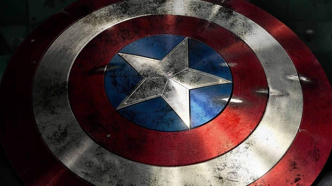
His iconic vibranium shield was originally triangular, but after complaints from rival comic book publisher MLJ about the character’s similarity to its own creation The Shield, it evolved into its current distinctive circular form.
The red, white and blue concentric circles that adorn it symbolise infinity, power and energy, while the central star gives the all-American hero a patriotic flourish; a nod to the star-spangled banner, while maintaining its own identity.
While his own emblem stands alone, ‘Cap’ also has the honour of leading The Avengers, which – rather like fellow Marvel superhero team the X-Men – also sports its own stylish logo. The idea to blend the ‘A’ with a dynamic arrow symbol originally came from Marvel letterer Gaspar Saladino, and was first seen in 1972.
03. Wonder Woman
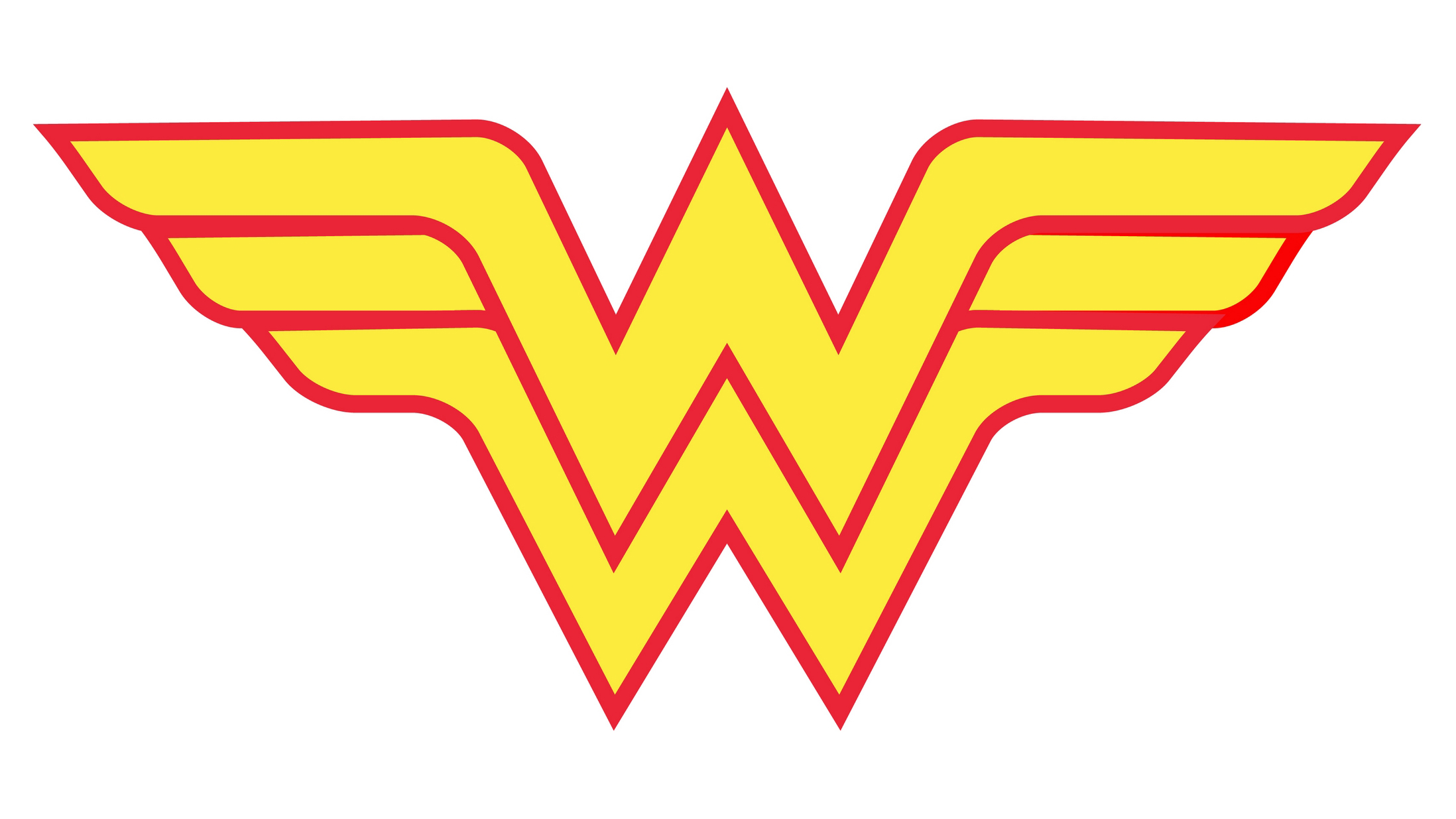
When Wonder Woman made her comic book debut in 1941, her associated emblem was an eagle, while her name was only crudely sketched in open script on the cover. It was only in the 1980s, when DC invested heavily in its superhero trio of Superman, Batman and Wonder Woman, that the Amazonian warrior acquired a distinctive superhero logo of her own.
As a fairly generic symbol of the USA, the eagle wasn’t easily trademarked and licensed in the way that Superman and Batman could be. Given that the character hailed from the mythological island of Themyscira, the US associations – so fitting for Captain America – were also rather confusing by comparison.
Having also worked on a revised Superman logo, legendary designer Milton Glaser was drafted in by DC to help solve both of these issues, combining the two Ws with a stylised wing motif that celebrates the heroine’s ability to fly, with a subtle nod to the original eagle emblem.
04. Batman
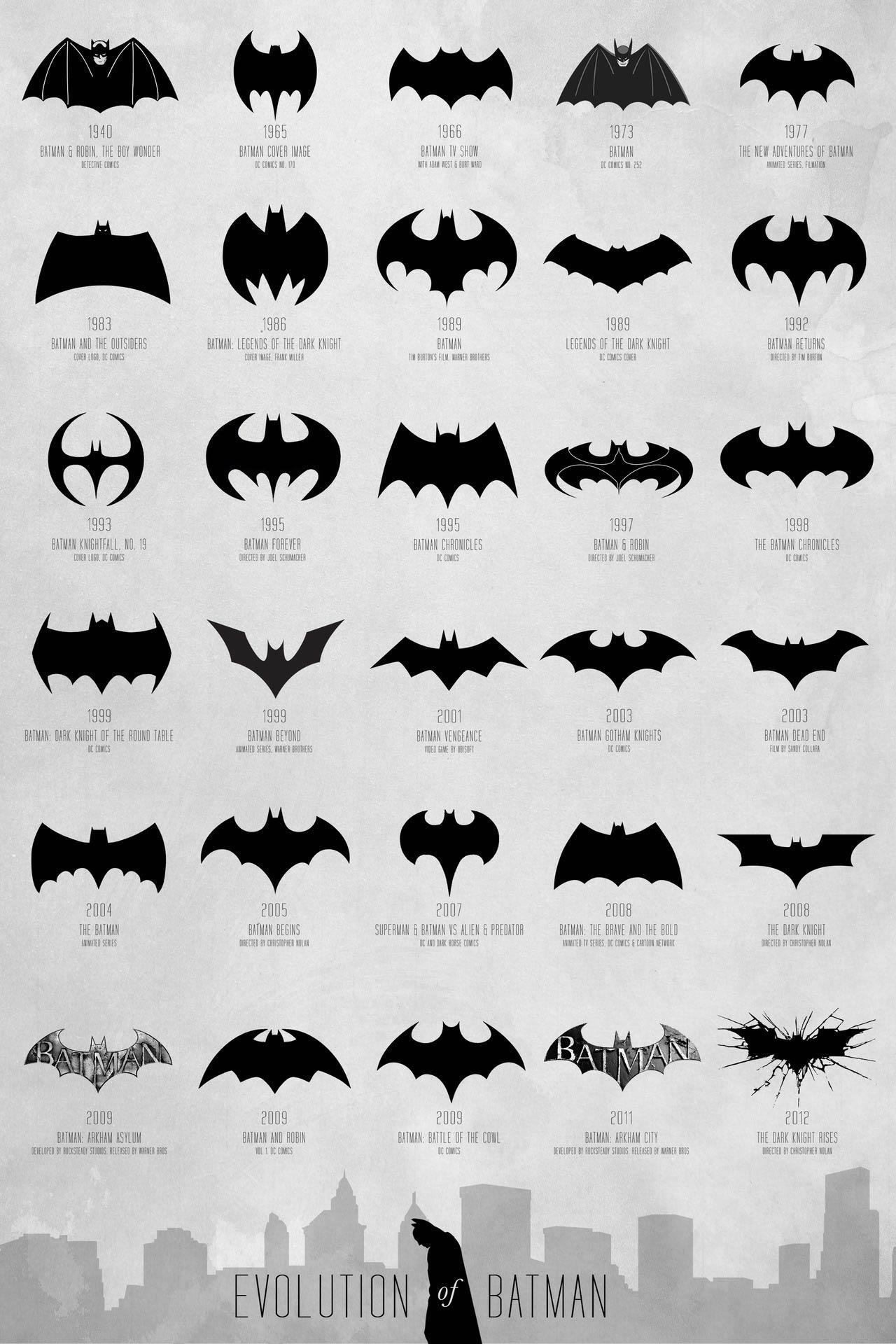
As with fellow DC superhero stablemate Superman, Batman’s logo emphasises his muscular physique, the oval form stretched across his chest. But his emblem also has a practical function: as a silhouette on a giant searchlight, the bat signal can summon him from any corner of Gotham. It also features in many of his tools and weapons, such as the Batarang and Batbelt.
While the distinctive bat has always been the central focus, the shape and form of Batman’s logo has undergone significant changes over the decades. It has shifted personalities from its comic book origins in the 1940s, through the lycra-clad camp of the 1960s TV series, to Frank Miller’s dark 1980s graphic novels – and latterly a canon of major movies, which have ranged from gritty psychological thrillers to wise-cracking action romps.
Ultimately, successful branding is about understanding your target market. Unlike Superman’s powerful and uplifting logo, which inspires awe, hope and pride in the general public, Batman’s symbol is often presented as dark, moody, mysterious and threatening – designed to strike fear into the hearts of criminals.
05. The Punisher
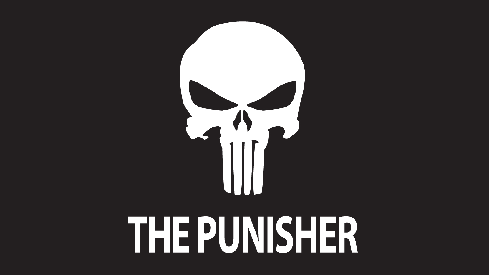
When it comes to antiheroes, it doesn’t get much darker than Marvel’s The Punisher. His menacing white skull logo, looming out of the darkness, is the last thing his enemies tend to see before being blown to pieces by the violent vigilante.
Besides the intimidation factor, The Punisher’s logo also has a practical function: to draw fire away from his vulnerable areas and towards his heavily armoured chest. In terms of his backstory, the skull harks back to the Vietnam war, where the character uses it to taunt his capturers. Comic artist John Romita Sr later developed it into a more prominent symbol.
In more recent years, the skull has attracted cult appeal in certain parts of the US Armed Forces, particularly the Navy SEALs and 24th Infantry. It featured on unofficial unit patches and was spray painted onto buildings, vehicles and equipment in Iraq and Afghanistan – gaining real-world notoriety that far transcends the comic book character himself.
06. Spider-Man
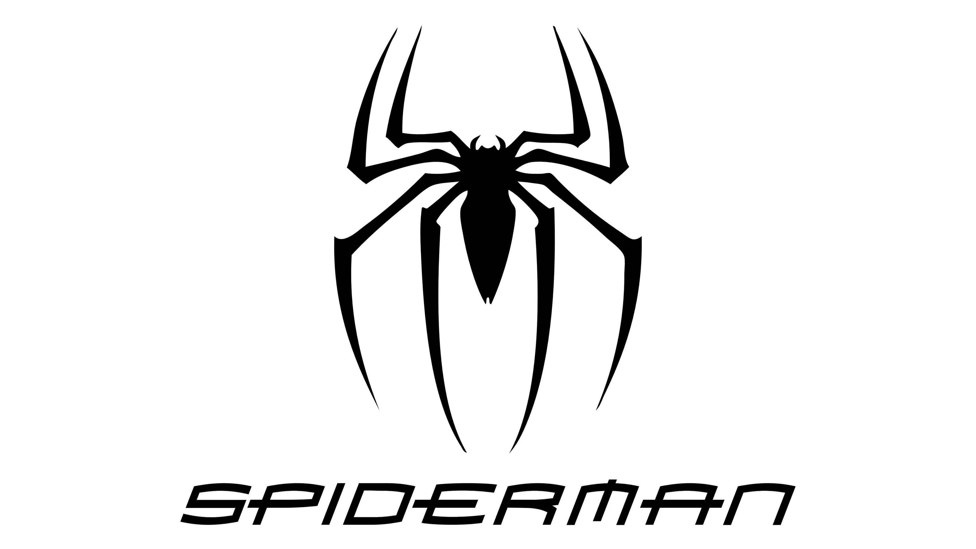
One of Marvel’s most-loved creations, Spider-Man – like Batman – has a superhero logo that’s evolved significantly over the decades, without losing its crucial association with the creature that inspired his name (and in Spider-Man’s case, gave him his powers).
When the character first appeared in the Amazing Fantasy comic, his spider badge had a round, cartoony body, echoed by the relatively handmade-looking costume. The size and shape of the symbol has changed dramatically since, developing longer legs and a sleeker, edgier body.
Some of these logo evolutions have been storyline-based, such as when Peter Parker bonds with the Symbiote to create the distinctive black version of his suit. This versatility, particularly when it comes to movie adaptations, helps keep the character fresh and relevant.
07. The Green Lantern
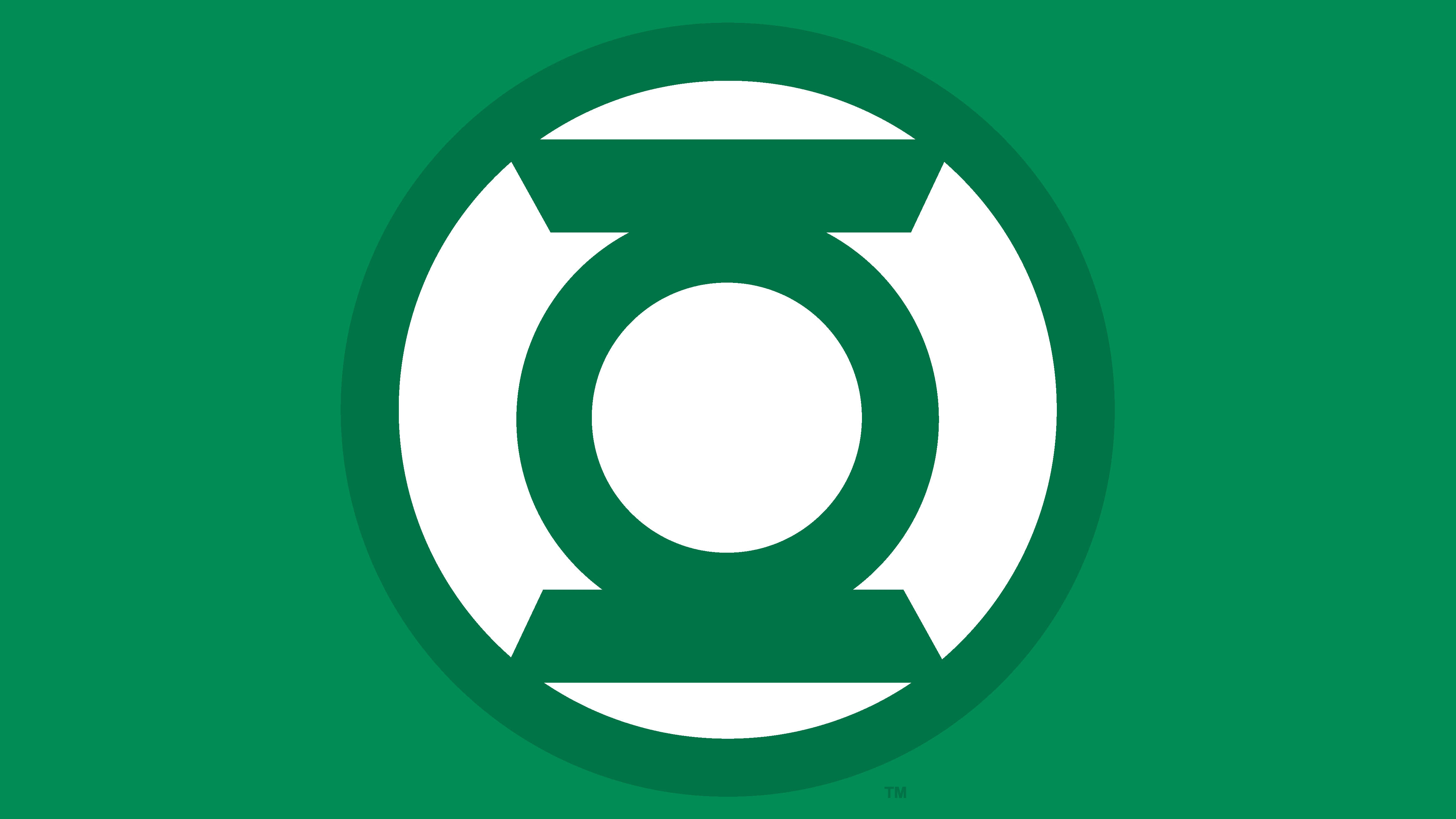
Technically, DC’s Green Lantern Corps constitute a whole army of galactic peacekeepers, rather than a single superhero – bound together not just by their ability to weaponise their incredible willpower, but by a shared brand identity and colour scheme.
One of the simplest superhero symbols in this list, the Green Lantern logo is not only a stylised version of the lantern itself, but can also be seen as a graphic representation of that all-important willpower quality – the central circle, symbolising the superhero’s ‘power ring’, looks to be forcing two rigid lines apart.
The Green Lantern logo is also joined by six other Lantern Corps symbols covering the rest of the colour spectrum, representing Greed, Rage, Fear, Compassion, Love and Hope, as well as black and white to represent Life and Death, respectively.
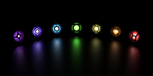
It’s a complex branding hierarchy that only more committed comic fans will fully appreciate, but the original Green Lantern superhero logo proves that it’s often the simplest forms that are the most memorable.
You might like these related articles:

Nick has worked with world-class agencies including Wolff Olins, Taxi Studio and Vault49 on brand storytelling, tone of voice and verbal strategy for global brands such as Virgin, TikTok, and Bite Back 2030. Nick launched the Brand Impact Awards in 2013 while editor of Computer Arts, and remains chair of judges. He's written for Creative Bloq on design and branding matters since the site's launch.
