7 key typographic trends in Marvel movie logos
What designers can learn from the decade's biggest superhero brand.
Sign up to Creative Bloq's daily newsletter, which brings you the latest news and inspiration from the worlds of art, design and technology.
You are now subscribed
Your newsletter sign-up was successful
Want to add more newsletters?
As Marvel Studios gears up to celebrate its 10th anniversary, we take a look at the typographic trends behind the Marvel movie logos.
With a plethora of superheroes to choose from – The Incredible Hulk, Thor, Captain America and more – Marvel has released a new movie each year since its 2008 release of Iron Man, building the brand into one of the most powerful in the world.
But with great power comes great responsibility, especially when it comes to the logo design of each movie. So what of the typography? How have the film's superhero logos developed over the last decade? And what can designers learn from their evolution?
Article continues belowHere we pick out seven big type trends from Marvel movie logos, and offer insights from designers.
01. Back to basics
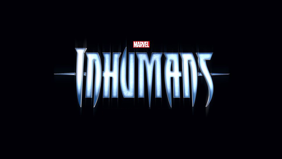
One clear typographic trend across Marvel’s 2017 and 2018 movie logos shows many of the designs increasingly returning back to their original comic book roots.
“From the get-go with the first Iron Man movie, Marvel Studios’ film branding wasn’t necessarily tied too closely to its comic book counterparts – with the exception of the Avengers logo,” explains comic designer and creative director Tom Muller. “This was done in order to establish IP and brands that reached further than comics.”
Another factor is that many older films were licensed out to other studios. Now, that trend appears to be reversing, with many of the newer logotypes giving a nod to their original comics.
Sign up to Creative Bloq's daily newsletter, which brings you the latest news and inspiration from the worlds of art, design and technology.
The wordmark for 2018 film Inhumans is modelled closely on the 1998 logo designed by Comicraft’s John ‘JG’ Roshell, while the Captain Marvel logo takes inspiration from comic book letterer Jared K Fletcher’s original design.
02. Anti-flat design
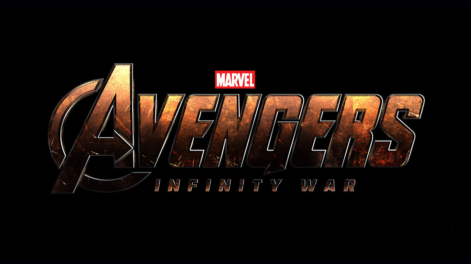
2016 might have been the year of flat design, but simplification of type continues to be a clear logo trend throughout 2017. Which makes it all the more notable that the newer Marvel movie logos are doing things differently – as showcased by the Avengers: Infinity War logo, which boasts blocky 3D type.
“There's been a global design shift towards simpler, cleaner, 'flat' design in recent years so, it's interesting to see this going in the opposite direction,” points out award-winning typographic designer Craig Ward.
“You can make the argument that the titles serve as a nice metaphor for the movies, which themselves have become darker, more mature and deeper.”
03. Textured type

Earlier Marvel movie logos saw the studio stick to simple typography, with faded hues often serving as the dominant special effect. With the new announcements, Marvel is moving into more textured territory, enabling movie titles to say even more about a film's characters and plot, while also popping from Marvel’s standard black backdrop.
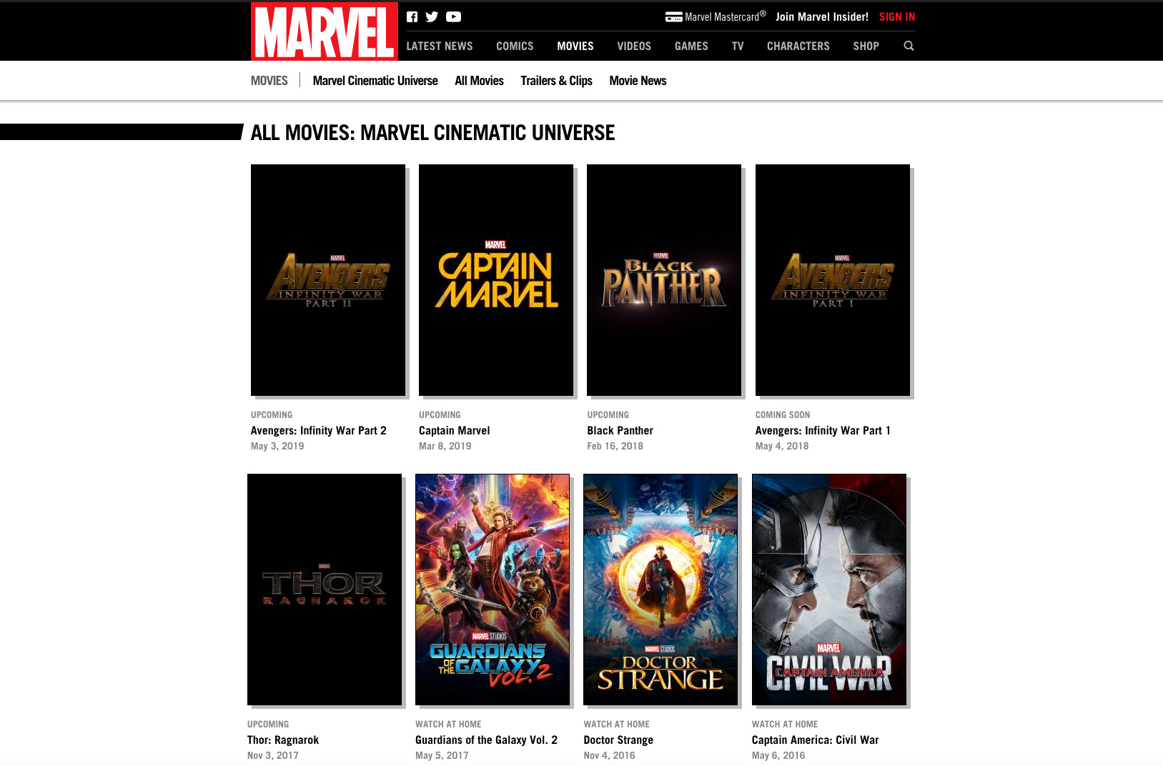
“One thing that I'm noticing now is how the new graphics have more texture,” agrees designer Paolo Grasso. “The initial logo for Thor: Ragnarok evokes a rocky texture, while there’s a metallic shine on the Guardians of the Galaxy: Vol 2 and Black Panther logos."
"The older logos seem to stay with that 'laser on black' effect," he continues, "which reminds me of movie logos of the late '90s, such as Mission: Impossible.”
04. Bolder colour palettes
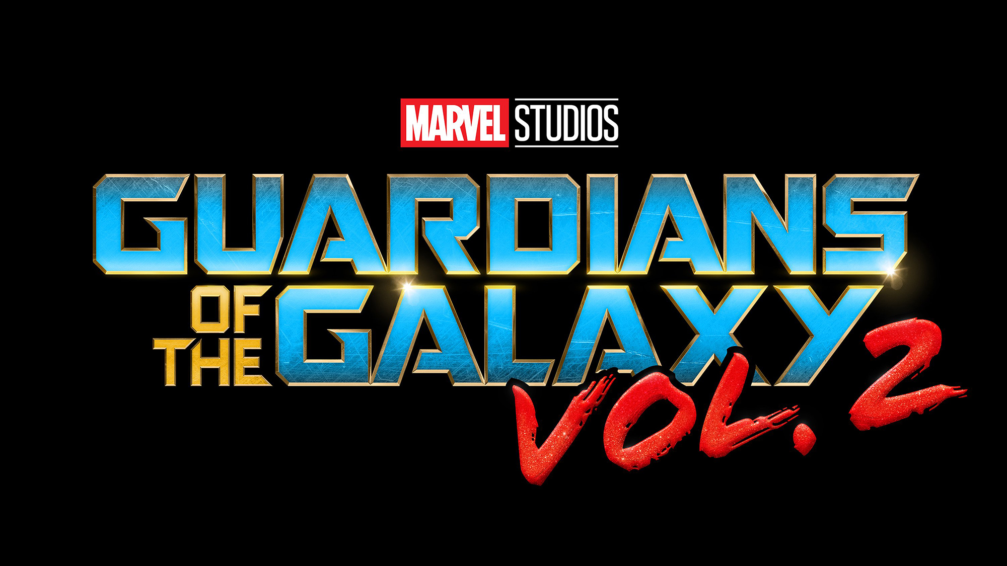
In Marvel’s earlier movies, the logos largely stuck to its standard silver and red colour palette – with a few exceptions. Lately, however, the typography has shifted towards gold and brass tones, which can be seen in the logos for Avengers: Infinity War and Black Panther.
Tom Muller adds that while the typography in the logos of Guardians of the Galaxy: Vol 2 and Thor: Ragnarok are “squarely embracing their four-colour origins”, they’re doing so “with a decidedly bolder colour palette.”
And it’s worth pointing out that the Guardians of the Galaxy: Vol 2 logo was the first Marvel movie to use blue as its main type colour.
05. Rounded edges
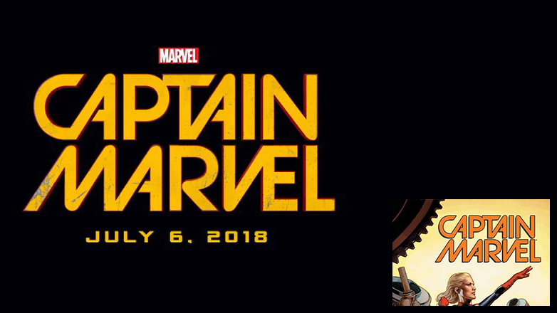
Looking at the upcoming Marvel movie logos together, the typography of one in particular sticks out as noticeably different to the others. While most of the logos feature square-shaped typography, Captain Marvel veers towards the circular. It’s based on Jared K. Fletcher’s original design, but it’s a noticeable shift towards something different.
A similar style was used recently in Spider-Man: Homecoming, perhaps signalling the way Marvel movies target younger audiences. Spider-Man: Homecoming is a light-hearted film (compared to, say, The Avengers) and the hero himself is one of the youngest in the universe.
This circular geometric type evokes a youthful sense of fun, rather than a distinguished type used for the older heroes.
06. 1980s gaming
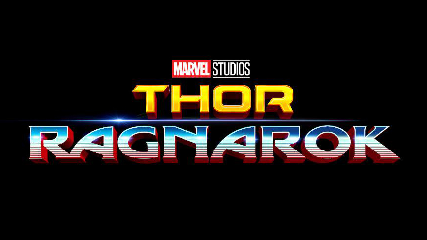
Speaking of a shift in direction, the latest Thor: Ragnarok typography looks undeniably different to the series’ previous logo outputs. 2011’s Thor saw a thin, metallic design, while 2013’s Thor: The Dark World provided a bold, textured type, similar to the initial Thor: Ragnarok logo.
However, a new movie logo was launched earlier this year and its retro gaming aesthetic marks the series’ change in tone. Director Taika Waititi described Thor: Ragnarok as a "70s/'80s sci-fi fantasy" movie – and the type in the new logo represents the new vision.
It’s clear from the Thor: Ragnarok trailer that the tongue-in-cheek approach that made Guardians of the Galaxy so successful will be taking centre stage in the new instalment. And while we're on the subject of Guardians of the Galaxy, the same effect can be seen in the Vol. 2 logo.
“It’s something of a trend, but adds much more character and gives a nod to the fun heritage of their comic counterparts,” explains designer Kyle Wilkinson. “A focus on the actual type design seems to be coming into focus too, as opposed to hiding some questionable type choices behind a cloak of special effects.”
07. Mismatched fonts
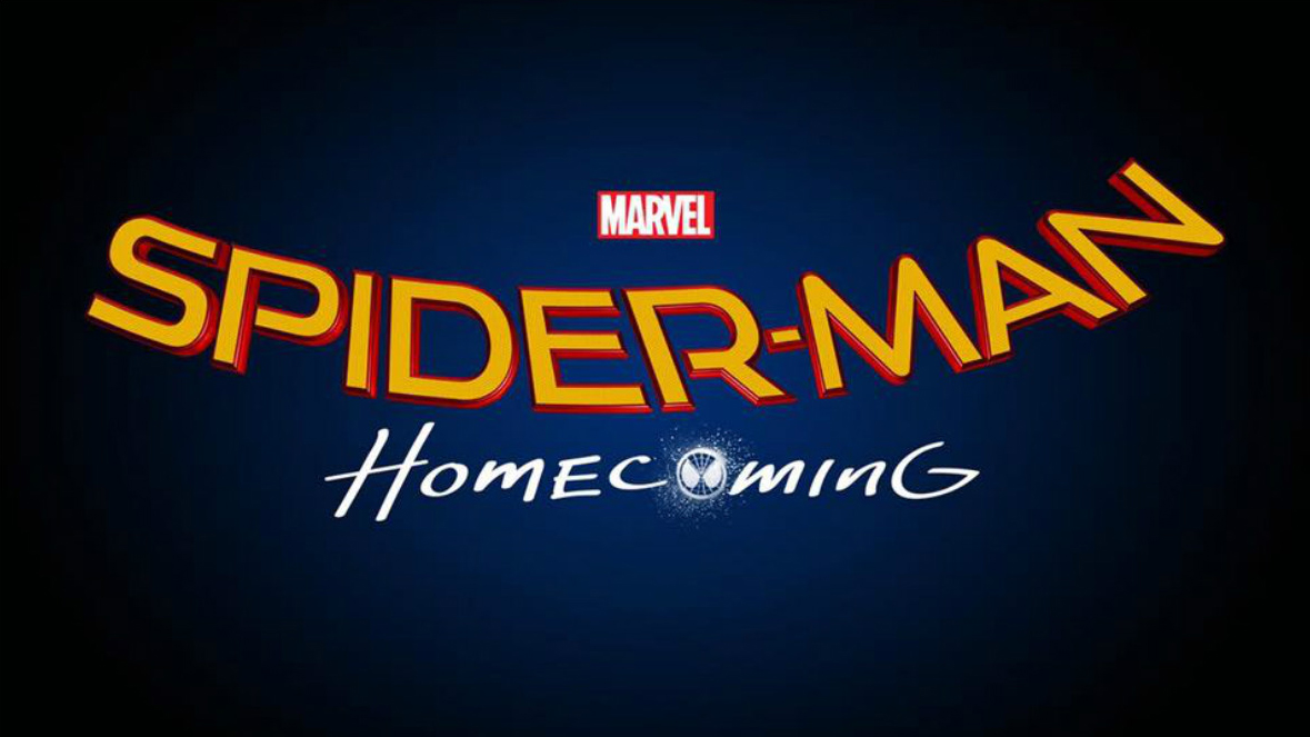
A retro and comic book influence can also be seen with the hand-drawn ‘Homecoming’ in the Spider-Man: Homecoming logo, and ‘Vol. 2’ in the Guardians of the Galaxy: Vol 2 logo.
While this mismatched vibe is achieved by using contrasting colours and nontraditional colour palettes, an unusual font pairing can also be an effective way to catch the attention of your audience.
Related articles:

Sammy Maine was a founding member of the Creative Bloq team way back in the early 2010s, working as a Commissioning Editor. Her interests cover graphic design in music and film, illustration and animation. Since departing, Sammy has written for The Guardian, VICE, The Independent & Metro, and currently co-edits the quarterly music journal Gold Flake Paint.
