5 logo trends for 2017 you need to know about
Sign up to Creative Bloq's daily newsletter, which brings you the latest news and inspiration from the worlds of art, design and technology.
You are now subscribed
Your newsletter sign-up was successful
Want to add more newsletters?
We’ve said it before and we’ll say it again: nobody thinks good design is about copying others. But nor does good design exist in a vacuum. So it’s good to know what kind of branding other designers are creating right now; whether it inspires you to follow in their footsteps or run screaming in the opposite direction.
In this post, we’ve gathered together some of the biggest current trends in logo design. None of them are particularly new or revolutionary, and you may recognise some from trends lists past. But they’re all still very much in force at the moment, and seem likely to continue to be influential for at least the next 12 months.
01. Cartoon-style logos
There’s been a marked rise in the popularity of hand-drawn lettering recently, and that’s also influenced a related trend for cartoon-esque logos. Perhaps all that sleek minimalism we’ve been seeing in logoland has broken us, and we’re once again yearning for the comfort of 70s and 80s children’s TV lettering.
Article continues belowThe trend can be seen, for example, in the cute and curvy logos for pet food brand Ollie by Communal Creative; file transfer giants WeTransfer; social-platform-for-play Robox; andchewable candy brand Fruna by Brandlab (with a bouncing ‘U’ in the animated version that’s beautifully reminiscent of Pixar’s lamp).
02. Geometric shapes
Geometric shapes have long been a popular design element, but it takes a lot of skill to get their use right. Lately, more and more designers have been succeeding, with examples including the new logo for Google’s self-driving car project Waymo, a collaboration with Manual and the in-house team; Spin’s logo for nightclub and music label Ministry Of Sound; the in-house rebrand for customer software company Zendesk; and the hard-geometry wordmark for Pyramida by Reynolds & Reyner.
03. Simplification
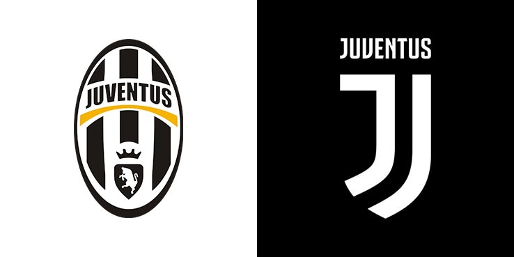
The move towards simplification of existing logos has been a trend for many years now. And it’s one that’s very much continuing into 2017.
This logo trend is partly about aesthetics, but it’s also about making your logo scalable at small sizes. And with tech trends like smartwatches and other wearables continuing apace, it’s unlikely to go away anytime soon.
Sign up to Creative Bloq's daily newsletter, which brings you the latest news and inspiration from the worlds of art, design and technology.
Recent examples of the trend include the new logo and identity for football club Juventus by Interbrand; Grey London’s controversial proposal for a redrawn WWF logo; Pentagram’s sleek and simple new branding for Canada’s Heart & Stroke Foundation; and Lippincott’s new design for Taco Bell.
04. Brighter colours
In recent months, we’ve noticed more and more brands using colour to brighten up existing logos, adding new hues to shake up existing palettes in eye-catching ways. Examples include the refresh of cognitive computing firm Digital Reasoning by Golden Spiral; the redesigned branding for travel search engine Dohop by Bedow; the new look for The National Outdoor Leadership School by Magnifico Design and Wolf & Wilhelmine; and the latest logo redesigns for Subway, Experian and Samuel Adams.
05. Typographical trickery
Designers have always delighted in incorporating little visual tricks and hidden messages into their logos, such as the famous use of negative space in logos by Fed Ex and Toblerone. And recently, we’ve seen this approach becoming popular once more.
Examples of the trend include new logo designs for the French town of Romans-sur-Isère by Graphéine (incorporating its famous bridge); Race Against Dementia by Brand Union (with a fragmented ‘D’ suggestive of both racing and dementia); Danish Design Award by Kontrapunkt (where the whole wordmark forms the shape of a ‘D)’; and pet adoption service Petfinder by Possible (where a subtle image of a dog appears within the script design if you look hard enough).

Tom May is an award-winning journalist specialising in art, design, photography and technology. His latest book, The 50 Greatest Designers (Arcturus Publishing), was published this June. He's also author of Great TED Talks: Creativity (Pavilion Books). Tom was previously editor of Professional Photography magazine, associate editor at Creative Bloq, and deputy editor at net magazine.
