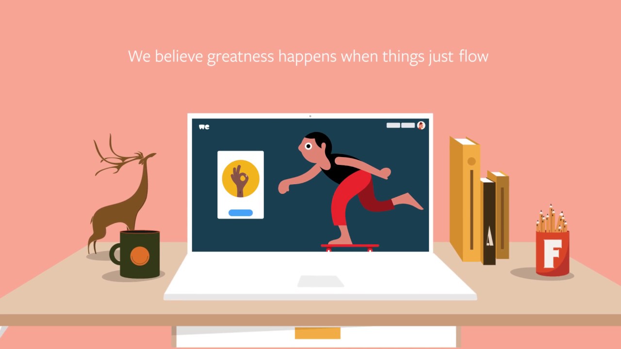
WeTransfer unveils new logo and brand identity
File sharing service WeTransfer has given its logo, branding and website a redesign for the first time.
Cloud-based file sharing service WeTransfer has revealed its first new identity, website and logo design since launching back in 2009. Deciding to go back to basics and build up from scratch, the new identity sees the company drop the word 'transfer' from the logo and focus instead on refining the wordmark symbol.
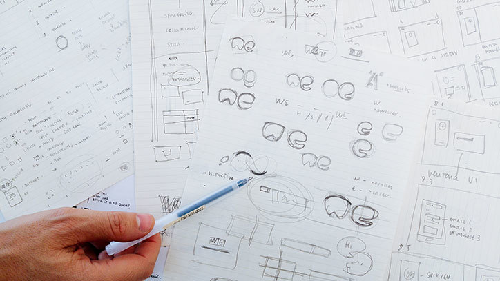
The new logo retires the roots in the typeface that could be found in the previous design iteration. WeTransfer's in-house creative director Laszlito Kovacs began drafting concepts and ideas before working with Bold Monday's Paul van der Laan to hone the details. The result is a cute new logo which Thijs Remie, vide president of design at WeTransfer, says is "well-balanced and exudes its personality at a small size."
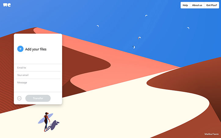
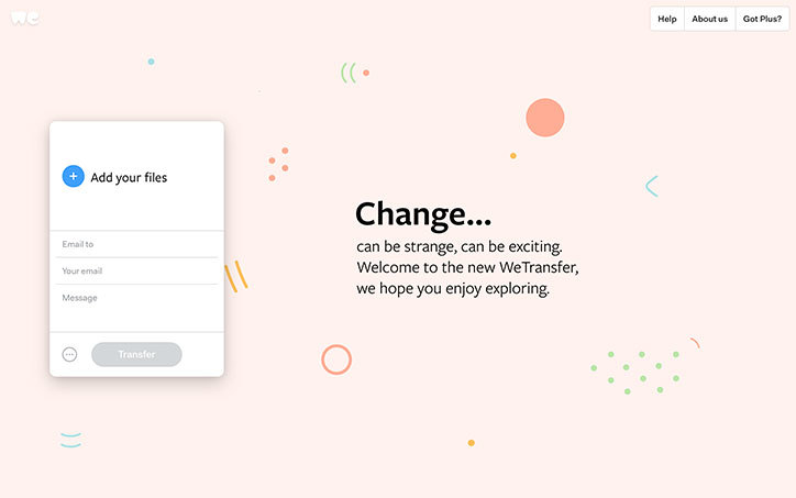
Beyond the new logo, WeTransfer's website has been given a fresh colour palette, new typography and a cleaner interface. A bigger message field that scales as you type, plus a set of illustrations that guide you through crucial moments of the transfer process complete the redesign.
Article continues below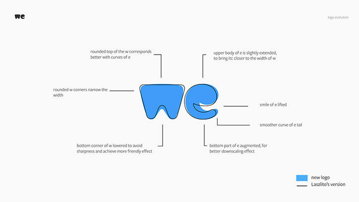

Related articles
Sign up to Creative Bloq's daily newsletter, which brings you the latest news and inspiration from the worlds of art, design and technology.

Dom Carter is a freelance writer who specialises in art and design. Formerly a staff writer for Creative Bloq, his work has also appeared on Creative Boom and in the pages of ImagineFX, Computer Arts, 3D World, and .net. He has been a D&AD New Blood judge, and has a particular interest in picture books.
