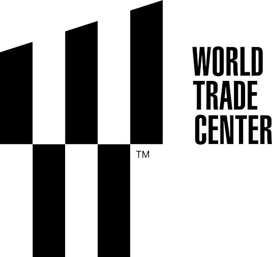
New logo for World Trade Center revealed

Rarely has a piece of graphic design been associated with as much political and emotional significance as this one. Landor Associates, the veteran agency behind everything from the famous FedEx wordmark to the most recent DC Comics identity was last year tasked with creating a new logo for New York's World Trade Center, which is still under reconstruction. And here's what they've come up with.
Set in Helvetica Ultra Compressed and making good use of negative space, the design performs a number of symbolic functions.
Symbolic elements
- The slant of the top half is at a precise 17.76-degree angle, in tribute to 1 World Trade Center’s 1,776-foot height.
- The logo contains a trident, symbolising the steel columns at the base of the twin towers which remained standing after the 2001 attack.
- The two parallel spaces in the top half of the logo represent the memorial beacons of the Tribute in Light.
- The two bars in the lower half represent the deep pools of the National September 11 Memorial.
- The design as a whole is a stylized W, standing for both World Trade Center, and Westfield World Trade Center, a shopping mall due to open there next year.
The new logo design aims lend a graphic unity to way-finding signs, building entrances, digital directories, kiosks, uniforms, websites, apps and marketing materials.
Article continues below[via The New York Times]
What do you think of the new logo? Let us know in the comments.
Sign up to Creative Bloq's daily newsletter, which brings you the latest news and inspiration from the worlds of art, design and technology.

Tom May is an award-winning journalist specialising in art, design, photography and technology. He is the author of the books The 50 Greatest Designers (Arcturus) and Great TED Talks: Creativity (Pavilion). Tom was previously editor of Professional Photography magazine, associate editor at Creative Bloq, and deputy editor at net magazine.
