Mobilise your website
When trying mobile design for the first time, not everyone has the time and resources to build a new mobile site or begin with a mobile first redesign. Kristofer Layon, author of the upcoming book Mobilizing Web Sites, explains how you can take mobile baby steps to design a decent mobile presentation for an existing site
Over the past few years, I have had the privilege of attending some great conference presentations about mobile web design. And if you have an interest in mobile and are reading this right now, you have probably also heard some inspirational lessons and valuable techniques that can help you design new websites for presentation on mobile devices.
The trouble for many of us, however, is that we often just go back to work and continue to dream about designing that first mobile website… as we continue to work on our existing desktop-oriented projects. Perhaps some of us are in-house designers who help maintain and update several existing websites (or maybe just one really large one). Or, perhaps we have contracts to continue maintaining and updating existing websites for our clients. Finally, the people we work for could very well be interested in mobile – but do they provide us with enough time, money, or other resources to help us get it done?
In these cases, we’re often not in a position to propose an entirely new site design in order to fulfill today’s new mobile presentation goals. So despite Luke Wroblewski’s rallying cry of mobile first getting us excited and inspired, where does it leave those of us who are faced with mobile later? Worse yet, what if we feel like our circumstances are keeping us locked into mobile never?
Article continues below 
Start with incremental improvements
Rest assured, feeling like you can’t start over is not a unique problem. I think Dan Cederholm may have said it best in August:
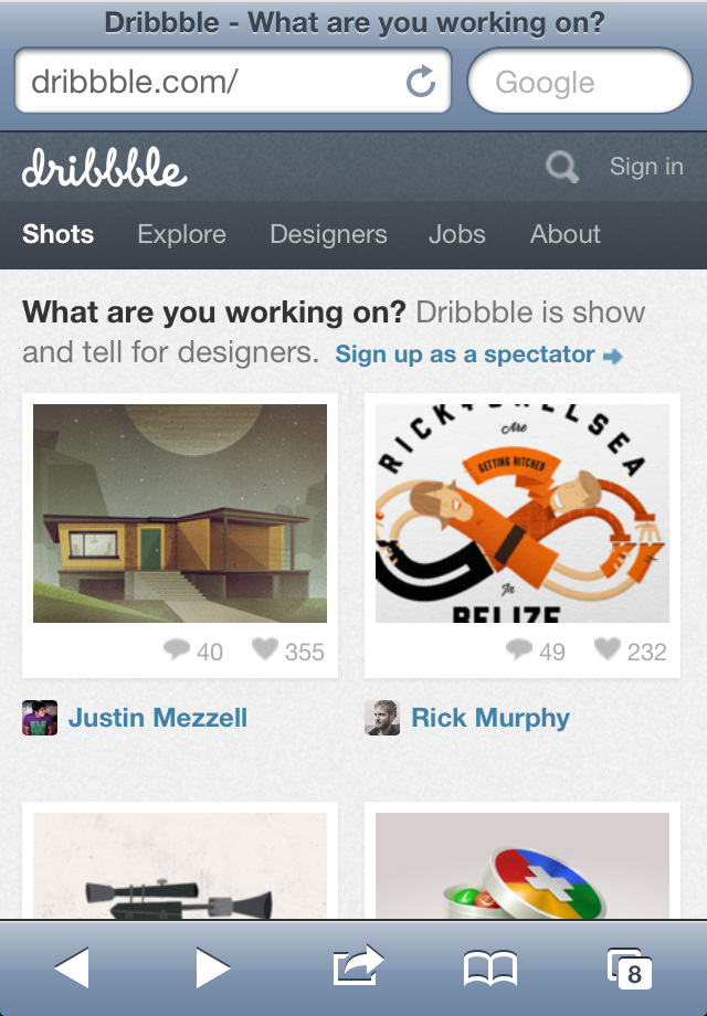
“For existing sites (particularly ones that are also businesses), teams don’t always have the luxury of tossing everything aside and building anew. We found ourselves in this position with Dribbble, a bootstrapped operation still run by 1.5 people … So I decided the best thing to do was compromise for now. Let’s keep the same content and code that’s been powering the large-screened version that Dribbble has always been, and then let’s do something adaptive to it … When time, resources and funds are more abundant, I’d love us to rethink things in a more holistic manner, but for now incremental improvements will keep us moving. And that’s the priority.”
In fact, research about the web shows that despite there being a large increase in the number of sites that are being optimised for mobile use, the vast majority of websites don't have a mobile version or presentation. One year ago, research by dotMobi showed that despite 40 per cent of the top 1,000 websites having a mobile version or presentation, that number went down to 30 per cent for the top 10,000 sites and just 19 per cent for the top 500,000.
This means that most of us are probably not yet doing any mobile design. But this is not an insignificant problem. Research also tells us that nearly half of mobile web users are unlikely to return to a website that they had trouble accessing from their phone, and 57 per cent are unlikely to recommend the site to someone else.
Sign up to Creative Bloq's daily newsletter, which brings you the latest news and inspiration from the worlds of art, design and technology.
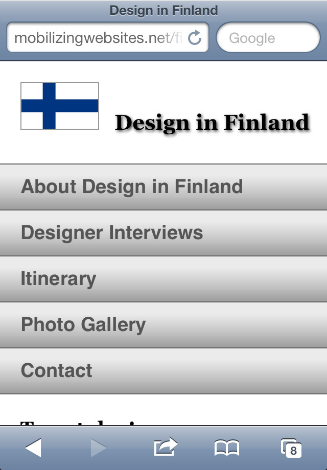
So what are some incremental improvements that you could make to your site to make it more mobile-friendly? They might include adjusting the layout to respond to different screen widths, redesigning the navigation to be more touch-friendly, and resizing text and images. These are all things that you can do within the confines of an existing design. Consider it remodeling an existing versus building a completely new house.
If you need to choose between incremental improvements to keep moving and waiting for the opportunity to do a completely new design but not moving at all while you wait, I suggest you keep moving. Even if you just take baby steps along the way. Because the bottom line is that this work will make more of the web mobile-friendly, help more people have a better mobile experience, and improve your business.
Plus, taking baby steps can be just as creative and important as redesigning from scratch.

Remodeling versus building anew
I suppose we can be forgiven for thinking that we need to start from scratch in order to design a good mobile experience. Indeed, when we think of design, our minds typically turn to new designs. Because the allure of creating something new is what drives many of us into design and development in the first place. Images, text, and code: the thrill of filling an empty browser window with a new interactive design that we have created is exciting and satisfying.
So when we are instead faced with incremental updates or improvements to existing web properties, it can feel more mundane. Where are the creative opportunities in that?
But sometimes we forget that working on the web is not any different from working with other media, materials, or mechanical systems. People get into a variety of creative fields because of the allure of starting from scratch and filling a blank canvas with something stunning and new – yet this can often be the exception rather than the rule. Take buildings as one example.
People who grow up wanting to design buildings sometimes end up going to architecture school and, when they complete their programs, graduate as architects. Similarly, people who prefer a more hands-on experience of craftsmanship and construction might attend a trade school to learn how to become a carpenter, mason, or other tradesperson. Regardless of the role, people who want to be engaged in the building design and construction fields are just as eager as we are to make their mark on the world. They want to build something exciting that they can be proud of. And they probably dream about making something new.
But for every new construction project, there are more renovation or improvement projects. This is the work that keeps most architects and construction tradespeople busy a lot of the time.
So let’s face it: often what is old becomes new again anyway, right? A renovation or reuse project isn’t really just an old project with a new layer. It is a new project with a different set of constraints, and a very unique set of existing conditions and context.
Cue the world of web designers and developers. In which we, too, got into our work because we were excited to make something new. But as I noted earlier, this isn’t always the case.
Re-contextualising our work using the architecture example, we can see that a new website does not always need to start from scratch. And in this particular case, a mobile web experience also does not need to start with a new website. Mobile later can indeed work; we do not necessarily need to wait for mobile first. And, actually, a great first step toward that elusive new mobile website from scratch is to start mastering the mobile web by taking baby steps and applying mobile techniques to an existing site design. One with which you’re already familiar.
Breaking out of fixed widths and grids
So how does this work, and where does one begin? That existing website you would like to mobilise for action in the 21st century of on-the-go web browsing probably feels rather hunkered down in a fixed-width, grid-based design that appears to be hopelessly mired in the 20th century.
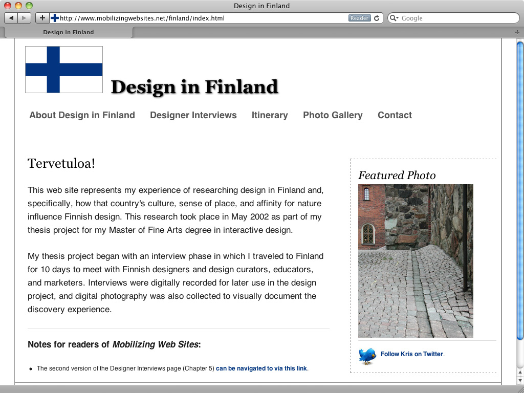
But if you are considering mobile-optimising – I like to call it mobilising – a website that uses CSS for layout, positioning, and styling, and HTML for content markup, you have already set the stage for a layout that can adapt to mobile devices and contexts.
And perhaps surprisingly, you have done this even if you used a fixed-width CSS layout. That’s right, even a fixed-width layout isn’t really fixed in the sense that it can never change or be responsive. It’s merely fixed for a certain set of conditions.

A fixed-width CSS framework does its work by doing two things:
- It defines a systematic way of organising the two-dimensional space of the screen, which is a fancy way of saying that it specifies units and measures for a grid.
- It defines a nomenclature, or system of names, that can be used as CSS classes and IDs for consistently and (as much as the web allows) predictably presenting a website’s content within its grid-based layout system. These are the class and ID names that are referenced in the HTML markup, on the content side of the house.
But all you need to do to start mobilising a fixed-width site is specify new units and measures for the existing HTML elements in your website that you want to optimise for mobile presentation. This approach can then be applied incrementally across various aspects of your design: layout, navigation, typography, images, and forms.
And as you start adjusting different facets of your site incrementally, you rediscover just how malleable and responsive web content can be.

Learning from incremental mobile improvements
I also contend that after you become familiar with mobile constraints, techniques, and opportunities, and apply them to an existing site, you are better positioned to learn and do much more. Then you can have your site evaluated by users, rethink your content more comprehensively for mobile presentation and contexts, and make the most informed decisions you can about making continued improvements. At that point, a more comprehensive mobile first redesign might no seem so daunting; it will feel like the right thing to do.
More importantly, it will feel like the right time to do it, too.
If you begin with user experience, layout, navigation, it can teach you a lot about the mobile context in which you will be redesigning. Learning responsive approaches to good mobile presentation helps you to see your content in a completely new context. It allows you to take these initial results of your mobilisation efforts and ask your colleagues and visitors for feedback.
Another way to look at this is, it’s a lot like packing for a trip and putting everything into a carry-on to bring on a flight so that you don’t need to check any luggage. But you don't really know how much you can bring, and how to scale your range of needs across the small volume that you have, until you really understand the size of that space and can test how your things fit into the limitations of that carry-on luggage.
Similarly, if you take some time to incrementally design a mobile version of an existing site, you can actually see how its web belongings fit into a mobile context. Which you can imagine could lead to all kinds of additional but important work: an inventory of your content, a review of your brand expression, and a re-evaluation of the entire purpose of your website. Truly, the metaphor of packing a carry-on bag is completely on target. The soul-searching that results from an initial mobile design gives you the increased appreciation of both your mobile constraints as well as the purpose of your journey.
So whether it’s iteratively adding additional responsiveness to an existing site via media queries and CSS, creating a mobile version using PHP that users can opt in and out of, or creating a separate mobile web experience with a mobile framework like jQuery Mobile, I say that it’s time to give mobile a try. The vast majority of the web is still not ready to be browsed on mobile devices. Isn’t it time that you do your part and help make more of it accessible to people on-the-go?
It’s time to start prioritising those web belongings and packing that carry-on accordingly!
Kristofer Layon's book Mobilizing Web Sites: Strategies for Mobile Web Implementation comes out 26 December.

The Creative Bloq team is made up of a group of art and design enthusiasts, and has changed and evolved since Creative Bloq began back in 2012. The current website team consists of eight full-time members of staff: Editor Georgia Coggan, Deputy Editor Rosie Hilder, Ecommerce Editor Beren Neale, Senior News Editor Daniel Piper, Editor, Digital Art and 3D Ian Dean, Tech Reviews Editor Erlingur Einarsson, Ecommerce Writer Beth Nicholls and Staff Writer Natalie Fear, as well as a roster of freelancers from around the world. The ImagineFX magazine team also pitch in, ensuring that content from leading digital art publication ImagineFX is represented on Creative Bloq.
