The top 25 movie posters of all time
We celebrate the most inspiring and memorable movie posters of all time. Is your favourite on the list?
09. Blade Runner
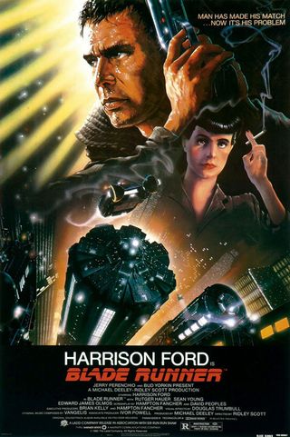
If Star Wars turned every kid into a sci-fi fan, Blade Runner did the same for the thinking man and woman – especially those with a keen eye for design. With a sequel scheduled for later this year, the original is still celebrated for its striking, futuristic cityscapes, and this stunning creation by poster maestro John Alvin certainly reflects the visual feast on offer. The strongly coloured images seem to jump out of the print, and evoke the film's themes of danger, darkness and destiny.
10. Attack of the 50 Foot Woman
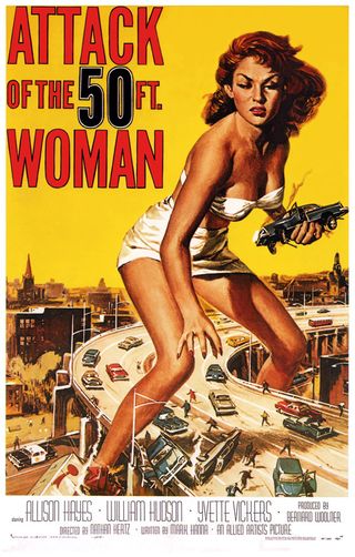
The 1950s saw Hollywood in a bit of a tizz. TV was conquering America. Cinema-goers were turning their backs on the silver screen to stay at home and watch the gogglebox. The studios fought back with sprawling, expensive epics for the picture houses on one hand, and sensational B movies for drive-ins on the other.
Every B movie needed a suitably lurid poster, and the go-to designer was Reynold Brown. And this one piece of art stands head and shoulders over the rest. Attack of the 50 Foot Woman instantly became a cult favourite. Unlike most Brown posters, this wasn’t a woman running away from a monster wearing next to nothing – the woman was the monster (albeit still wearing next to nothing).
Designer view:
Anthony Dry, illustrator and designer: "A seemingly lost art form that has been imitated but never bettered, the style of the 1950s sci-fi and horror boom goes unmatched. The 50-foot woman piece – while cheesy by today's horror standards – is a masterpiece of bold composition.
"It's strong and defined, using Allison Hayes' beauty as the spine of the picture. Your eye follows her figure down to the chaos below, while the striking mustard sky concentrates the action. It's a real shame we don't see similar illustrations these days, with only the paintings of Drew Struzan holding their own against the photographic designs of today."
11. Batman
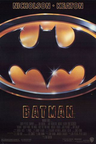
Creative agency B.D. Fox Independent had already worked with Tim Burton on the poster for Beetlejuice, a typically gaudy, if surreal, 1980s one-sheet. Its approach to the director's first Batman film had to be decidedly different.
Ever since Adam West had pulled on the pointy-eared cowl in the 1960s, Batman had become a bit of a joke. Yes, hardcore comic fans knew the dark side of the Dark Knight, but your average Joe immediately thought of comedy camera angles and slapstick 'kapows'.
Get the Creative Bloq Newsletter
Daily design news, reviews, how-tos and more, as picked by the editors.
The sight of Michael Keaton in his buffed-up batsuit may have prompted even more Joker-like guffaws, so B.D. Fox went back to basics. The bat-emblem was unmistakable and yet somehow wasn’t the comfy, fabric patch of the past. It was weightier, hard-edged and confident. Criminals needed to be on their guard.
Designer view:
Rob Redman, freelance 3D artist: "This movie poster harked back to the cheesiest of 60s Batman but added a subtle new twist to the design, with a more aggressive set of curves and a more menacing silhouette.
"The bat sign has been redesigned many times since and, although more fitting for current trends, even the latest incarnation doesn't imbue viewers with quite such a feeling as the stark black and yellow. This symbol has – more than any other – become an icon; instantly recognisable by anybody, anywhere."
12. The Usual Suspects
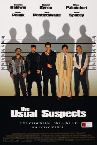
There was nothing usual about the poster for the Usual Suspects. Usually the ideas come from the marketing team. Usually it is commissioned while the film is at least still being shot. Usually it isn’t an integral part of the film's origins. None of that applied in this case.
Following the success of Bryan Singer’s debut film, actor Kevin Spacey approached the director. The Hollywood star loved what he did and wanted to work with him. So Singer set about coming up with an appropriate story.
The first idea that popped into his head was the poster. Five men on a police line-up. The story flowed from that image. Who were these men? What links them? What happens next? After the film was finally shot, there was no doubt the poster would follow Singer’s original idea: five criminals, one line-up, no coincidence.
Designer view:
Joe Tuckwell, design director of MoreSoda: "The line-up image sets the tone for the film perfectly and, unusually, was a visual idea the director had even before they'd begun the movie. Rather than simply highlight the lead roles it kicks off the story and starts you thinking: five guys in a line-up but what's the connection? The poster is so effective that it has taken an already iconic image and made it its own."
13. Gone with the Wind
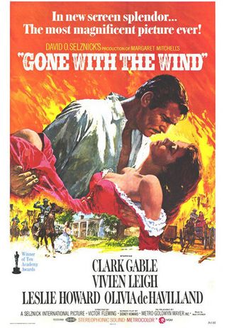
As in all things in life, first impressions count, but sometimes you get a second chance to make an impact. While the original poster for Gone with the Wind (a conventional shot of Clark Gable and Vivien Leigh enjoying a romantic clinch) was pleasant enough, it was the poster that accompanied the 1966 re-release that went down in cinematic history.
The passionate pose was conceived by freelance art director Tom Jung and realised by painter Howard Terpning, better known for his paintings of Native Americans. Before too long, the design was being aped here, there and everywhere.
Designer's view:
Shane S. Mielke, designer and creative director: "The Gone with the Wind poster has that iconic, old Hollywood painted artwork style from the 30s. It visually focuses on a large-scale Rhett Butler and Scarlett O'Hara engulfed in flames and passionately rising out of miniature scenes of action below. The colours and backdrop of fire are iconic to both the story of the main characters' relationship and the chaos of the story, making it memorable and immediately recognisable to anyone who has seen the movie."
14. Forbidden Planet
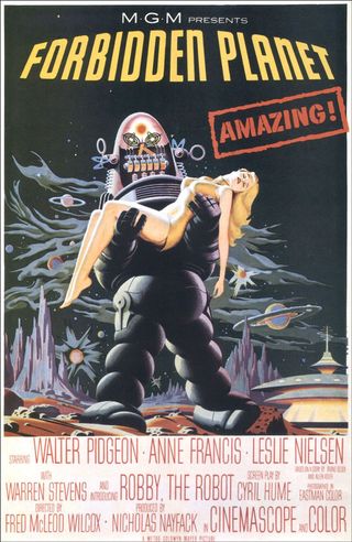
There was no mistaking the star of Fred M. Wilcox's sci-fi spectacular. The seven-foot tall form of Robbie the Robot strides across an alien landscape, a prone girl draped across its malevolent arms. The poster, a product of an anonymous MGM artist, was duplicated around the world, complete with the bold, red flash reminding you that all of this is rather amazing (duplicacted across languages: 'Suprenant!', 'Verrassend!', 'Asombroso!').
Despite the fact that it bears very little resemblance to the movie's actual storyline, this poster spawned a thousand B movie clones.
Designer view:
Lee Binding, illustrator and photographer: "The poster is beautiful hyperbole, created around the same time when creatures from Black Lagoons were lusting after bikinied babes; the woman in Robbie the Robot’s arms bears no resemblance to star Anne Francis whatsoever, and Robbie himself is one of the most benevolent characters in film history, so the poster doesn’t even slightly sell the film’s plot.
"The film’s real monster, the Id, is suspicious in its absence, but as the robot was one of the most expensive props created for a film, it's easy to see why it was the film's sell; to the point where Robbie is treated as a full cast member and gets a credit.
"I love this art because it is simply the best of the innumerable prone woman/monster posters; oversaturated colouring with gorgeous work on the highlights. The smooth curves of the woman – whoever she is – and Robbie become almost geometric. And it instantly tells a story, albeit not the one you're about to see!"
15. The Exorcist
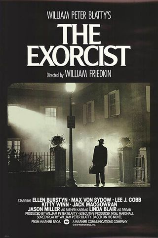
When it came to designing the poster for The Exorcist, Bill Gold’s brief made one thing very clear: he was not to use an image of the possessed girl from the film. In fact, there were to be no religious connotations at all.
At first, Gold’s team shot some original photos. The girl (unpossessed) lying on the bed, the girl smiling, a door opened just a crack to suggest that something nasty was lurking on the other side. However, they were all rejected out of hand, so Gold went to the box of stills provided by the studio.
The first picture he picked out was the image of the priest arriving for the exorcism with his briefcase in hand. He knew he’d struck gold. "When you looked at this still," Gold told sabotagetimes.com in 2011, "you knew somehow that whatever is about to happen inside that house is not going to be good!"
Working with colleague Dick Knipe, Gold adapted the image, taking out detail to highlight the lone figure. "After that no-one wanted to see anything else."
Designer view:
Mark Plastow, web designer and illustrator: “Through flawless composition, we are given subtle semiotic clues about The Exorcist. The evocative use of extreme contrast between light and dark not only recalls the American noir tradition, but that of film language itself. The mood of pervading dread serves as an indicator to treatment of the film's themes, the battle between light and dark.
"The suburban street furniture, its mundane nature juxtaposed against this pervading mood, becomes an unsettling gloomy recess, encroaching slowly outwards. Something grotesque occurring in a seemingly normal environment.
"The titular character appears hesitant and trapped in a shaft of light from Regan's room. His old fashioned, world-weary silhouette clearly belonging to an earlier age. You just know it's not going to go well for him."
16. Anatomy of a Murder
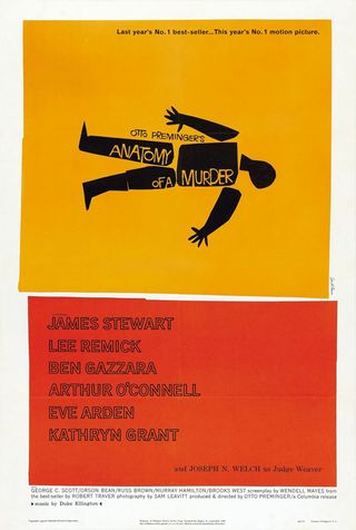
When it came to poster design, Saul Bass’ philosophy was simple: "symbolise and summarise". Never is this clearer than in Anatomy of a Murder. The corpse, split into seven pieces, lies stark against an orange background. Simple but stunning, it’s little wonder why Bass' posters have been often imitated, but never bettered.
In fact, when the poster for Spike Lee’s Clockers came out in 1995, those in the know immediately got the reference. But Bass himself wasn’t so impressed. ''It's flattering that someone would look back and say it's terrific,” he told Entertainment Weekly. “But I'm also puzzled. Do these people have such paucity of imagination (and the chutzpah) that they would do this and think it would remain undetected?"
The poster’s designer, Art Simms claimed it was homage, but Bass wasn’t convinced, saying: "The convention is when anyone steals something, they call it an homage."
Designer view:
James Hines, freelance illustrator: "One could simply say that the poster for Anatomy of a Murder can be regarded as iconic because it is the work of Saul Bass and leave it at that.
"He was a master at creating iconic imagery and any of the posters that Bass created could have been included in this list. His work with filmmaker Otto Preminger remains peerless and the designs for Anatomy of a Murder are arguably his best.
"Bass' talent was his ability to distil the essence of a film down to extremely simple elements, and to apply these elements across a whole campaign with subtle variation and a great deal of flair and imagination.
"Bass' work has not gained iconic status over time: his designs were iconic the day he made them. He helped define the look of the era, his work became synonymous with the jazz sound of the time and further testament to his genius is that his designs for movies are often far more widely known than the films themselves."
Click to the next page for 9 more awesome movie posters

Thank you for reading 5 articles this month* Join now for unlimited access
Enjoy your first month for just £1 / $1 / €1
*Read 5 free articles per month without a subscription

Join now for unlimited access
Try first month for just £1 / $1 / €1
The Creative Bloq team is made up of a group of design fans, and has changed and evolved since Creative Bloq began back in 2012. The current website team consists of eight full-time members of staff: Editor Georgia Coggan, Deputy Editor Rosie Hilder, Ecommerce Editor Beren Neale, Senior News Editor Daniel Piper, Editor, Digital Art and 3D Ian Dean, Tech Reviews Editor Erlingur Einarsson and Ecommerce Writer Beth Nicholls and Staff Writer Natalie Fear, as well as a roster of freelancers from around the world. The 3D World and ImagineFX magazine teams also pitch in, ensuring that content from 3D World and ImagineFX is represented on Creative Bloq.
