The top 25 movie posters of all time
We celebrate the most inspiring and memorable movie posters of all time. Is your favourite on the list?
17. Silence of the Lambs
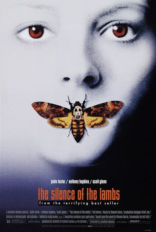
The iconic image of Jodie Foster staring out of the Silence of the Lambs with a moth covering her mouth is a favourite for both critics and fans. But have you ever noticed the other work of art hidden in the poster?
The skull on the back of the Death’s Head moth is a reproduction of Salvador Dali In Voluptas Mors, a 1951 photograph by Philippe Halsman, itself based on Dali’s own Female Bodies as a Skull. The image, in which seven naked females contort themselves into the shape of the skull, was reportedly given to design agency Dazu by the film’s director Jonathan Demme.
Designer view:
Sam Green, illustrator: “The Silence of the Lambs poster is an instantly recognisable classic that transports you directly to the all-too-familiar iconic scenes that are now embedded in the horror genre's hall of fame.
"The ghostly cold appearance of Jodie Foster's face floods the frame, with her blood-red eyes vacantly staring directly at the viewer, there is a strong sense of vulnerability in her presence and a numbed paralysis, almost suggestive of rigor mortis. The tension in the image is created by the enigmatic placement of the moth on her mouth, seemingly rendering her mute.
"The moth, for me, has strong connotations of masculinity as an oppressive and deviant force, and the skull image on the moth's back is an important symbol that ties it altogether, enhancing the morbid tone. There are nuances of violence and horror wrapped up in gothic beauty, resulting in a tastefully executed poster that stimulates our imaginations with chilling effect."
18. Pulp Fiction
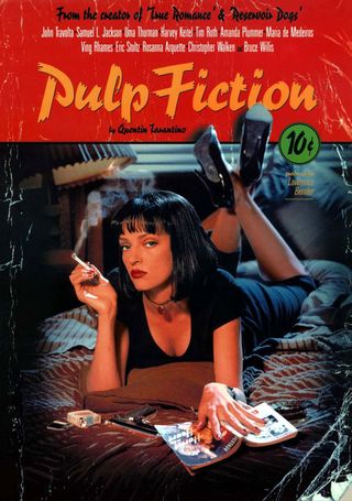
The poster for Quentin Tarantino’s follow up to Reservoir Dogs screams sleaze. The femme fatale fixing you with her cold eyes, the cigarette, the gun. Then there are the trappings of the cheap and nasty paperbacks of the past: the magazine masthead, the 10-cent price tag, the creases. Pulp Fiction is a throwback to the hardboiled noir of the past and yet still feels dangerously contemporary.
The brainchild of James Verdesoto, then-creative director of Miramax's in-house design team, the poster soon graced millions of students' walls around the world. "The Pulp Fiction poster has been hailed by many, actually, as one of the best posters of past 20 years," Verdesoto told Fox News. "But that's for others to decide, not for me. I'm certainly appreciative when people appreciate my work."
Get the Creative Bloq Newsletter
Daily design news, reviews, how-tos and more, as picked by the editors.
Designer view:
Henry Hargreaves, pro photographer: "Pulp Fiction is the definitive movie poster for me. When I was about 13 I brought this poster from my local record store without even knowing a thing about the movie (and it wasn't cheap!).
"I grew up in New Zealand and we were about a year behind the US in film releases, so for over a year I had fantasies about what this film was about. I knew it had a hot brunette who sits on her bed reading paperback with a gun, so it had to be cool.
"But the true test of a great movie poster was how it transcended trends. It stayed up on my wall long after seeing the film, leaving home and was eventually only taken down last year when my parents sold the house."
19. Metropolis
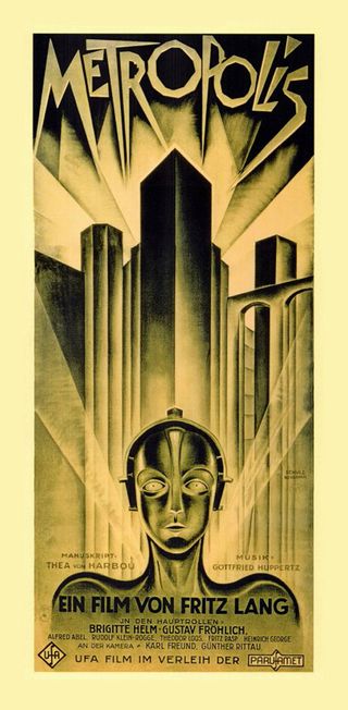
Heinz Schulz-Neudamm's striking artwork became a record-breaker when it was purchased in 2005 for £398,000, making it the most expensive poster in the world. Only four copies of Schulz-Neudamm’s poster are known to exist, and it has been described by collectors as the 'crown jewel of the poster world'. This Art Deco-inspired movie poster was created for the Berlin premiere of Fritz Lang's seminal science-fiction production.
Designer's view:
Dale Halvorsen, aka Joey Hi-Fi: "I first encountered this iconic design in a book of classic movie posters. I was then a wide-eyed first year graphic design student. I had at that stage not seen the film, but the poster for Lang's gothic futurist masterpiece was so compelling I was determined to find a copy of the film to watch! That experience still influences my work today.
"Sleek, powerful and machine-like, the illustration and the distinctive bespoke typography capture the tone of the film perfectly. I admire posters and book covers where the illustration and typography combine to form a striking and cohesive unit. And the Metropolis poster is a prime example. The way the geometric shapes of the city and typography contrast with the flowing lines of the female robot, and the use of a limited colour palette of sepia tones and black all add to the poster's unique appeal."
20. Clockwork Orange
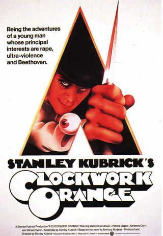
As with Jaws, the image we now associate with Stanley Kubrick's A Clockwork Orange wasn’t the first past the gate. Poster veteran Bill Gold had been creating winning compositions since 1942's Casablanca, but after six months of sketching had drawn a blank for Kubrick's dystopian fantasy.
Eventually he teamed up with Ivan Punchatz to create a stark image of the film’s lead character Alex DeLarge crucified on a computerised cross. Kubrick still wasn’t convinced.
"We submitted it to Kubrick and he didn't like it," Gold told the New York Times in 2010. "He's very tough, very exacting. He knows exactly what he wants. I guess it was too scientific looking. He wanted more of a flesh-and-blood violence look." Gold's final design placed Alex at the centre and is dotted with eyes, hinting at the extreme therapy the character will endure in the film.
Designer view:
Jeremy Ville, artist, product designer, author: "I love the way the 'A' is incorporated into the design: just simple black, white and orange against a stark white background. This poster made a huge impact on me as a kid. It was the first piece of graphic design that opened my eyes and got me excited about having a career in this field.
"I still remember that day I first saw it, and the feelings it evoked in me. The bespoke font with drop shadow also makes this poster extremely successful. To me it's one of the most memorable movie posters of all time."
21. Vertigo
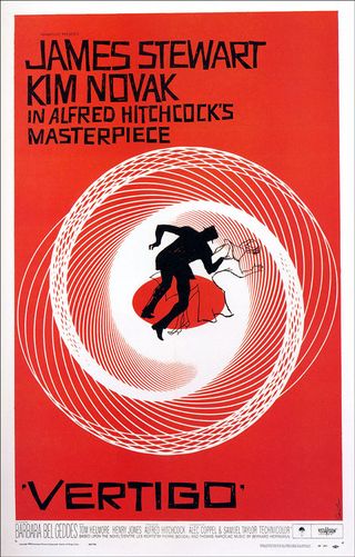
Saul Bass didn't just design the poster to Hitchcock’s 1958 masterpiece, he created the hypnotic and haunting opening sequence as well. A celebrated graphic designer long before he turned to films, Bass' unique style came to the fore with the poster campaign for Otto Preminger's The Man With the Golden Arm.
Vertigo is pure Bass. Stark, flat colours, off-kilter and jagged figures, hand-cut typography and of course those hypotrochoid curves familiar to any child who ever played with a spirograph. You can’t help but be pulled in towards the poor figure who is stumbling at the heart of this movie poster.
Over 50 years later, Bass' design seems as contemporary as ever. "Before I ever met him, before we worked together, he was a legend in my eyes," said Martin Scorsese in 2011. "His designs, for film titles and company logos and record albums and posters, defined an era."
Designer view:
Jeremy Kool, 3D artist and graphic designer: "I've always loved the Vertigo poster. It's just a classic. The fact that the poster actually gives you the impression of dizziness and falling is a stroke of brilliance. The saturated colour really punches home the alarming tone of the film, as well as the roughened, handmade text that helps with the sense of tension.
"Just as with any great work of design, there is nothing superfluous about this movie poster. It's all there to drive home the point, and nothing goes to waste."
22. Star Wars
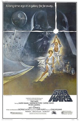
Tom Jung wasn’t 20th Century Fox’s first choice for Star Wars’ poster art. They wanted Frank Frazetta, the American artist best known for muscle-bound Conan the Barbarian book covers. That wasn’t to be, though, so Jung – the man responsible for the posters for Dr. Zhivago, animated Lord of the Rings and Papillon – was drafted in.
His brief was to deliver something suitably Frazetta-esque. Perhaps that’s why Luke Skywalker has abs that would make Arnie jealous or why Princess Leia is showing so much leg.
"We had a problem with Carrie Fisher," Jung admitted to Cinefantastique in 1997, "because they wanted to make Princess Leia more glamorous.” Jung persuaded his wife to pose in place of the young actress.
Designer view:
Mike Lane, web and graphic designer: "On a personal (and geeky) level, this poster was the first glimpse many of us had of this new universe and mythology back in 1977, and it was truly awe-inspiring. The imagery stirred the imagination like nothing I had previously seen.
"Prior to seeing the revolutionary film, the striking design conjured so many enticing questions in our young creative minds about who these people were and what this story was all about. For me, this painting and related art were a huge contributing factor to me becoming a designer in the first place. The influence of the original Star Wars and the visions of the artists realising the mythology inspired me at just the right place and time."
23. Jaws
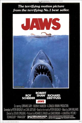
According to Tony Seiniger, the man behind the Jaws poster, there are two rules when it comes to creating an iconic movie poster. First of all, it needs to be different: “something nobody has seen before – that'll get it attention.” But that’s only the beginning.
The poster has to tell its story in mere seconds. After all, most people will be driving past it at 30 miles per hour. "That's the challenge, to try get two hours of entertainment down into a simple graphic you can read in three seconds," Seiniger explains.
He certainly rose to the challenge here, with the instantly recognisable image of the great white rising from the depths to snack on a bathing beauty. Not that the final image came easily – Seiniger’s agency spent six months perfecting the poster.
“No matter what we did, it didn’t look scary enough,” he told USA Today in 2003. The problem was that no matter how they were drawn, the sharks ended up looking more like friendly dolphins. Then, in a stroke of genius, Seiniger realised where they had been going wrong. “You had to actually go underneath the shark so you could see his teeth.”
Designer view:
Brendan Dawes, MoMA-exhibited artist, designer, author and maker: "I love how the shark is so large compared to the swimmer, almost to a cartoon-like level, but there's certainly no humour here. This is a terrifying image, with the shark almost looking like the top of a blade or a missile on an unstoppable mission to seek and destroy. The whole thing is beautifully composed including the hand-drawn, now iconic type with the little fish-hook of the 'J'."
24. Alien
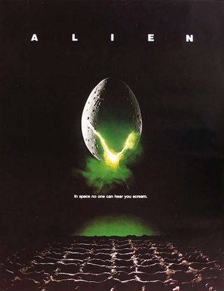
"In space," copywriter Barbara Gips wrote, "no one can hear you scream." Even after all this time, the slightest glance at the Alien poster makes you uneasy. The uncanny yellow light spilling through the crack of the central egg immediately warns you that the contents aren’t going to be cute and cuddly.
Of course, the egg itself bears no resemblance to the face-hugger egg from the film. Early effect tests were made using regular hen eggs, some shots even finding their way into the original teaser trailer. This lead to design agency Bemis Balkind smearing modeling clay onto a hen’s egg to create the poster. A staple of the breakfast table became the stuff of nightmares.
Designer view:
Jamie Gwilliam, 3D designer: "The dark and cold simplicity of this poster remains elegantly terrorising. Personally I feel movie plots can often be given away in current poster designs. This clever design, however, only hints at the toxic horror that will unfold.
"This poster stands the test of time, encompasses everything a movie poster should aim for, of course helped by the strap line, which is iconic in its own right. The egg poster remains recognisable after 30-plus years, and will continue to be because of the confidence in its minimalistic layout."
25. Ghostbusters
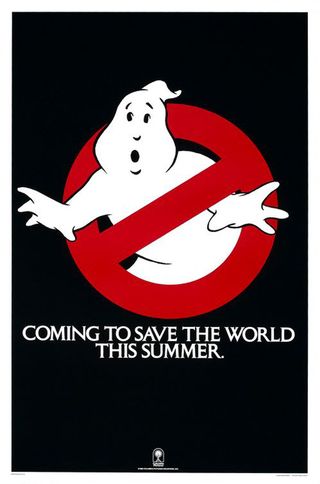
Today it would be known as viral marketing. In 1984 a poster started to appear. It was a cartoon ghost caught in a red ‘restricted’ circle. There was no title, no list of stars, no director’s credit. There wasn’t even a release date. All we were told was that someone was 'coming to save the world this summer.'
We had no idea who they were, or why the world needed saving in the first place. It was the poster that put the tease into teaser. The title, cast list and credits came later, but by then the poor trapped spook had been burnt into everyone's consciousness and has remained there ever since.
But who was behind the design of the logo itself? It was a mystery for years until the release of the movie on Blu-ray in 2009. "The no-Ghost logo was in Danny Ackroyd’s first script," art director John DeCuir admitted. "I take credit as having art directed and designed the original logo but I did not conceive it."
Designer view:
James Hilton, chief creative officer, AKQA: "Just to clarify; this is about the most iconic poster, not film. It’s important to stress that point, so that when people are sitting around discussing history’s most iconic films – 2001, Clockwork Orange, Vertigo and so on, they don’t hold me up as the guy who thought the pinnacle of cinema was Ghostbusters. But it is the most iconic movie poster. Show that logo to anyone over the age of say, 28, and they’ll tell you what it is.
"For me, it holds particular significance: when the film came out, I wanted to be a Ghostbuster. So much so that I started making Ghostbuster badges for myself. Classmates saw them, and asked if I could manufacture more.
"Once the unit price of 50p had been agreed upon, I got to work. I could rattle out 10 a night – full colour, laminated, with pin. My business empire came to abrupt halt, though, when a parent contacted the school to enquire where her child’s lunch money was going. Who you gonna call? The deputy head, as it turns out."
Related posts:

Thank you for reading 5 articles this month* Join now for unlimited access
Enjoy your first month for just £1 / $1 / €1
*Read 5 free articles per month without a subscription

Join now for unlimited access
Try first month for just £1 / $1 / €1
The Creative Bloq team is made up of a group of design fans, and has changed and evolved since Creative Bloq began back in 2012. The current website team consists of eight full-time members of staff: Editor Georgia Coggan, Deputy Editor Rosie Hilder, Ecommerce Editor Beren Neale, Senior News Editor Daniel Piper, Editor, Digital Art and 3D Ian Dean, Tech Reviews Editor Erlingur Einarsson and Ecommerce Writer Beth Nicholls and Staff Writer Natalie Fear, as well as a roster of freelancers from around the world. The 3D World and ImagineFX magazine teams also pitch in, ensuring that content from 3D World and ImagineFX is represented on Creative Bloq.
