How to create a Blade Runner-inspired poster
Journey to Los Angeles 2019 with this image that combines character art with the city's neo-noir architecture from the iconic film.
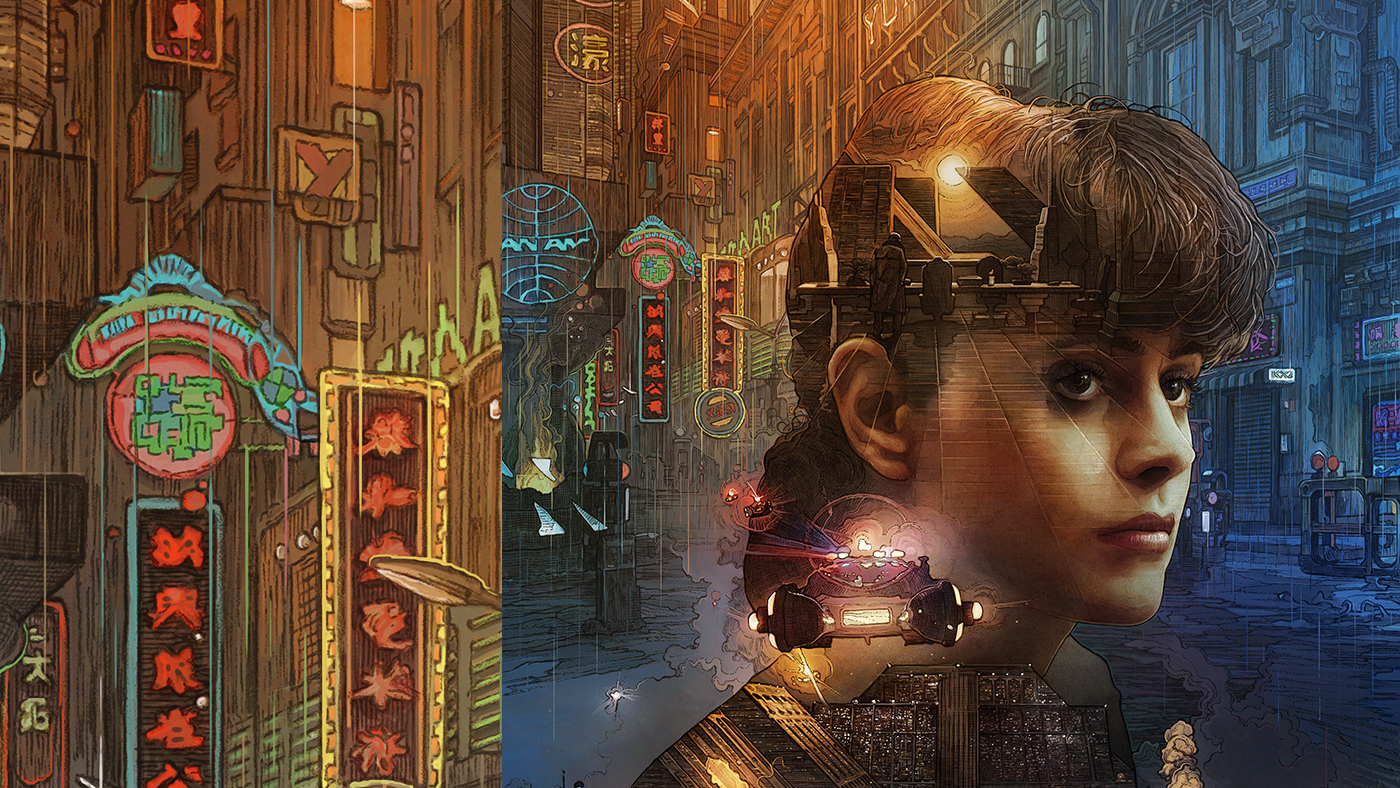
The ImagineFX team got in touch with me to create the cover image for their film art issue. Their interest was piqued by my fan art piece for the video game The Last of Us, and the series of artworks I created for The Witcher 3 limited edition steelbooks. I was asked to paint a piece of art based on the 1982 science fiction film Blade Runner, by focusing on the character of Rachael and then incorporating futuristic architecture from the film, just like I did with Ellie from Naughty Dog’s game. This workshop will take you through my creative process.
I’ll start by explaining my approach to the concept stage, where one needs to focus on defining the idea for the artwork and the general composition. Later on I’ll explain how to find the right tone for the artwork by choosing the best reference photographs and colour scheme.
I’ll then reveal how the concept becomes a high-resolution illustration. This part will include tablet sketching, a lot of pen and pencil drawings and some intense colouring. The final stage will involve drawing tweaks, and adding final effects and enhancement layers.
Article continues belowI encourage you to create the image at a large enough size so that you’re able to print it out for displaying as wall art. I imagine this sort of image looks best when it’s printed quite large.
01. Visualising the brief
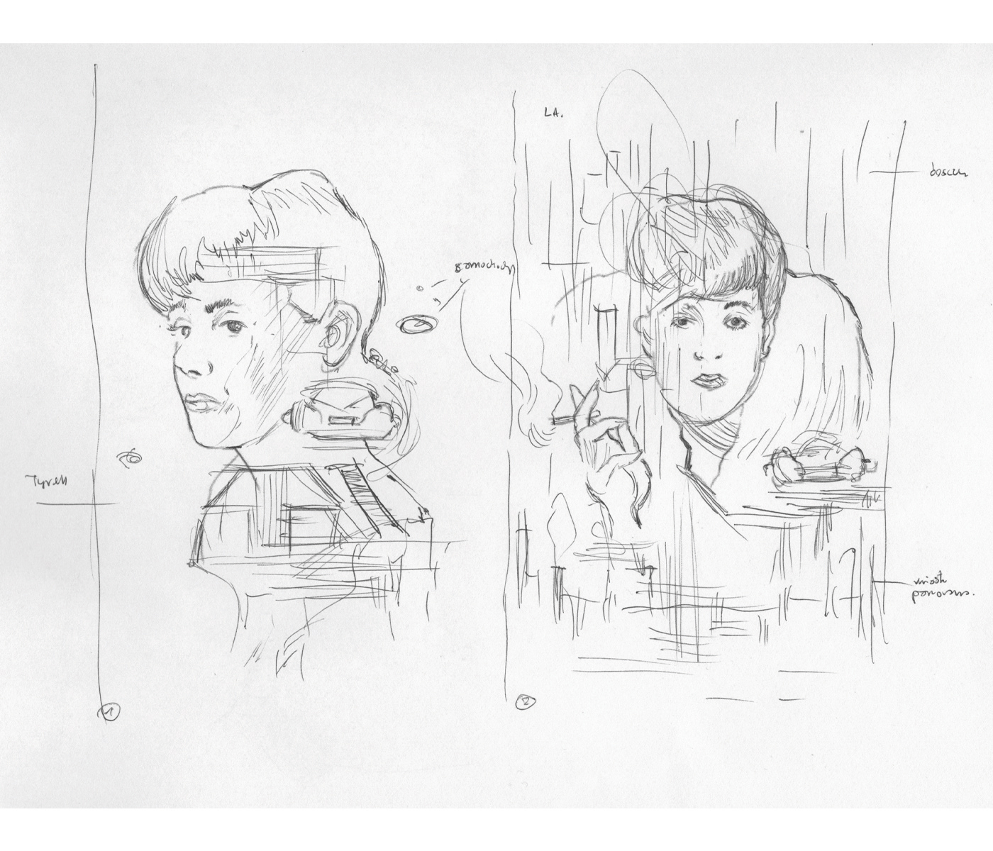
I start with a super quick sketch on paper. I visualise only two ideas, because the brief from ImagineFX is quite specific. I’m asked to focus on the character of Rachael, but then think of ways to bring in the neo-noir environment of Los Angeles into the illustration, which is almost like another character in Ridley Scott’s film. I go with the first sketch, and decide to flip it horizontally.
02. Reference images
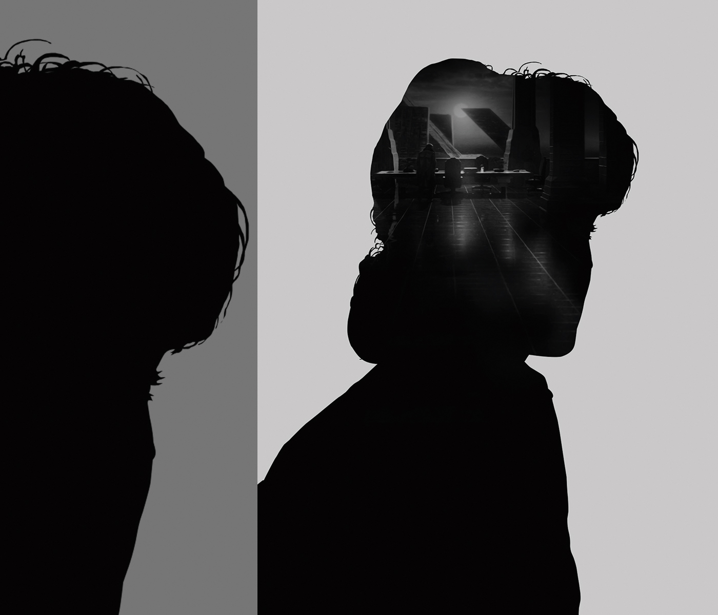
Searching online, I find a few portraits of Rachael, some shots of the iconic Tyrell building , the flying police car and the futuristic LA panorama. I try to keep sides of the image empty for now and I put Rachael in the middle. I make a selection of her and start to incorporate various photos onto her using Hard Light and Screen layer modes. I like how Tyrell building’s interior works with her hair and top part of the face, especially how the floor lines “cut” across her face, creating a sort of architectural sketch.
03. Strengthening the composition
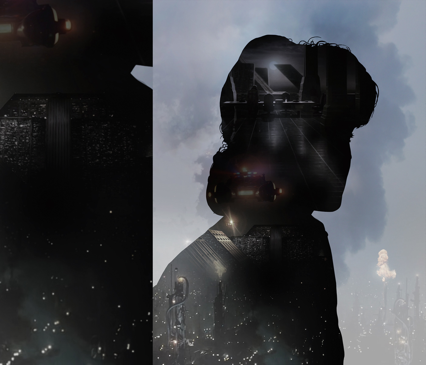
I add the city panorama at the bottom of the image, which makes the composition ‘heavier’, while I like how the lights of the flying police car reflect on to Rachael. I cover up her chest by adding an exterior view of the Tyrell building: doing this makes the structure look as if it’s looming menacingly on the horizon.
Sign up to Creative Bloq's daily newsletter, which brings you the latest news and inspiration from the worlds of art, design and technology.
04. Making final touches to the concept
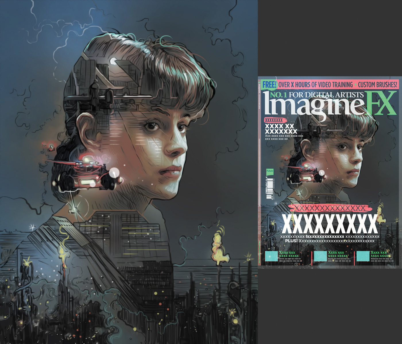
I add smoke textures to the image using Screen and Soft Light layer modes on the edges of the image. I use the Gradient Tool and masks when necessary. This helps to make the composition more coherent, while at the same time placing the main focus on Rachael. Once I’m happy with how the concept looks I sketch on top of it to bring out the details, and then send it to the ImagineFX team for their comments and approval.
05. Implementing the revision requests
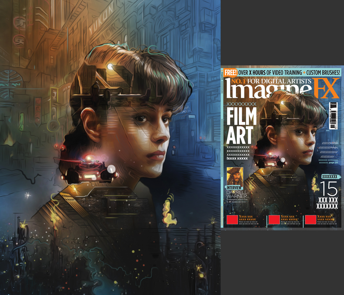
I lower the police car and move the portrait to the right. ImagineFX suggests I should add more city lights, so I find a good reference from a Blade Runner image. I distort the image’s perspective so than all the vertical lines are straight, and then modify it with neon lights. I apply blue and orange gradients to make the colours pop more, especially from the top.
06. Sketching over the concept
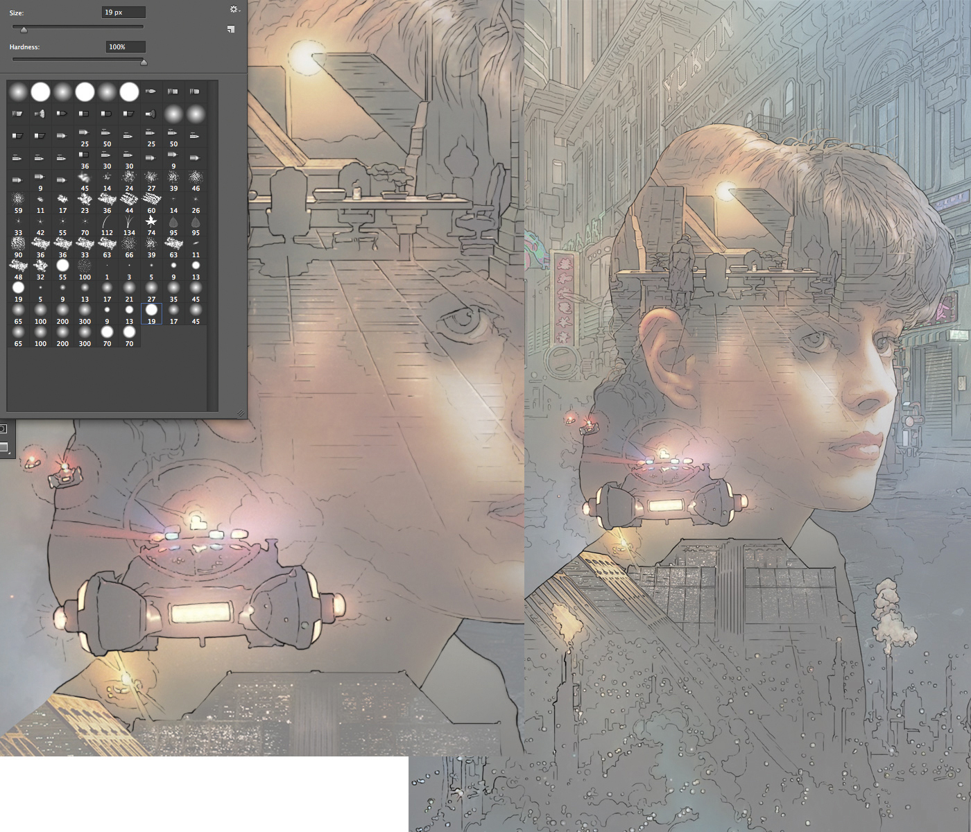
Once the concept is approved I add a plain white layer on top of the flat concept image at 40 to 50 per cent Opacity. I use a simple Round brush (2-3pt) to sketch each element of the image, focusing on the head while keeping the rest loose. I draw all the vertical and horizontal lines while holding Shift, which helps to tie together the image’s architectural structures.
07. Printing and drawing
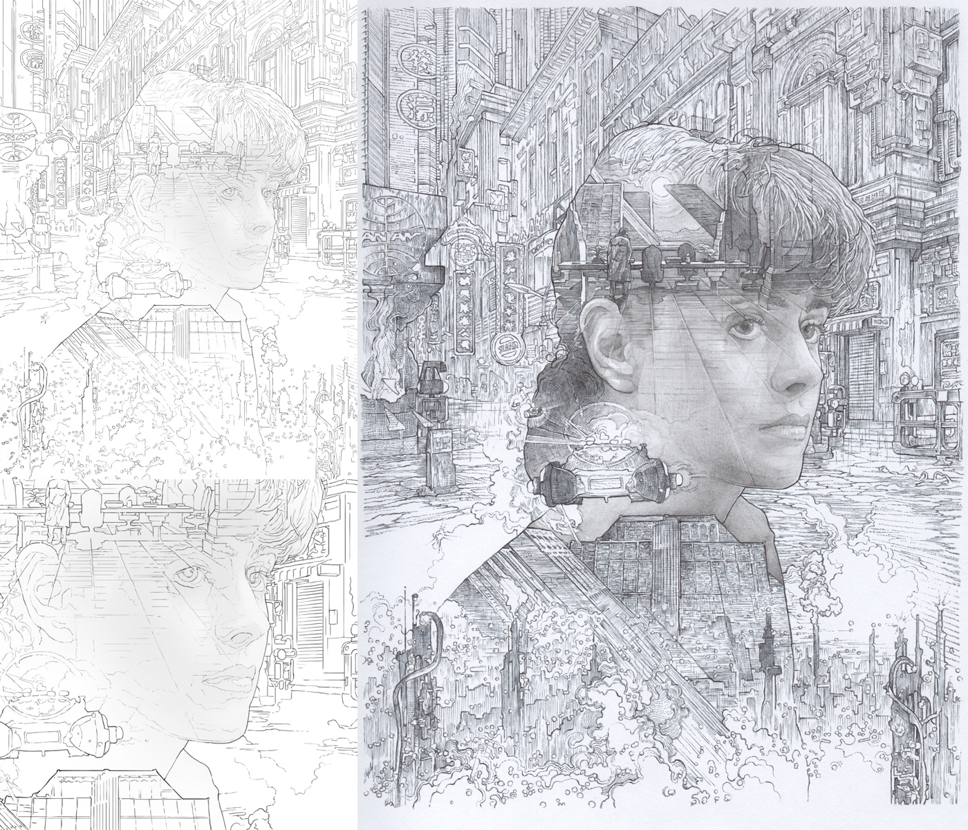
I print the finished concept, which has some barely visible shadow tones on Rachael’s face. The whole image fits on to a single sheet of A4 paper. I draw most of the illustration using a black ballpoint pen. For the face I use a 0.5B graphite mechanical pencil. I spend a lot of time adding subtle lines and making the drawing as detailed as possible.
08. Applying the drawing layer
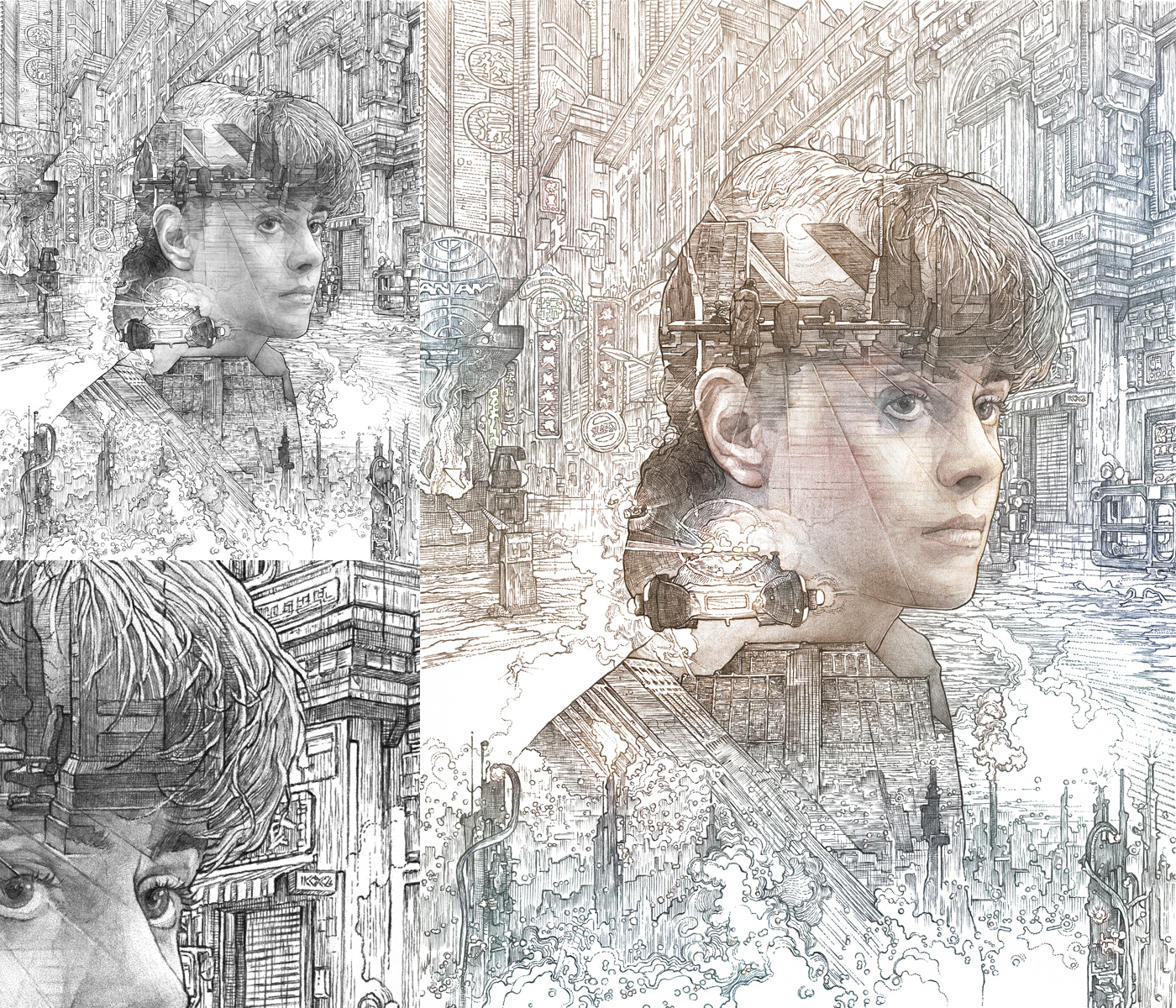
I scan the finished drawing at 400dpi, then use Levels to enhance the whites, greys and blacks. I place the Grayscale drawing layer on to the concept and match it with my sketch. Using Select>Color Range I apply various Colorize Hues onto the drawing: red, yellow, blue and so on. I make the top background drawing lighter and change the layer mode to Multiply.
09. Adjusting the source material
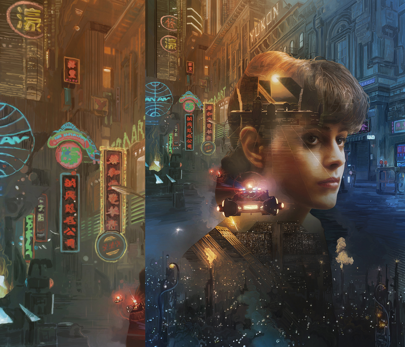
I use the Gradient tool to lighten the dark areas, then select a soft Round brush (2-8pt) to colour the various areas that are created by the drawing layer. I draw at various Opacities (30 to 90 per cent), covering up the low-resolution look of my photo references where necessary. I hold down Alt to quickly select nearby colours to maintain the smooth, painterly look, all the while regularly referring back to my drawing layer.
10. Enhancing the base colours
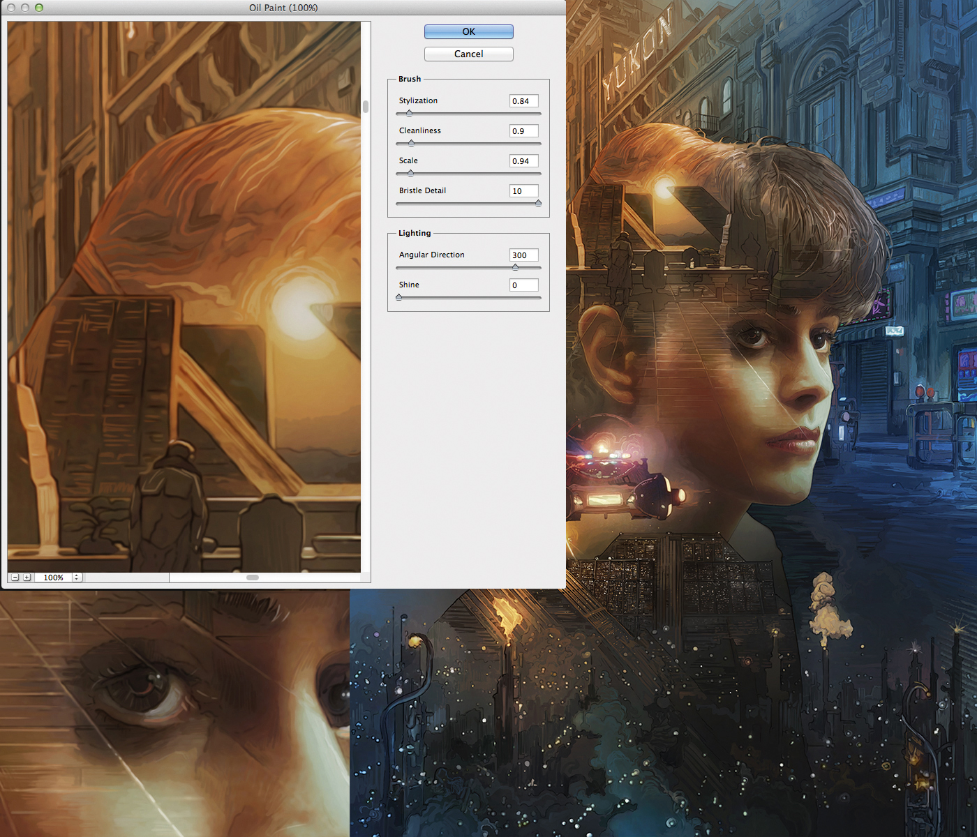
Next I press Cmd+J to duplicate my colour layers and set them at an Opacity of 60 per cent. This makes my painted colours look more solid. I then shift the sketch layer to the top and turn it to Soft Light layer mode. I erase the sketch from the face using a layer mask. Having done this I duplicate all the layers and merge them yet again, before applying Filter>Oil Paint on to the merged layer at 0 Shine.
11. Adding the effects to the colours
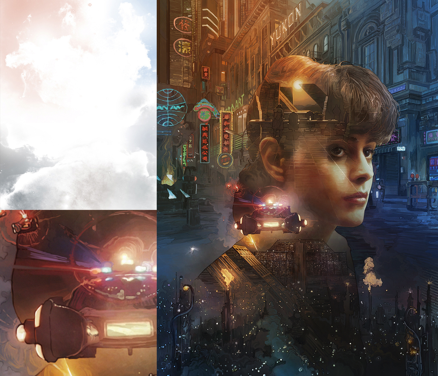
I use high-resolution textures to enrich the colour effects and Color Range to select areas that I want to enhance, before adding colour using the Gradient tool. I add a stars texture that fills the image and change it to Soft Light layer mode at 30 to 60 per cent Opacity. Finally, I duplicate and merge everything, then apply Filter> Noise>Add Noise (2.80) and reduce the Opacity to 70 per cent.
12. Further tweaks to the image
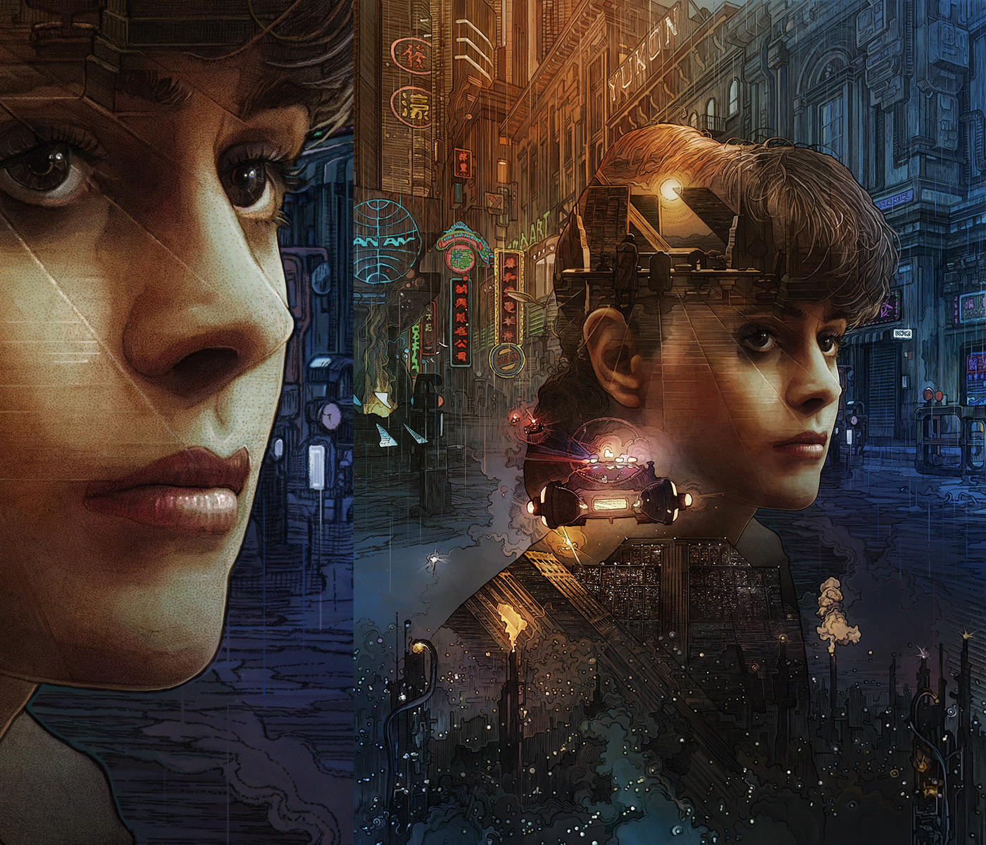
I create another layer above the colours and drawing, and use a Round brush (2-5pt, 90 to 100 per cent Opacity) to refine all the little details such as light reflections in Rachael’s eyes, strands of hair and her lips. I also fix any minor errors in the drawing by covering them up with colour. Then I add the visible rain drops by using Shift to create simple straight lines.
13. Finishing up
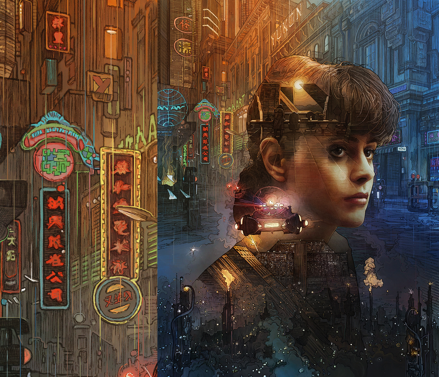
I select Rachael, invert the selection and lighten the background slightly. Then I increase the colour saturation so that the art will stand out on ImagineFX’s cover. Next I duplicate all the layers, merge them and apply the Oil Paint filter – just enough to tie everything together. I repeat the duplication, apply a High Pass filter at 1.4 pixel radius and set the layer mode to Overlay.
This article was originally published in ImagineFX magazine issue 142. Buy it here.
Related articles:
