10 top tips for multi-screen site development
Google's Matt Brocklehurst outlines ten considerations for creatives looking to upgrade their site.

With so much multi-screening going on, consumers' expectations of how websites work on smartphones is increasing. They don't want to pinch and slide the screen to view a site's content. And they don't want to struggle to get pages to load, when filling out a form or making a purchase on their mobile device. They want a site to "just work", whatever screen they happen to be on.
So how can businesses make their websites work across devices? Whether you opt for responsive web design, dynamic serving or entirely separate site builds for mobile and desktop, here are some guidelines for making the most of a mobile-ready site:
01. Be search-savvy
Make sure your site can be easily found on search engines as it will affect where your site appears in rankings. Optimise your search ads strategy with attention to mobile bidding. Design creative copy especially for mobile, as well as using the best suited mobile ad formats.
Article continues below02. Remember, speed is king
Smartphone users want information to load quickly. Speed is also taken into consideration for search rankings on Google, which means it's important for boosting organic hits. Avoid using heavy images and don't jam the homepage full of information. Instead streamline the experience for your user.
03. Know your audience
Use analytics tools to get an understanding of how your customers are accessing your site and where drop-off points occur. Then you can adapt your design and content accordingly.
04. Identify most needed functionality
For example, retailers may need the best functionality for store locators, shopping baskets and/or product search. Whatever the most important action is on your site make sure it works flawlessly and is front and centre.
05. Customise, don't cut
A smartphone user should be able to see the same content available on a tablet or desktop computer - not a slimmed down version. Content should be customised to ensure it is easily accessible and not overloaded onto the homepage.
Sign up to Creative Bloq's daily newsletter, which brings you the latest news and inspiration from the worlds of art, design and technology.
06. Facilitate moving between screens
Allow people to save content so they can revisit it on another device. For example, if users add to a wishlist or shopping basket on a smartphone, they should be able to go to back to it on a tablet or desktop. This will make it much easier for users to purchase.
07. Ensure sites are touch-friendly
The layout of the site should be suitable for mobile users so that everything is visible without needing to pinch and zoom-in on the screen.
08. Avoid mouse-overs
These work well on desktops but not on smartphones where people are using their thumbs.
09. Provide a click-to-call button
Smartphone users are obviously inclined to make calls, so it makes sense to provide a call button at particular drop-off points on a customer conversion journey. Make sure these are big and easy to click.
10. Simplify the checkout
One of the most important areas for ensuring customers make a purchase is the order form. It should be easy to use, as short as possible, include default inputs to save time and have good error design. The little things can make a big difference, for example, if a customer needs to input a phone number, then the number typepad should appear.
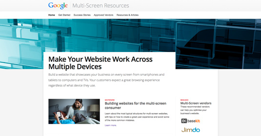
You can find more information on the best ways to build a site that works across devices as well as tips and tricks to improve your mobile site on the Google website.
Words: Matt Brocklehurst
Matt Brocklehurst works as product marketing manager, mobile advertising at Google.

The Creative Bloq team is made up of a group of art and design enthusiasts, and has changed and evolved since Creative Bloq began back in 2012. The current website team consists of eight full-time members of staff: Editor Georgia Coggan, Deputy Editor Rosie Hilder, Ecommerce Editor Beren Neale, Senior News Editor Daniel Piper, Editor, Digital Art and 3D Ian Dean, Tech Reviews Editor Erlingur Einarsson, Ecommerce Writer Beth Nicholls and Staff Writer Natalie Fear, as well as a roster of freelancers from around the world. The ImagineFX magazine team also pitch in, ensuring that content from leading digital art publication ImagineFX is represented on Creative Bloq.
