Minimal redesign for Rdio lets music be the star
The Rdio design team uses album artwork as its primary ingredient in this minimal and elegant redesign.
Social jukebox Rdio is an online music service, with over 20 million songs available at users disposal. In a need of refresh, the company's website design underwent a minimal and elegant makeover, which uses various album artwork in a new, eye-catching landing page. We spoke to visual design lead on the project Geoff Koops, UX designer Mike Towber and front end engineer Jason Norris to find out more...
What prompted the redesign?
Geoff Koops: Across Rdio's design and engineering efforts, there is a consistent desire for reduction and simplification - to improve our users' experience, to reduce maintenance and technical costs, to communicate beautifully and economically. So when we found the right window of time for this redesign project, that same approach was brought to bear on the website.
It felt like we could dramatically reduce and simplify our web marketing presence: fewer words, fewer pages, fewer image lock-ups of phones and tablets with screens. A less comprehensive, everything-but-the-kitchen-sink description of the product, less persuasion about the product, and a more direct way in.
Article continues below 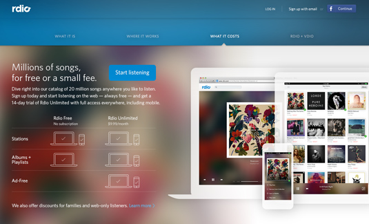
Additionally, Rdio.com simply needed a refresh. The previous version of the site was elegant and quite effective, and it had served us well for a couple years, but it was beginning to show its age, feeling out of sync with some major web and mobile product design updates that had been rolling out for months and with increasing frequency.
In addition to an outdated look-and-feel, the website actually contained some outdated information. There was enough content that it was burdensome, especially for a lean, mostly product-focused design team, to keep all the copy and product screens current. We wanted to strictly limit the amount of content in part so we wouldn't be bogged down with a lot of content maintenance down the line.
What was your design approach to the project?
GK: To us, a radically simple marketing website does the job in one page. And not one enormous long-scrolling, 20-minutes-to-read-it-all page. Rather, one short page (with some scrolling allowed) that got the necessary information across. We kept that as a practical guideline as we approached the project. But brevity in our approach wasn't just an arbitrary goal.
Rdio is its own best marketing site. It's free to sign up for and use, and we think users will be delighted once they start listening to and discovering music. We believe in the product passionately. So, getting people to spend a lot of time on the logged out pages of our site is, of course, not our goal - we want people to spend time in the product.
Sign up to Creative Bloq's daily newsletter, which brings you the latest news and inspiration from the worlds of art, design and technology.
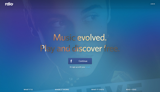
With that in mind, as we approached this project we wanted to simplify the proposition on the landing page. We prioritized creating a fast, obvious entry point into the app for visitors who'd already made up their mind - placing a big Facebook/email sign up option front and center - and eliminating less important calls to action and non-essential copy.
Rdio is its own best marketing site. We believe in the product passionately
Recognizing that there will be people who do need more information before making their decision, we provided a concise explanation of our subscription options and a couple "pillar" features, but concealed it just "below the fold" on page load no matter the visitor's browser window size.
In fact, we began to think more about redesigning the marketing site as simply redesigning the first screen of the product for users who haven't logged in yet - and, of course, we were optimizing for those visitors who have never logged in.
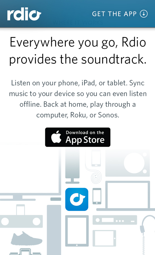
We wanted a website for logged out users and new visitors that felt like it belonged in the same design family, and was designed by the same hands as those that designed the Rdio app, while not borrowing so directly from the product design as to confuse visitors about where the boundaries were.
Through it all, a couple basic priorities anchored our explorations: providing persistent sign up access, and massively simplifying our messaging.
How did you come up with the concept for the landing page?
We knew the landing page needed to be a rich experience but not a lengthy, demanding, or even too immersive an experience, because while we wanted to capture attention, we didn't want to derail our new users.
At Rdio, we do our best to get out of the way and let the music be the star, and we try to make the experience of listening to and discovering music as delightful and elegant as possible. One way we try to accomplish those things is by treating the album artwork with a lot of respect, using it as the primary ingredient on our palette.
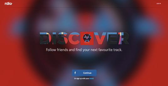
In exploring concepts for the landing page we, looked at options that involved playing embedded music or video, or creating original photography or bringing in existing music-oriented and lifestyle photography. Photos and video that depict the effects or lifestyle around music can be evocative and even moving, but they also run the risk of feeling a little manipulative and "advertising-y."
In the end, we chose the concept that most explicitly demonstrated that respect for album artwork and positioned albums as the key visual element in the various states of the page. For us, visually merging the music and the message was most true to the product and our culture at Rdio.
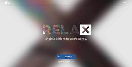
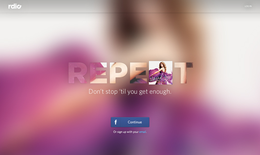
The album art becomes letters embedded in the four headline words in the animated opening sequence. And in the page’s resolved state, more album artwork is layered behind a semi-transparent Rdio blue color field, allowing a glimpse right through the knocked-out letters of the tagline ("Music evolved. Play and discover free") to the artwork underneath - a foreground/background play that nods to the endless stream of music that’s waiting inside Rdio.
What did you use to build the site?
Jason Norris: UX and visual design happened mostly in Illustrator and Photoshop, with the impromptu whiteboard or pencil sketches capturing spontaneous thoughts throughout. Motion and scrolling prototyping was done in After Effects and Keynote.
In terms of building the site, the previous marketing site had been a separate, static site, which prevented us from being able to share styles and bits of functionality we had developed for the Rdio app. Our engineers built the new landing page using the same component-based Javascript framework that we use to build the Rdio app, which is built on top of the Backbone.js framework.
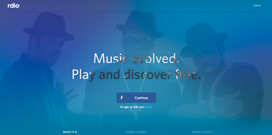
We made heavy use of the HTML5 canvas element in order to dynamically render the blurred album art and text “cut-outs.” The scrolling is controlled by some finely tuned, custom Javascript.
05. What was the most challenging aspect of the project?
Mike Towber: Letting go of secondary and tertiary tiers of information, eliminating 'side-door' entrances, and reducing the actions that visitors to the site can take is a leap of faith.
Sure, you can soft-launch or test multiple scenarios to minimize surprises, and iterate based on what you learn, but simplifying our site that much was always going to take a lot of nerve at some point, as well as repeated reminders of the original goals and priorities, for us to just go for it.
What do you think of the Rdio redesign? Let us know in the comments.

Kerrie Hughes is a frequent contributor to Creative Bloq, and was once its editor. One of the original CB crew, Kerrie joined the team back in 2013 after moving from her role as staff writer on 3D World. Since then she's written regularly for other creative publications such as ImagineFX, Computer Arts and Digital Camera World. After a stint working for the police, Kerrie is back reviewing creative tech for creative professionals.
