20 typography terms you might not know
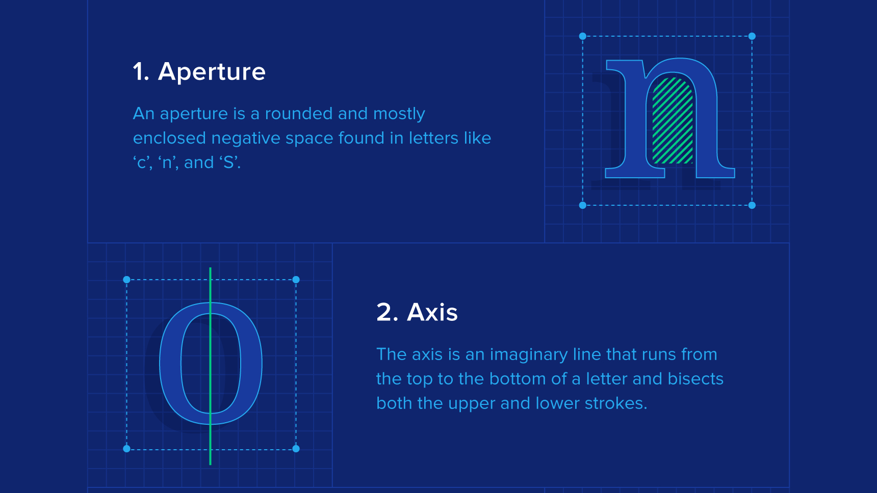
This infographic reveals some lesser-known type terminology.

If you've ever tried to explain the intricacies of a design to a colleague or client, chances are you'll have found that sometimes words can fall short of the mark when it comes to specifying what you're talking about. That's where some wonderfully bizarre terminology comes in, and the field of typography boasts plenty.
The varied and obscure vocabulary surrounding typography might seem pernickety on the surface. But when you know the anatomy of your letter shapes, you'll not only have more authority when working with others, you'll also be able to diagnose problems with your type more easily. (And if you're still not sure what the difference is between font and typeface, see our font vs typeface post.)
That's the thinking behind this infographic of 20 lesser-known typography anatomy terms put together by Toptal, a marketing place for visual interaction designers. Like all the best infographics, this one makes its data immediately understandable. Clear illustrations by Micah Bowers pinpoint a collection of letter parts that every designer should know, but which can often fly under the radar. How many do you know?
Article continues below 
Have you memorised them all? Why not test out your knowledge by examining the anatomy of the best free fonts online?
Related articles:
- Typography trends in 2019 to look out for
- The 8 biggest typography mistakes designers make
- 10 typography tricks every designer should know
Sign up to Creative Bloq's daily newsletter, which brings you the latest news and inspiration from the worlds of art, design and technology.

Dom Carter is a freelance writer who specialises in art and design. Formerly a staff writer for Creative Bloq, his work has also appeared on Creative Boom and in the pages of ImagineFX, Computer Arts, 3D World, and .net. He has been a D&AD New Blood judge, and has a particular interest in picture books.
