Typography trends in 2019 to look out for
From hand-made typefaces to phototype brutalism, leading designers forecast the biggest type trends of 2019.
Typography trends – like graphic design trends, or colour trends – rarely appear out of nowhere. Instead, they evolve and grow as they move from the niche towards the mainstream. That's why, to forecast the big typography trends of 2019, we're first taking a look back at the biggest type movements of 2018.
Elsewhere on the site, you’ll find articles covering the key typography rules and terms every designer should know, the difference between font vs typeface, as well as typography tutorials to help you improve your type design skills, and our definitive collection of the best free fonts out there.
Here, however, we're looking to the year ahead. We asked some of the top names in type to share their thoughts on the biggest typography trends of 2018 – as well as their predictions for what will be hot in 2019. Here's what they said...
Article continues below01. Hand-made typefaces
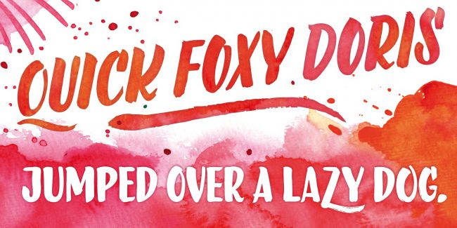
"For me 2018 wasn’t that much about sans, serif or geometric styles, but more about the technical part of fonts: colour, variable and OpenType feature support," says handwriting fonts specialist and LiebeFonts founder, Ulrike Rausch. "There are so many more possibilities now to play around with and fantasise about what these technologies could be used for.
"I also think that, even though handmade typefaces have been flooding the market already for quite some time, they will still be in demand a while longer. These kind of fonts need a lot of OpenType programming and usually have tons of extra characters in order to make them look like real hand-written text. It is a pleasure to see that almost all Browsers support most of the OpenType features now, and that web designers are more and more aware of the existence of the css font-feature-settings that enable all these font extras.
"In 2019 I would love to see more people using fonts and not just typing with them. Most fonts offer so much possibility and variety, which is rarely tapped to its full potential. I always encourage designers to check if a font comes with a tutorial or some specimens that show what the font is capable of thanks to their character set or certain technical features. So let’s use more of all these possibilities and create more typographic variety in 2019."
02. Variable fonts
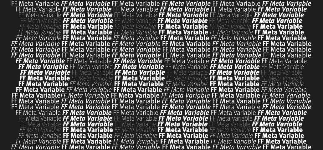
"Throughout 2018, I’ve been very happy to see variable fonts transforming from a technological novelty to a maturing technology, ready to be used and provide value to users," says Monotype font engineer Marianna Paszkowska.
Working between type technology and design, Paszkowska has been uniquely placed to see these trends evolve. "If you’re not familiar with them yet, variable fonts are single fonts that act as many: all the variations of width and weight, slant, and other attributes can be contained in a single highly efficient font file. Users can also animate between different style variants."
"In 2018 we’ve seen main providers of graphic design software and all major browsers adding or improving support for variable fonts. This was probably the fastest feature implementation in the history of CSS. Because of its efficiency, this format gained the attention of web designers and developers. We have also seen the first adoption of these in visual identities."
Sign up to Creative Bloq's daily newsletter, which brings you the latest news and inspiration from the worlds of art, design and technology.
Variable fonts are just at the starting point of their development
Marianna Paszkowska
"But truth be told, variable fonts are just at the starting point of their development—we’re still exploring their capabilities and usability. This is all happening right now. Variable fonts may change the way designers work. They could influence new, non-conventional approaches to how we think of type systems. It could also, and probably will, influence the way type is marketed and sold. For users it offers the potential for responsive type, which may be of interest in situations where type needs to remain readable across different scales or devices.
"It was great to see this brand-new trend settling down in design and I can see variable fonts becoming even more prominent in the graphic design next year.
"It’s fascinating how much can be done with Open Type font format. Even non-variable fonts have many possibilities to be explored. In 2019, I expect to see also more fonts with sophisticated features significantly improving user experience.
"These include fonts simulating handwriting and calligraphy in a more natural way with more sophisticated features as well as fonts more technologically advanced with better, more useful open type features aiming to solve issues like language localisation, micro typography and advanced typesetting are the ones I’m looking forward to the most."
03. Phototype brutalism
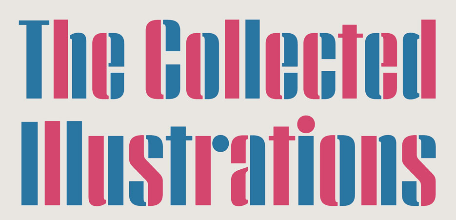
"The typographic trend that most stood out to me this past year – perhaps following on from the 'undesign' trend that now appears to be on the wane – is what I can only think to call 'phototype brutalism'," says Hoefler & Co. typographer Sara Soskolne.
"Phototype brutalism is a kind of toughness of form that seems to recall the dense, slightly sinister, rough-yet-insitutional-feeling sans serif types of the 1960s; accompanied by contemporary takes on their more glam cousins, the high contrast, tight-but-not-touching serif faces of the '70s.
"It doesn’t seem like a coincidence that these kinds of forms would feel current again right now. Given the recent US midterm elections, in terms of upcoming typographic trends I'd say we can expect to see a somewhat tempered version of this same trend to continue through 2019, with a strong chance of more humanistic preferences in 2020."
04. Less and less design
Designer and creative director Craig Ward isn't convinced that the days of 'undesign' are over quite yet, "my thoughts for 2019 are that we'll see less and less design!
"There has been a real surge this year towards the use and creation of very perfunctory, naive and brutalist inspired typefaces and design, and it's only a matter of time until a mainstream brand adopts it, making it a trend suddenly.
"Gareth Hague’s typeface Harbour is starting to turn up a lot (I’ve used it myself), and Alex Trochut just released Utopian & Dystopian (see above). But in design terms, SP-GD and DIA are doing great, brutalist design."
Related articles:

Dom Carter is a freelance writer who specialises in art and design. Formerly a staff writer for Creative Bloq, his work has also appeared on Creative Boom and in the pages of ImagineFX, Computer Arts, 3D World, and .net. He has been a D&AD New Blood judge, and has a particular interest in picture books.
