4 clever ads that don't even show the product

Sign up to Creative Bloq's daily newsletter, which brings you the latest news and inspiration from the worlds of art, design and technology.
You are now subscribed
Your newsletter sign-up was successful
Want to add more newsletters?
The aim of advertising is usually to put the spotlight on a product as a solution. Even if the customer rather than the product is made the hero, the product is still there allowing the customer to achieve their dream. Except when it isn't.
Over the years, we've seen a few brave adverts where the product was removed, sometimes quite literally, leaving customers to work out what was being sold. In some cases, it may have caused confusion but in others, the decision showed just how strong branding can be (see our pick of the best print ads and the best billboard advertising for more inspiration).
01. The beerless Corona beer adverts

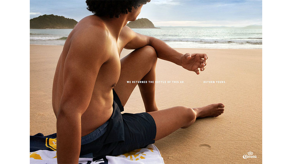
Created by David São Paulo and Bogotá, this recent Corona print and OOH campaign looks pretty much like what we might expect from summer beer commercials: sun, sea, sand and attractive people. But where's the beer?
There's just enough Corona branding going on for anyone looking closely to deduce who is behind the ads, but the beer bottles themselves were removed in a message intended to remind people to recycle them instead of leaving them on the beach. The ad sparked some intense debate because some thought the small type broke accessibility standards while others thought the message made no sense.
02. Ikea's cut-out product ads

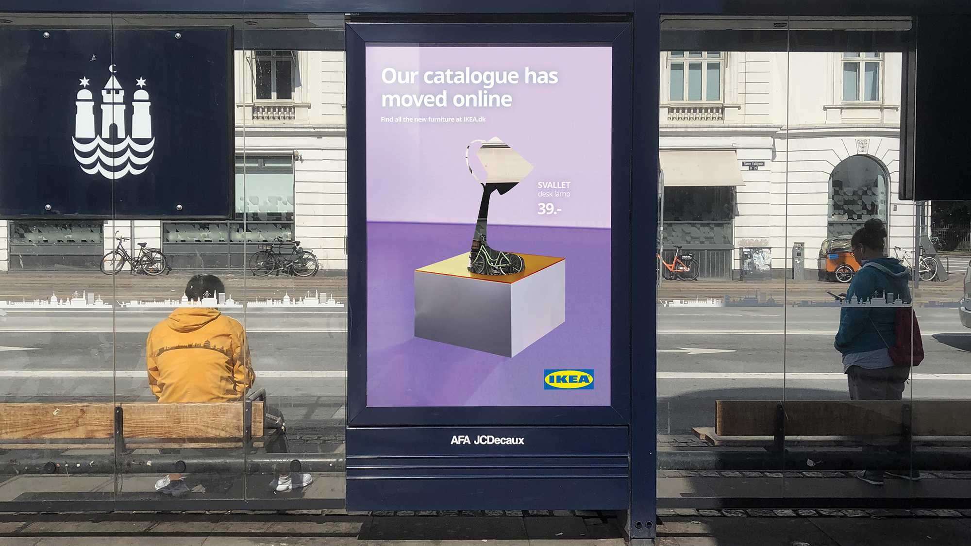
In these clever Ikea ads, the furniture giant aimed to make sure Danish customers got the message that its catalogue was moving entirely online. Created with Danish agency Hjaltelin Stahl, products are cut out from the posters, leaving a see-through silhouette that was sure to get the attention of passers-by. Of course, Ikea's catalogues were so familiar that there could be little doubt as to what was being sold.
Ikea tends to experiment with its ads. More recently, there was much acclaim for another series of rule-breaking Ikea ads in which the products weren't exactly missing, but they were in the background, not fulfilling their intended function. With the copy "proudly second best", Ikea recognised that sometimes children prefer to be with their parents than using Ikea cots or chairs.
03. McDonald's type ads

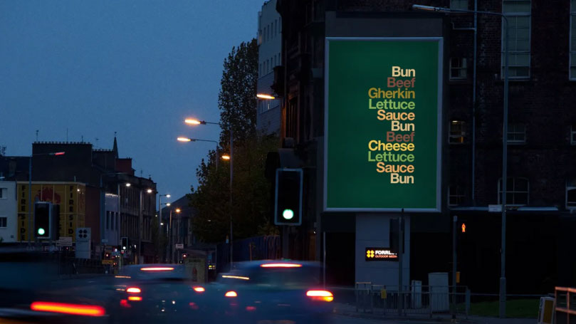
In these striking typographical McDonald’s ads, the product is featured in a way, just not as we would normally expect it. Instead of showing us an image of menu items, or even their written names, the ads show nothing but a list of ingredients. Not even the McDonald's M is present in the minimalist designs.
Sign up to Creative Bloq's daily newsletter, which brings you the latest news and inspiration from the worlds of art, design and technology.
With posters reading "muffin, egg, sausage, cheese, muffin" and "bun, beef, gherkin, lettuce, sauce, bun, beef, cheese, lettuce, sauce, bun", the words were in the colour of the ingredients, but there was no other branding to speak of, not even McDonald's' custom typeface, Speedee.
The ads were created by Leo Burnett London and designer David Schwen based on Schwen's Type Sandwiches that he created in the early 2010s. A brand like McDonald's has the money to spend on ads that people might not even understand, but it's so well known that many people will get the reference.
04. KitKat takes a break
A post shared by Wunderman Thompson (@wunthompson)
A photo posted by on
Meanwhile, Wunderman Thompson demonstrated the power of consistent branding with a clever KitKat video billboard advert in London earlier this year. They appeared to have taken the brand's tagline to heart, taking a break before finishing the advert.
The resulting video of a cursor typing out five letters doesn't name KitKat and doesn't feature its product or its logo, but the brand colours, two words and a clever allusion to a tagline that's been around since 1957 are all viewers need to work it out, and the cleverness of it makes all the more memorable than if the brand had displayed its full tagline.
Looking for more brand inspiration? See our histories of the best 21st century logos. or check out the best branding books.

Joe is a regular freelance journalist and editor at Creative Bloq. He writes news, features and buying guides and keeps track of the best equipment and software for creatives, from video editing programs to monitors and accessories. A veteran news writer and photographer, he now works as a project manager at the London and Buenos Aires-based design, production and branding agency Hermana Creatives. There he manages a team of designers, photographers and video editors who specialise in producing visual content and design assets for the hospitality sector. He also dances Argentine tango.
