Text-to-image AI art generators have been the most radical and controversial development in art and design this year. The technology has exploded at a pace that's hard to keep up with, allowing users to create incredibly realistic images from just a simple text prompt. Sometimes.
Despite the vertiginous technological advances, there are still some requests that seem to fry AI image synths' brains. For anyone wanting to confuse an AI model and make it produce a nightmarish jumble of nonsensical chaos, one creative has found the ultimate silver bullet rubbed in garlic. This video shows one model's attempt to generate images of cereal boxes, and it's quite an experience (if you're not yet up to speed on how the tech works, see our piece on how to use DALL-E 2).
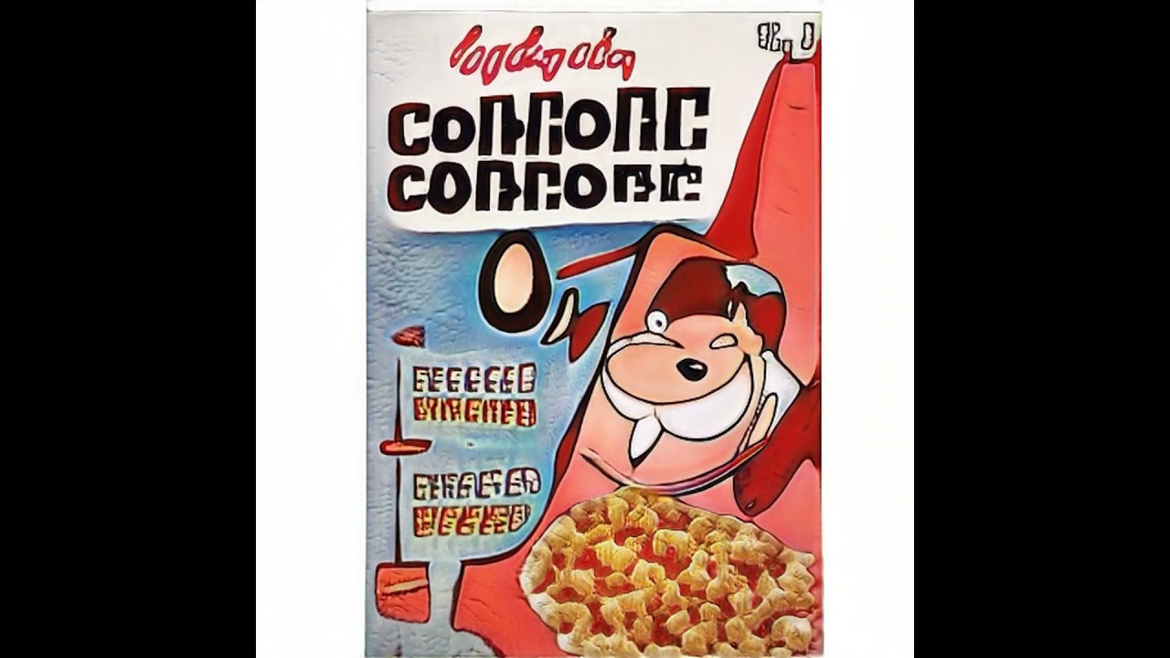
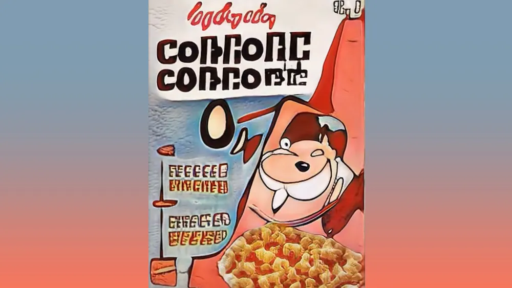
While AI image generation technology has advanced at a terrifying speed, it still faces challenges when confronted with things like text and logos in its training data. The programmer ThomasDotCodes’ decided to test perhaps the ultimate challenge – breakfast cereals.
Cereal boxes have a clearly discernible and recognisable style in their design, but they also include a lot of challenging features, from the brand logo and product name to cartoonish mascots and imagery of the cereal itself, which can vary in shape from flakes to loops, boulders, clusters and more.
Thomas.codes says the images above were created with a custom PKL file trained using styleGAN2-ada on around 700 images of American cereal boxes from the 1960s to the present day, with duplicates removed to avoid bias. "The training collapsed pretty quickly," he says. "Probably due to the low number of images along with the wide variety of traits, especially text."
We can certainly see the traditional shape and design of cereal boxes – and even something that looks like the Kellogg's logo, which reminds us of Heinz's clever use of generative AI to show how it dominated the Ketchup market. There are also attempts to create mascots, although they look like nightmarish fantasy creatures. Common cereal shapes like loops and puffs also crop up, but the shapes start to get applied to the lettering too, resulting in some crazy type.
"StyleGAN has a particularly difficult time with letters, but despite that the results here are easy to identify so overall successful," Thomas says. They are successful in the sense that they're clearly recognisable as cereal boxes, just not from this planet. "I really liked that mascot that looks like a walrus with a football helmet," someone commented on the video. Well, there's a new idea for Kellogg's right there.
Read more:

