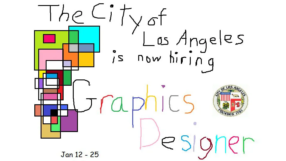
The city of Los Angeles hit a nerve with designers yesterday when it shared an advert for a 'graphics designer' vacancy on its Twitter and Instagram profiles. And while it might initially seem to be a classic case of bad design, the ad – which looks like it was whipped up in Microsoft Paint or another piece of free graphic design software – could just be a stroke of genius.
We'll start with the city of Los Angeles logo, which is incorporated... clumsily. The lettering is inconsistent, both in terms of shape and colour. To cap it off, the salary details and opening dates are written in the font everyone loves to hate: Comic Sans – while the multicoloured square graphics add a child-like aesthetic.
Or do they?
Somebody seems to know an awful lot about graphic design... Yes, it's awful, but that's the point. It communicates in an instant that the team need a graphic designer. So does that make this a good piece of graphic design?
Either way, it's certainly proved popular. Currently the Tweet has over 11,000 likes and 5,400 retweets. Given how fast the ad is spreading, we're sure it'll have racked up plenty more by the time you're reading this
Design humour
Whoever created this image has already demonstrated a good sense of humour, but it doesn't end there. They've also taken the time to respond to some of the wittier graphic designers who have taken time to reply. There's even a reference to that hilarious Ryan Gosling Papyrus font sketch from a recent Saturday Night Live. This person knows their audience.
On top of that, the Twitter account is even retweeting some of the intentionally bad designs people have shared in an effort to show off their graphic design skills, including these gems...
pic.twitter.com/MDpMRn6d7yJanuary 19, 2018
hire me pic.twitter.com/vK8Jouk5mqJanuary 19, 2018
I think I’m qualified pic.twitter.com/TLq9nyfZJVJanuary 19, 2018
i like #soccer.hockey is #cool.free tickets are #awesome.RT this #fantastic tweet & ur entered to win 2tix #LAKingsNight@BaileyLAKings pic.twitter.com/un22YwRgkDApril 28, 2017
If you're a graphic designer looking for a full-time position in the Los Angeles area, be sure to check out the vacancy (with an advertised annual salary of $46,708-$103,230) properly on its careers page. The closing date is 25 January, so don't hang around.
Related articles:

