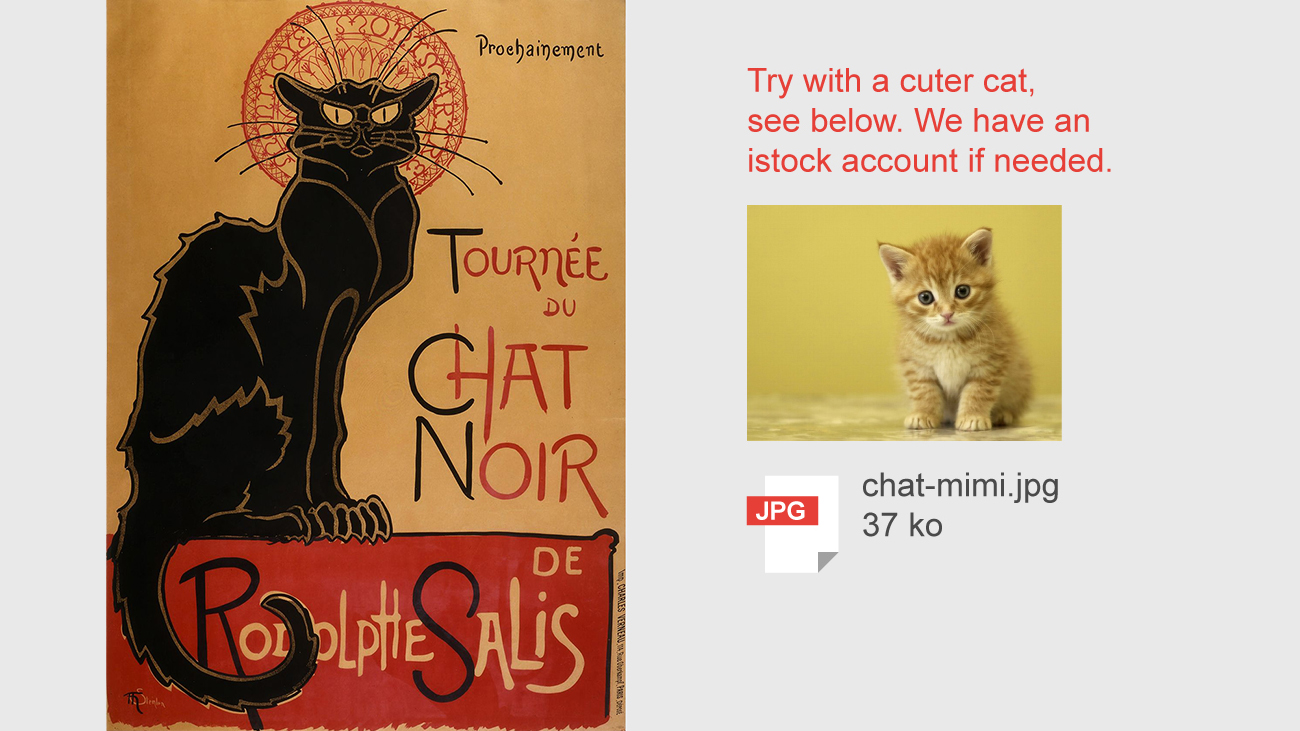
Famous artworks ruined with design by committee
Iconic posters get overloaded with imagery to show how unproductive design by committee is.

You've been working for weeks or months on a winning piece of graphic design – a great poster, logo or album cover, perhaps. You've thought it over carefully, deploying every skill you learnt while studying and working as a designer. After long consideration, the project's done and you submit it to the client.
You look forward to their reaction, but then you hear the message that every professional designer dreads: "I've got a few suggestions to make..."
The phrase 'design by committee', where lots of people chip in on an idea (often without any reason or authority), is a situation that no creative wants to find themselves in. It results in an original, eye-catching design losing its impact, becoming generic, and costing everyone a lot of time.
Sometimes the best thing to do in situations like this is laugh, so that's exactly what the team at Graphéine did. Running with an idea originally posted on Twitter by @MarieJulien, this series of images imagines how nightmare clients could ruin iconic and effective pieces of design.
The team looks at Tournée du Chat noir (Black Cat on tour), 1896 by Swiss painter Théophile-Alexandre Steinlen; legendary designer Saul Bass' Anatomy of a Murderer movie poster; Milton Glaser's Dylan poster; and Grapus Atelier's Louvre logo.
With comments like "The font is too old-fashioned," "Add partners' logos" and "Too much white space," the scariest part is how easy it is to imagine this happening in real life.
Click on the images to enlarge them, making the hilarious comments such as "For your info, 'murder' is usually gore. Please add blood splatters," more readable.
Daily design news, reviews, how-tos and more, as picked by the editors.
Graphéine definitely had fun with these: "This font is too square. Try something curvy like Comic Sans."
Read more about these on the Graphéine blog
Related articles:

Dom Carter is a freelance writer who specialises in art and design. Formerly a staff writer for Creative Bloq, his work has also appeared on Creative Boom and in the pages of ImagineFX, Computer Arts, 3D World, and .net. He has been a D&AD New Blood judge, and has a particular interest in picture books.


