Have we entered the era of bad graphic design?
Three of 2017’s biggest albums all sport strikingly crude covers. We talk to designers behind these ‘bad’ designs to find out what’s going on.
Sign up to Creative Bloq's daily newsletter, which brings you the latest news and inspiration from the worlds of art, design and technology.
You are now subscribed
Your newsletter sign-up was successful
Want to add more newsletters?
The first few months of 2017 have seen albums released from some of the biggest names in pop, rock and hip-hop. While most of these artists will be eyeing up Grammy and Brit awards, the rest of us have been eyeing up their album artwork – and a notable trend is emerging in the use of experimental design that goes against what might normally be considered ‘good’ artwork.
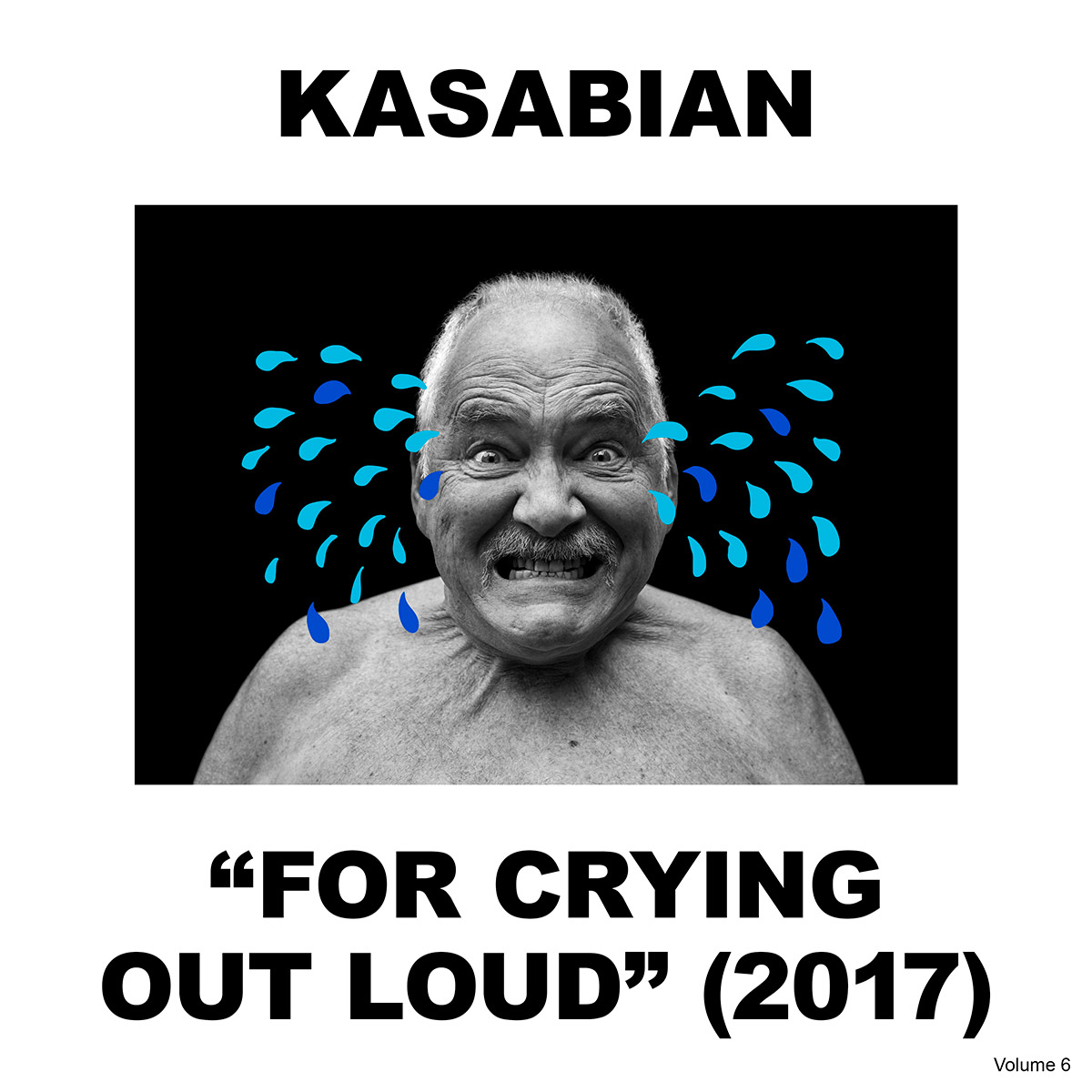
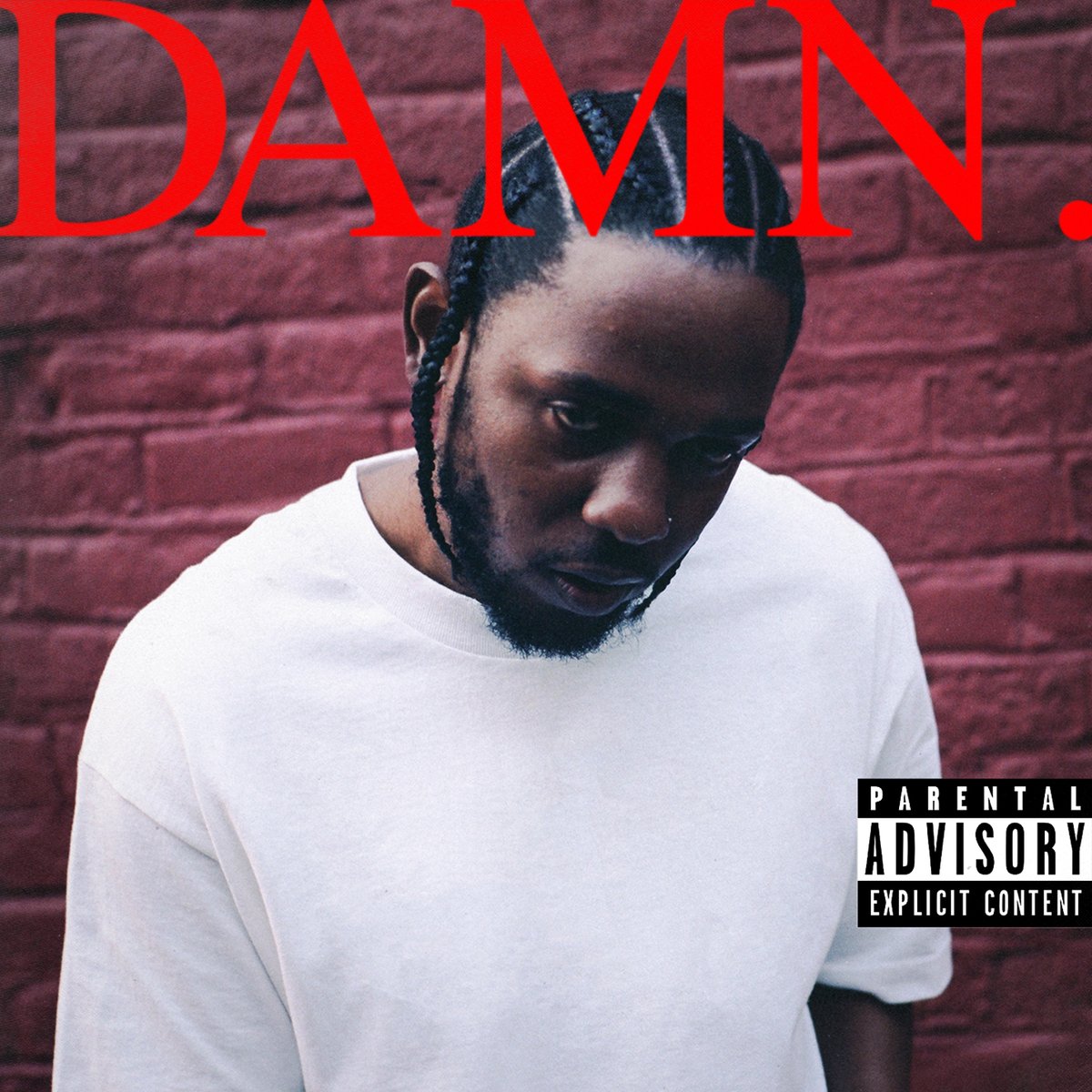
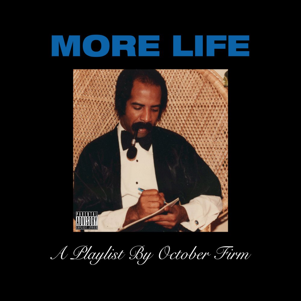
Drake, Kendrick Lamar and Kasabian have all created covers that draw inspiration from grid-based modernism and the freer post-modernist design movement, but with a notable new element that makes them undeniably 2017.

Album artwork is often seen on screen, housed in a tiny square on a streaming site, so it needs to be instantly engaging – whether in a good or bad way. All three cover designs have been stripped down to a single image and bold, in-your-face fonts, to provide maximum exposure in a small space.
Article continues belowIn a further response to the small display format, Kasabian has included ‘2017’ on its front cover, reminding its audience that the album was released this year.
Meme culture
These particular covers also mimic one of the most engaging social media trends around: memes. “The internet is the mega force driving the music industry right now,” says graphic designer and Barnbrook studio member Marwan Kaabour.
“Album art exists in the digital realm, usually at a small scale," he continues. "It needs to look good both as a tiny thumbnail in the iTunes store and on a massive billboard somewhere. Not everyone has the luxury to buy a 12-inch record and relish in the large format. This might be another reason why stripping down all unnecessary elements seems to be the trend.”
We live in a very meta and self referential society... design will always be reflective of what is going on with the populous
Jonny Costello
“Social media – and the need for album art to be shareable, 'memeable' and likeable – is definitely another factor. Album art needs to stand on its own as a good piece of design, as well as be thought-provoking and capable of triggering a reaction.”
Sign up to Creative Bloq's daily newsletter, which brings you the latest news and inspiration from the worlds of art, design and technology.
“The meme is staple in the visual language of now – you can’t deny it – and they have the potential to be spread like wildfire,” adds Adult Art Club art director Jonny Costello.
“I would like to hope that people aren't taking design cues from a style of crude typography born on 4chan message boards, but we live in a very meta and self-referential society. Design is a visual language and will always be reflective of what's going on with the populous. The meme aesthetic isn’t on point for me, but it's a reminder of how powerful the right bit of text with the right image can be. I feel that things generally fall into the meme category out of chance, rather than a considered decision.”
Easy design
“The speed of churn necessary to get any piece of communication online is now so rapid that there are very few choices available. And given that everyone has access to very basic software and thinks they can Google any skill set, it's inevitable that this ‘undesign’ is the bug that gets turned into a feature,” says Professor of Interactive Digital Arts Fred Deakin.
“It reminds me of the graphics and type that you see a lot in the world of fine art, where, again, there's an assumption that design is easy.”

The release of Kendrick Lamar’s album ‘DAMN.’ sparked a huge range of ‘DAMN.’ memes that spread across Twitter.
While this is a clever marketing ploy in itself, giving Lamar free exposure, it also stands testament to the fact that artists are beginning to break down the wall between themselves and their audience to seem more relatable and real.
Keeping it real
While in the past the music industry often presented an unobtainable, lavish experience with big-budget music videos, and covers adorned with expensive clothes and lush sceneries, 2017 has seen a push against this. Artists are being presented as more real than ever before – and like Lamar, this often starts with the album artwork.
“Anything that isn’t too polished and feels like it’s coming from a genuine place, I’m in full support of,” continues Costello.
“We're conditioned quite heavily in seeing design in our everyday lives that's very polished and has a massive amount of gloss laid on, so when we're confronted with something a little more raw and challenging, we're immediately taken aback. Design, as part of the package in relation to music, serves to support and enrich the audio. So if it's a case of the visual sentiment ethos in the audio, it all serves to make the entire album more compelling and true to itself.”
The simplicity of these covers is capable of cutting through the visual noise and is powerful in its ‘basic-ness’
Marwan Kaabour
These covers may also signal a reaction against the increased focus on design that's arisen in recent years. “Design awareness has immensely increased in the last decade or so. There’s a lot of ‘design’ around, perhaps ‘over-design’,” adds Kaabour. “I find that the simplicity of these covers is capable of cutting through the visual noise and is powerful in its ‘basic-ness’. And yes, this is part of a larger trend you can trace back to David Bowie’s 2013 cover The Next Day (as well as his 2016 Blackstar, both designed by Jonathan Barnbrook) or Beyonce’s self-titled album.”

Interestingly, one of the designers who worked on the vision for the DAMN. cover, LA-based Vlad Sepetov, took to Twitter to respond to the initial critique: “I wanted to make something loud and abrasive. And maybe some won’t see that, but I’m glad that Dave and Dot saw the value in making something that didn’t fit the mold. Just given the bare bones we fleshed something out that has a lot of people talking. It’s not uber political like TPAB but it has energy IMO.”
The good, the bad, the ugly
And while the debate continues as to whether these covers are an example of ‘bad’ design or simply a new direction in album artwork, they’ve certainly struck a chord with both designers and music fans alike.
“I find calling these an example of ‘bad’ design quite problematic, as it implies there’s a concrete vision of what ‘good’ design is,” offers Kaabour. “Modernism in itself proposed an ideal of what universally, timelessly good design is, but even that goes in and out of fashion. A lot of modernist graphic design feels like it belongs to a certain time. Design is an expression, and the three examples pointed out here are an expression of where design is in 2017.”
Designers and artists have always pushed back against what is stereotypically considered the norm
Marwan Kaabour
“I think designers and artists have always pushed back against what is stereotypically considered the norm,” adds Costello. “Like most art movements, it goes in antagonistic waves. In music, one of the most pronounced examples of this was the raw and real, lo-fi cut-and-paste punk aesthetic that steamrolled the super-surreal, ornate and embellished visual language of prog rock."
“Sometimes, because it shouldn’t work, it inadvertently does. I think a lot of what we're seeing today – which people may class as bad design – are unaccomplished efforts to recreate a style of an era and capitalise on the nostalgia. More often than not, unless this is executed extremely well, it can fall short.”
Related articles:

Sammy Maine was a founding member of the Creative Bloq team way back in the early 2010s, working as a Commissioning Editor. Her interests cover graphic design in music and film, illustration and animation. Since departing, Sammy has written for The Guardian, VICE, The Independent & Metro, and currently co-edits the quarterly music journal Gold Flake Paint.
