This nature inspired airport logo has an ingenious dual design
Can you spot the hidden symbol?

Sign up to Creative Bloq's daily newsletter, which brings you the latest news and inspiration from the worlds of art, design and technology.
You are now subscribed
Your newsletter sign-up was successful
Want to add more newsletters?
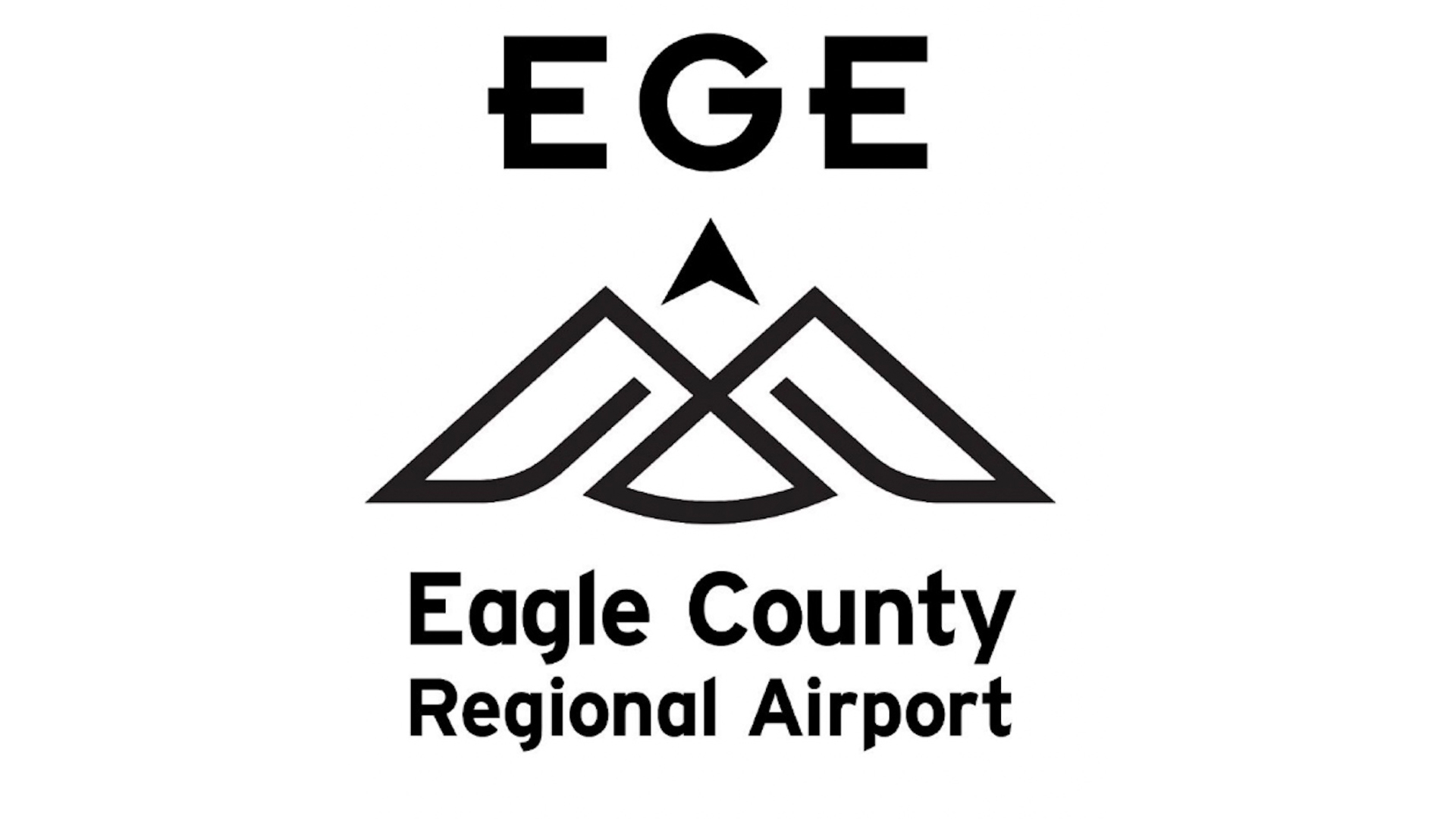
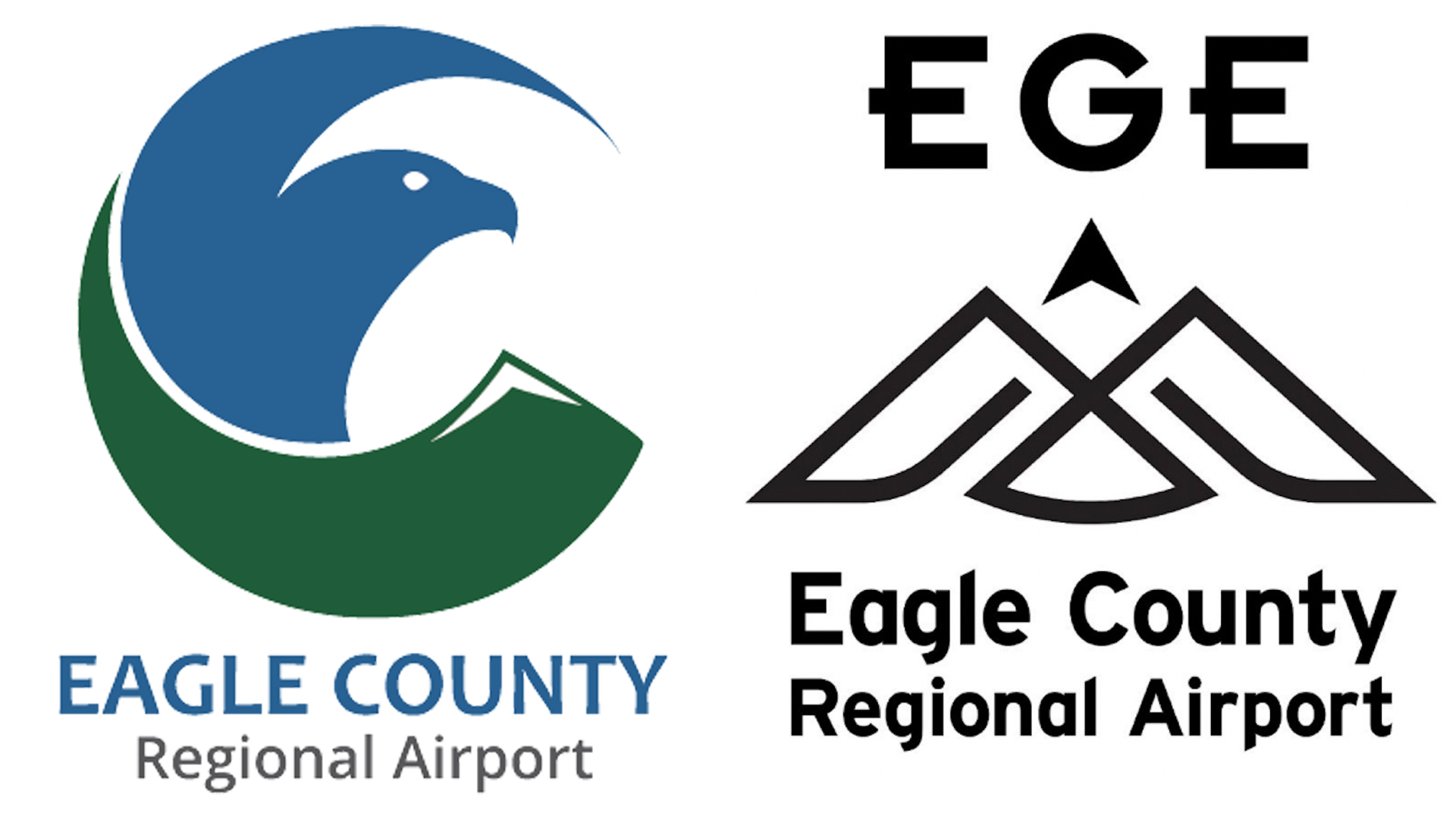
As part of a rebranding project, Eagle County Regional Airport has revealed a new logo design with a clever hidden detail. The crafty design features a minimalist mountain in a nod to the airport's beautiful surrounding landscape – but take a step back and a hidden symbol is revealed.
We love an ingenious hidden design and this logo expertly shows how secret design features can be sleek and sophisticated, while still remaining on theme. (For more inspiring logo design, check out our collection of the best logos of all time).

As part of a 20-year plan to guide the airport’s growth, Eagle County Regional Airport has refreshed its marketing with a host of new features. The logo design references the stunning natural landscape that surrounds the airport, using bold graphic lines to create a strong brand identity rooted in natural imagery.
But there's more to the logo than meets the eye. A zoomed-out look reveals the image of an eagle, a clever dual design that references the airport's name. As an emblem of strength and power, the eagle design also reinforces the concept of flying, artfully coinciding with the airport's tagline “Fly easy. EGE.”

According to Vail Daily, the new logo wasn't originally a hit with Jeanne McQueeney, a commissioner in charge of approving the update. “The first time we saw this… it did look a little military,” McQueeney said, but after some explanation and a little reconsideration, it seems that the design has grown on her.
Eagle County's new airport logo is a masterclass in sleek creative design, expertly conveying the airport's identity through strong, simple symbolism. It proves that clever branding can be both minimalist and effective while still being playful. For more design easter eggs, check out the Cleaveland Browns logo that has a ridiculous number of hidden meanings.
Sign up to Creative Bloq's daily newsletter, which brings you the latest news and inspiration from the worlds of art, design and technology.

Natalie Fear is Creative Bloq's staff writer. With an eye for trending topics and a passion for internet culture, she brings you the latest in art and design news. Natalie also runs Creative Bloq’s 5 Questions series, spotlighting diverse talent across the creative industries. Outside of work, she loves all things literature and music (although she’s partial to a spot of TikTok brain rot).
