For many graphic designers, getting the chance to create a brand identity for a big company would be a dream come true. And while these gigs can be tough to land in real life, 10 designers have done away with convention and decided to reimagine some famous logos just for the fun of it.
The results are a mixed bunch. Some are simple and effective, and deploy a lot of the pointers we highlighted in our logo design guide. In fact they're so good we could easily imagine them rolling out for real. Others, however, leave a lot to be desired, and underline just how difficult creating an effective logo can be.
The hypothetical logos were compiled by Dribbble, one of the most popular platforms for design related self-promotion. In the roundup we see some recognisable identities given everything from a subtle polish to a complete overhaul.
Take this reimagining of the Amazon logo by designer Sam Bunny. Plenty of the familiar Amazon logo elements are present and correct. Lower case sans serif lettering? Check. Orange visual connecting the letter 'a' and 'z'? Check. But all of these parts have been streamlined to create a distinctly new identity. It's all the more impressive when you learn that it only took Bunny an hour to make it.
When the new logo is placed next to the existing Amazon version, complete with its arrow image and bendy 'z', we can't help but think that the real logo could benefit from a few elements of Bunny's design.

Not all logos can be so easily reimagined though. The Target logo, for example, is about as minimalist as they come, yet it does a brilliant job of representing the brand. If you were to add anything to this, it detracts from its effectiveness.
Designer Irvan Pratama had a shot at taking the Target logo in a new direction by incorporating a blue arrow image. We can see what they were going for. The faded and contrasting colours work well together, but it's just not as striking as the version that Target currently has plastered all over its shops.
Pratama even added sneaky shadow beneath the arrow to give the design extra oomph. The trouble is, these additional bits and pieces overcomplicate what is already a straightforward and striking design. If this version were presented to the Target bosses, we could see them removing them straight away. Sorry, Pratama.

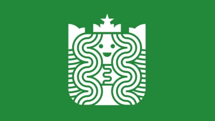
To see some more hypothetical logo alternatives, including different versions of the PlayStation, Red Bull, and NASA logos, take a look in the gallery below by clicking left or right.
And for the full collection, head on over to Dribbble, where you'll also find links to the profile's of each creator involved.


Related articles:

