TfL is well-known for enriching the cultural life of Londoners through its provision of art across the Underground. From beautiful ad posters through to poetry, there is plenty to keep you occupied when journeying deep underground. With London now re-emerging after a long year spent inside, there's a new artwork in town – by eminent artist David Hockney, no less.
Sounds aptly impressive, right? Actually, it's being widely mocked by the public – with many criticising it (hilariously, we might add) for being a bit, well, terrible. And it is true, at first glance the poster does not match up to the stunning creativity usually shown on the tube. In fact, it looks like it was made on MS Paint in 1996… by a child.
But we're here to argue that it's genius for the purpose it was made for, which is to get everyone talking about London's cultural reawakening. The design certainly won't be making it into our best poster designs roundup, but would a beautiful poster be creating the same amount of noise? If you happen to be heading to the UK capital yourself, see our guide to the best hotels in London.
Brilliant work from David Hockney in Piccadilly—the first of a series of major art projects we’ve commissioned as part of our brand new #LetsDoLondon campaign. Lots more to come very soon! #DavidHockney pic.twitter.com/djW8BGSNuuMay 11, 2021
For some background, the Piccadilly Circus artwork (above) was announced by just-re-elected Mayor Sadiq Khan as the first output of the new #Let'sDoLondon campaign, which comes with a £7 million fund attached to it and will involve transformed streets, installations, creative festivals and more.
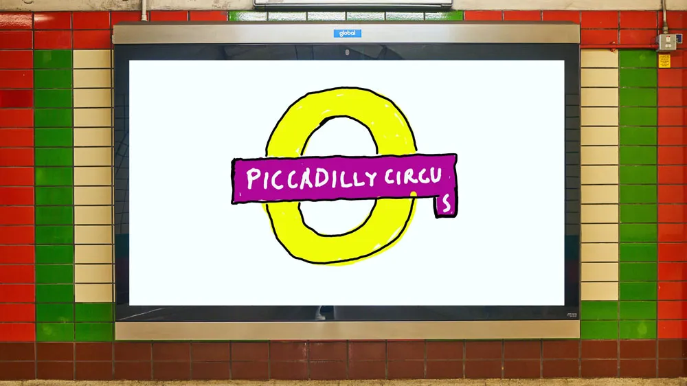
The piece itself is a hand-drawn version (a little too hand-drawn, perhaps) of the Piccadilly Circus sign. The piece is decidedly childlike in style, with an unexplained misplaced ‘s', which has dropped off the baseline of the typography – and, crucially, people hate it. Like, really hate it. Many even responded brilliantly by sharing their own mockups of how the rest of the series' artwork could look.
I prefer this to Hackney’s current underground work. It’s genuinely childish.May 13, 2021
DMs open if you need anymore. £6 a popMay 11, 2021
And others are sharing their own opinions for what the 'rushed, infantile' style really means...
Isn’t the whole thing a Hockney pisstake? I thought that was the point. Obviously it’s rushed, infantile, rubbish. The perfect metaphor for the state were in surely.May 12, 2021
All this has created more buzz for the project itself, meaning the Let's Do London campaign is starting off with a bang. Even Hockney (who created the work for free, FYI) seems to have a sense of humour about the whole thing, as his retweet of an article with a mocking headline shows.
Some angry voices are calling out the decision to feature this work from a famous artist, when so many more unknown creatives are struggling after a tough year.
Absolutely, give the commission to a young artist 👩🎨May 13, 2021
We totally take the point (and would usually agree), but nothing grabs attention like divisive design – especially one with a big name attached. Plus, this artwork has enough weird features to really get people talking, about the art itself and about London's cultural awakening.
And with a bunch of creative projects lined up over the next year, showcasing a wide variety of creative talent the city has to offer, Hockney's contribution means we're likely to be a little bit more aware of what's being produced and perhaps more likely to participate. Or maybe it's just a miss for Hockney. Either way, we certainly paid attention.
Want more London Underground art? See our roundup of the best London Underground posters ever, which are more iconic than divisive.
Read more:

