Jelly-O is a brand that feels like it's been around forever but that desperately needed CPR if it were to continue much longer. It's been with us pretty much since the dawn of the modern age (well, at least since 1897 in name, and its product dates back even to 1845), but it's fast been losing its place as the USA's most famous dessert.
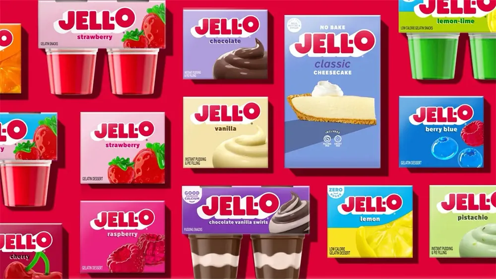
Its first rebrand in a decade could be its one chance to recapture some of that shine. The new Jell-O logo is clean and chunky, and the 'O' is enormous. It feels like it's taken lessons from all those soft drink rebrands we've been seeing.

It's not an exageration to say that Jell-O was fairly revolutionary when it came out. It made what was once an expensive kind of dessert accessible and easy to make. It became ubiquitous and hugely versatile. Apparently, in the 1930s people even made savoury salads with it (and I thought it was only used for shots during Spring Break). But sales peaked in the 1960s and, according to Associated Press, have fallen severely since the start of this century.
Jell-O's owner, the Kraft Heinz Company, says the new look aims to capture "the jiggly fun that Jell-O brings to parents and kids alike." And while the new Jell-O logo doesn't jiggle exactly, it does have a big fat drop shadow for a retro 3D look, particularly on the O, which now stands out higher than the rest of the design. The brand's also replacing photos in its packaging design with illustrations to complete the more "sensorial" retro look.

It feels like a rebrand designed to remind us that Jello-O still exists that people used to like when they were kids, going all in on the kitsch nostalgia value while making the products much more noticeable on a store shelf. The misaligned O adds a playful touch and the blocky letters better capture the product than the thin spiral 'O' that's being replaced (for me, that looked more like a hygiene product or a cold remedy).
It's also right on trend, following a wave of vibrant retro rebrands that we've seen from soft drink brands. Interestling Jell-O is just as old as some of those brands, such as Pepsi. It's also replaced is 'sugar free' claim with the more modern 'zero sugar'.
It remains to be seen whether it will work. Jell-O's decline in popularity is not doubt partly due to changing tastes and competition, but it's also a victim of its associations with the past, particularly with hospital and school food. It will be hoping the rebrand strikes the right balance, highlighting its heritage but also taking that in a more positive upbeat and carefree direction (for tips for your own rebranding, see our guide to how to design a logo).

