Car brands occasionally have one-off branding scandals – people hated Audi’s new logo for China and I don’t even need to get started on Jaguar’s infamous rebrand that was all over the internet at the end of 2024. But these controversies fade, and people move on.
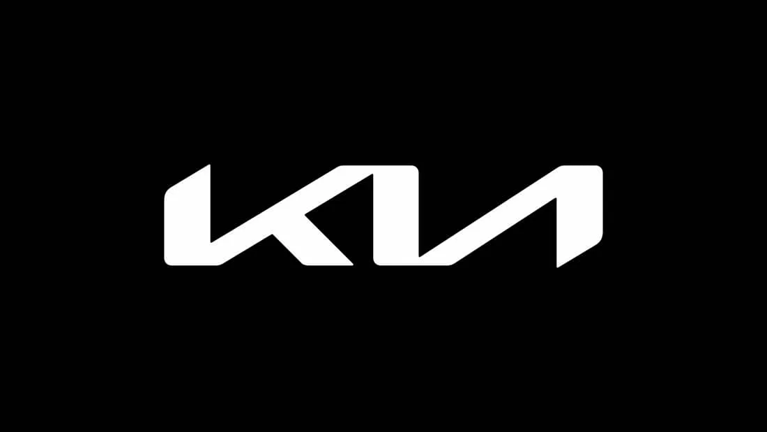
The same can’t be said for Kia’s 2021 rebrand, which is still a source of heavy debate. After years of Kia’s well-known red logo that circled its brand name in an oval, its new logo was a simple, geometric, silver shape spelling out ‘Kia’, only for many it appeared to spell out ‘KN’.
This is still causing Reddit pages to pop up every now and again with people asking about the ‘new car brand’ they saw on the road today. It’s almost a talent to create a design that still sparks discussion and confusion four years after its unveiling.
But just because we got so used to the red Kia logo, doesn’t mean that’s always been its signature look. Kia’s changed up its look many times before – ever since its launch in 1953 – so should this logo redesign really still be such a hot topic? That’s what we’re going to unravel, with a thorough deep dive into the issue.
New Kia logo (2021)
Not many car rebrands have broken Guinness World Records, but Kia broke the record for the amount of drones used in one show in its unveiling ceremony. With sparks like that, you’d at least expect the result to be readable. It didn’t take long to find out from Twitter (now X) that many saw ‘kn’ in the new logo rather than ‘Kia’.
the new kia logo is so unreadable that at least 30k people a month search for the "KN car" ever since its debut pic.twitter.com/jRj25JoAPpNovember 17, 2022
The middle line of the ‘a’ was taken out to make it even more stripped-back: the picture of ultra-modern. This was perhaps the logo's downfall. Had it been kept in, the symmetrical angles could have been maintained while the middle line of the ‘a’ would have given the brain the little step it needs to bring the instant connotation to ‘Kia’ rather than ‘kn’, with a backwards ‘n’. Would it have looked so stylish though?
What else could they have done? Using symmetrical angles for the ‘k’ and the ‘a' might have worked; emulating rhythm and dynamism to match Kia's new slogan, ‘movement that inspires,’ as well as stability and reliability.

Did Kia need to rebrand? Well, look, the old logo was dated (more on Kia's logo history below). As familiar as it was, it was hardly the pinnacle of graphic design. Its recognisable red stood out like a sore thumb in the market, while the new rebrand fits in with the skyrocketing SUV market, which is increasingly inspired by futuristic designs.
With Elon Musk rushing to become Back to the Future’s hero with his flying Cybertruck designs, there's no doubt car brands need to catch up. The continuous line of the new logo combined with its sans-serif text makes it a whole lot easier to build into the design of a car too, with the old logo’s circle and unnecessary tiny serifs being quite clunky to feature on a car.
With Kia needing to catch up to the industry of sleek, effortless SUVs, the new logo is a design that is almost so clever it’s unnoticeable. The issue that is impossible to get around however, is the fact that – as yet - for many it’s unrecognisable.
Google searches
The Google statistics for the term ‘KN car’ only continue the branding embarrassment, with ‘what car is kn’ trending high.

Although interest in ‘KN car’ spiked in 2022, the term is still consistently searched for, showing not everyone’s clocked the change yet, and people are still struggling to recognise the logo out and about.

Four years into a rebrand, you wouldn’t think it would be ideal for a company for people to still be confused about its name. A recognisable logo is everything, isn’t it?
But we understand what Kia was trying to do, and although the execution was shaky, once enough people have caught on, there’s a chance the logo might end up benefitting the company in the longer term…
The Kia logo old vs new

The red oval surrounding the old logo was dispensable – so it’s finally been dispensed with. SUV brands are increasingly opting to replace their logos with simple shapes and post-modern sans serif lines to allude to simplicity and ease amid a fast-moving, rapidly evolving world.
These logos tell you that their cars will be fast-moving too so you’ll never fall behind. Kia’s a major player in the hybrid and SUV car landscape, and this is where the industry is, and has been for some time. So its on the right track.
But while staying relevant is important, it’s just as crucial to avoid being synonymous to your competitors, and Kia is in danger of doing that.
The old logo was dated and no longer doable; it was clunky and the company needed to catch up. But even if Kia fixes the legibility of its new logo, it’s still got the issue of synonymity on its plate.
The answer? In my opinion there are three routes Kia could take here:
1. Add a line to the ‘a’.
2. Rename Kia to KN.
3. Chuck both designs out the window and start from scratch.
Otherwise, with fewer people recognising Kia on the street – the most important place of advertisement for a car – it risks one day being forgotten.
Though of course there is another option.
4. Stick with it and ride it out as a talking point.
The history of the Kia logo

Kia's original logo was made up of a complex, triangular pattern, with imagery connoting wheels and car mechanics. It couldn't be further away from its current sleekness, but its strength was in its heritage-style design. Luxury car brands such as Lamborgini, Alfa Romeo and Lagonda all boast similar logo designs boosted by the strength of the names behind it.
Kia, however, is not a luxury car company. It positions itself in the market of family-friendly SUVs for town and city life, meaning that as strong as this original logo is for a car company, it needed a change if Kia wanted to accurately portray the brand's message and get it to the right audience.
Every ten years Kia releases a standard logo redesign, and in its first forty years these changes were radical each time. For example, it went from its first ever heritage-inspired logo of its 1953 launch, to a large green 'Q' in 1963.

1986 brought a purple and blue rebrand that resembled the sort of logo you'd come across on an industrial estate. Somehow it got to the well-known red oval, but the adjustments that went on between 1953 and 1986 make the 2021 redesign look like a simple strip-back rather than anything too radical.

When you dive into the history of Kia'a logos, the 2021 rebrand isn't actually its biggest jump. If anything, it makes the most sense of all of them yet.
What would you do if you were in charge of the Kia logo? Let us know in the comments

