“Incredibly disturbing”: the internet is terrified by King Charles’ new portrait
Why does it look like he’s emerging from a hell portal?

Sign up to Creative Bloq's daily newsletter, which brings you the latest news and inspiration from the worlds of art, design and technology.
You are now subscribed
Your newsletter sign-up was successful
Want to add more newsletters?
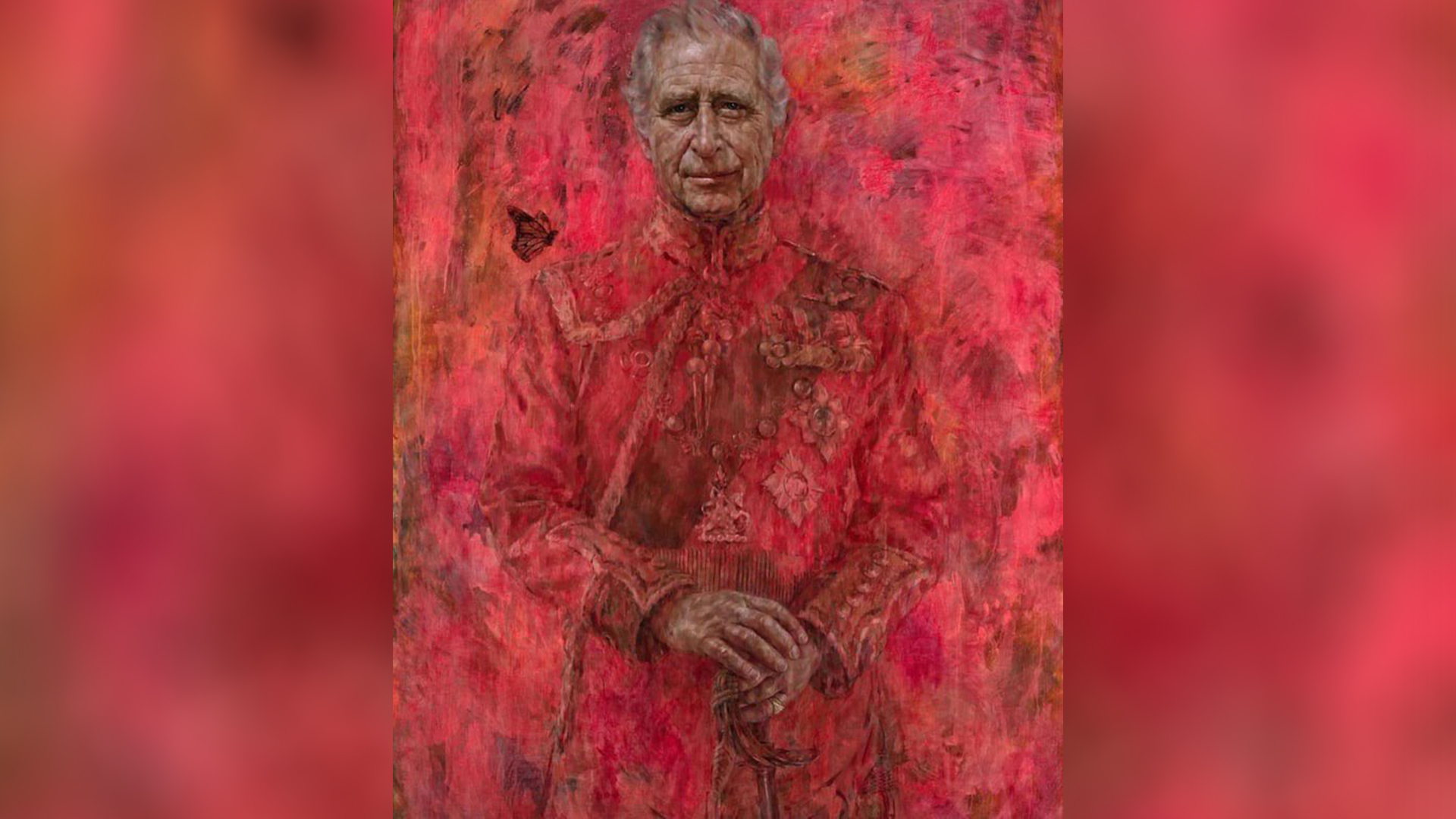
The King of England has been the subject of ridicule after his official portrait was unveiled earlier this week. The disturbing, post-apocalyptic style portrait with its striking red theme has drawn some hilarious comparisons, from Han Solo to (less flatteringly) a tampon.
While I doubt that artist Jonathan Yeo's intentions were to grab his art supplies and produce a portrait that looks straight from the depths of hell, the internet has not disappointed with its out-of-pocket comparisons. Despite the backlash, there's a reason behind the blazing depiction, celebrating heritage, strength and sovereignty in the boldest of ways.
A post shared by The Royal Family
A photo posted by theroyalfamily on
So why does King Charles look like a victim of a Just Stop Oil protest? Naturally red is often associated with the Welsh Guards that protect Buckingham Palace, but it's also strategically used to compliment the decor of Drapers’ Hall where the portrait will reside. In colour psychology, red is a signifier of strength and power – a colour synonymous with regality.
Article continues belowI'd argue it's an interesting choice to envelop the King in a disconcerting red mist, but the eerie monochromia is a purposeful touch, aiming to draw the viewer to the King's face. It's part of the monarchy's modern approach, showcasing the "human being underneath" (Yeo's words, not mine). The monarch butterfly perched on his left shoulder gestures to the King's continuous environmentalism efforts – a subtle yet poignant symbol.
I’m not sure why Charles commissioned a portrait of himself burning in hell? pic.twitter.com/Mfph4t9mOxMay 15, 2024
Jonathan Yeo reveals inspiration behind new King Charles portrait... pic.twitter.com/OSvnpeiJj8May 15, 2024
You could spend hours dissecting the nuance of the new portrait, but predictably the internet was more interested in the memes. "I’m not sure why Charles commissioned a portrait of himself burning in hell?" one X user commented, while another compared the artwork to a scene from The Shining.
X users weren't afraid to get unfiltered with their opinions, with many drawing connections to the tampon-gate scandal that plagued the King's younger years. Others drew connections to the Picture of Dorian Gray, while some joked about its resemblance to Han Solo in red carbonite. With one user calling it "incredibly disturbing and off-putting," the general consensus seems to be that we're all deeply disconcerted and confused – comforting feelings when looking at a portrait of the reigning monarch.
Now why did King Charles get his official portrait of him as a bloody tampon😐 pic.twitter.com/pYsdkmNNkeMay 15, 2024
Anybody else find the new portrait of King Charles III incredibly disturbing and off-putting? pic.twitter.com/s9tU4GOO4EMay 15, 2024
If you're after some more disturbing artwork, check out the creepy painting restoration that uncovered a hidden demon. For something a little more wholesome, check out the stunning hand painted book cover designs that are a dream for bibliophiles.
Sign up to Creative Bloq's daily newsletter, which brings you the latest news and inspiration from the worlds of art, design and technology.

Natalie Fear is Creative Bloq's staff writer. With an eye for trending topics and a passion for internet culture, she brings you the latest in art and design news. Natalie also runs Creative Bloq’s 5 Questions series, spotlighting diverse talent across the creative industries. Outside of work, she loves all things literature and music (although she’s partial to a spot of TikTok brain rot).
