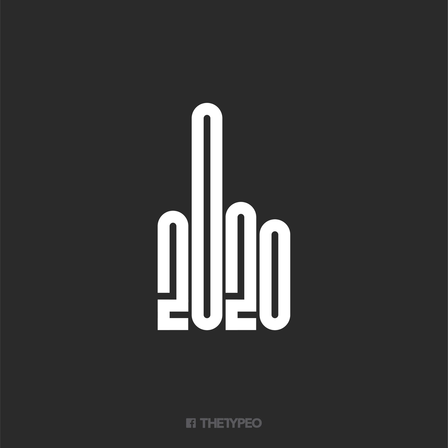
This logo of the year is hilariously blunt
But we wouldn't quite swear by the design.
Almost six months in, it's fair to say that 2020 has already been quite a year. And if you're wondering what the logo of the year (that's a thing, right?) might look like, wonder no more – one designer has created a simple yet effective symbol that communicates exactly what 2020 seems to be trying to say.
While our logo design inspiration guide is full of tips, it seems The Typeo didn't have to look much further than the apocalyptic vibe of the year so far when it came to the design (below) – in which 2020 is quite literally giving us the finger.
(For more attention-grabbing logos, see the best monogram logos and the best 3-letter logos).

While it took us a moment realise we're looking at a hand, (could the bottom of the first '2' be lengthened to resemble a thumb?), once we saw it, we couldn't help but appreciate the striking message. It feels bluntly appropriate for the year of, among other things, the coronavirus pandemic.
The design was shared to Reddit's r/DesignPorn channel, where it has naturally faced some, er, constructive criticism. Some needed it pointing out that the logo is meant to resemble a hand, and many agree that the appearance of a thumb could make it a lot more obvious. Execution-wise, it might not be about to enter our best logos of all time list, but we're big fans of the sentiment.
While it's certainly been a strange one, 2020 has at least brought many areas of the creative community together – our introduction to the best free resources for creatives stuck at home is full of inspiring examples. And if your office and home are the same thing right now, our guide to working from home like a pro has you covered.
Read more:
Sign up to Creative Bloq's daily newsletter, which brings you the latest news and inspiration from the worlds of art, design and technology.

Daniel John is Design Editor at Creative Bloq. He reports on the worlds of design, branding and lifestyle tech, and has covered several industry events including Milan Design Week, OFFF Barcelona and Adobe Max in Los Angeles. He has interviewed leaders and designers at brands including Apple, Microsoft and Adobe. Daniel's debut book of short stories and poems was published in 2018, and his comedy newsletter is a Substack Bestseller.

