
The best three-letter logos have to work hard, but their relative brevity can also be their greatest asset. Being compact, three-letters logos can often be more versatile than a longer wordmark while still creating an easily recognisable brand.
There's something about the rhythm of threes in general, as political speech writers well know, and a trio of letters tends to be chosen as the ideal length for a concise but memorable monicker – just think of media personalities, from JFK to J-Lo, and numerous sports bodies and other organisations.
For brands that already have a three-letter name, sometimes there's no need for an additional visual mark. It's more a question of turning those three short letters into something unique (see our guide to the best monogram logos for even more compact designs).
What makes the best 3-letter logos?
Achieving a three-letter logo that makes a lasting impression on people isn’t as easy as it might sound. Although each letter can be crafted in various ways to communicate something about the brand and what it does, bringing them together to form a balanced yet distinctive piece is challenging.
Many designers opt for a solid, structured form. But there are a lot of these around – making it difficult to stand out from the crowd. For others, the curves and intricacies of a script-based monogram are the way forward. But the intricacy of a monogram can make a logo more difficult to read in an instant. What’s usually needed is a touch of inspiration, and a touch of genius.
Focusing only on logotypes – we haven’t included anything that relies on a mark – we reckon the selection below constitutes the best three-letter logos ever made, in reverse order. For our favourite logos in general, see our post the 10 best logos of all time.
10. The MTV logo

MTV’s powerful, structural logo was created by a start-up design studio called Manhattan Design back in 1981. Its heavy, three-dimensional 'M' establishes its solid form, with the spray-painted TV dropping in as a creative highlight to lend the identity some street cred.
Made old-school style by Frank Olinsky, Pat Gorman and Patti Rogoff, the TV element was actually sprayed onto acetate in a stairwell in Greenwich Village. Even then, the designers envisaged the 'M' being used as a canvas for different colours, patterns, images and possibly moving footage too, giving the world one of its first adaptive logos. In this way, the MTV logo captured the spirit of the eighties and early nineties.
09. The CNN logo

As with MTV, it was a case of needs must in the early 1980s as cable television took off in the US. While the music station was to broadcast videos 24 hours a day, CNN’s concept was non-stop news. At the last minute, founder Ted Turner and his board realised they needed a logo and ad agency Communication Trends in Atlanta obliged.
Turner ‘got’ the concept immediately – a cable running in-line through a smoothly curving, modernist formation of the three letters. The logo was designed in 48 hours and has been on air ever since the station’s launch on 1 June 1980.
08. The Yves Saint Laurent logo

Although the French fashion house rebranded as Saint Laurent Paris a few years ago, its beautiful monogram logo is still seen on fragrances, bags, jewellery and in various secondary applications. And why would the brand rid itself of a classic monogram, which stands out against the heavy structure of most other three letter logos thanks to the way the letters intertwine without becoming too indistinct and decorative?
Designed by Cassandre – the pseudonym of Adolphe Jean Marie Mouron – the logo was drafted by hand in 1961. It has a touch of the art deco about it, perhaps tracing back to Cassandre’s own background as a leading poster designer of the 1930s.
07. NYC

Could this be the biggest example of location-based identity design? Produced in 2007, NYC's huge, blocky type makes it the epitome of a structural three-letter logo. The forms are designed to work vertically and horizontally, and just as the huge 'M' in the MTV logo was used as a canvas for music-related imagery, the chunky NYC is meant to provide a window into a multicultural city.
Like the city’s layout, it has been designed on a grid of blocks, but in application it has proven itself adaptive and flexible. Designed by Wolff Olins, the logo has become a lynchpin of tourism marketing – following on from Milton Glaser’s I Love New York logo, of course – and the peg for a range of initiatives such as greenNYC.
06. The SAS logo

Designers love doing identity work for airlines. From sick bags to aircraft livery, there’s so much to play with. The core logo for Scandinavian Airline Systems had its origins with Landor Associates, which came up with the basic letter forms in 1983; was placed in a blue box by Stockholm Design Lab in 1998; and was released to fly free by Bold in 2016.

Essentially, the slant of the letters and the contrast between bold and thin strokes enables the type to look solid and yet light enough to fly at the same time. Bold’s addition of gradients to the brand colour palette have helped modernise the identity but it’s the expertly handled geometry in the lettering that chimes most with the straightforward Scandi functionality.
05. The BBC logo

ABC, NBC, CBS, CBC… there are plenty of broadcasting companies with three-letter identities and logos, but this clear, solid, globally recognised mark which the BBC has used since 1997 just has the edge on other contenders. You could argue that its grounded feel matches the corporation’s impartial editorial approach, or that the blocks look almost like keys on the keyboard at which a diligent correspondent is beavering away.
However, Lambie-Nairn’s design really aimed to deal with the issues of the digital age. At the time, various BBC entities were using different logos, but its main mark – slanting letters with blue, red and green lines underneath them – didn’t render well at small sizes or on digital displays. Since the 1950s, the lettering has been in blocks, and Lambie-Nairn refined this tradition, using Gill Sans in hopes of giving the logo a timeless quality.
04. The Caterpillar logo

As a manufacturer of earthmoving and construction equipment, the strong and structured feel of Caterpillar's logo looks just right. But the insertion of the yellow triangle adds a little mystery. What does it represent? A mound of rubble that needs to be moved? A hillside someone wearing CAT-branded boots is about to conquer?
Well, according to the internal design team that created it, the triangle actually conveys optimism, support and energy. It was introduced in 1989 and since 1996 the company has extended its reputation for rugged, high-traction products into the clothing and footwear sectors. The three-letter CAT logo makes for an ideal enduring tag for this gear.
03. The V&A logo

Designed by Pentagram founder Alan Fletcher in 1989, the Victoria and Albert Museum’s logo is a lesson in exclusion. By leaving out the left-hand stroke of the capital 'A' and tightening the 'V' and the rest of the 'A' in to house the ampersand, a unique but very recognisable form is established. The thin, Bodoni-like serifs and strong contrast in the strokes speak of the V&A’s timeless elegance.
In 2002, branding agency Wolff Olins helped give the identity more a dramatic and vibrant presence by demanding that it always be used in colour. Black was banned. Strictly speaking, it’s three characters rather than three letters, but to this day the V&A marketing department considers the logo to be as valuable as any piece in the museum’s collection.
02. The IBM logo

Just like a good piece of music needs to connect with the listener in the first eight bars, Paul Rand made an unforgettable impression on the nascent tech industry with his eight-bar logo for IBM. Redesigning his earlier identity from 1956, in 1972 Rand split the slab serif type horizontally using seven gaps, which seem to allude to the scan lines that were visibly present on early computer monitors (and televisions for that matter).
The black bars – or positive space – are ever so slightly thicker than the white ones to overcome the optical effect of the negative space surrounding the logo. In a fast-moving business, it has stood the test of time. Like the modernist ethos Rand promoted, IBM’s logo stands for honesty and integrity.
01. The London Symphony Orchestra logo
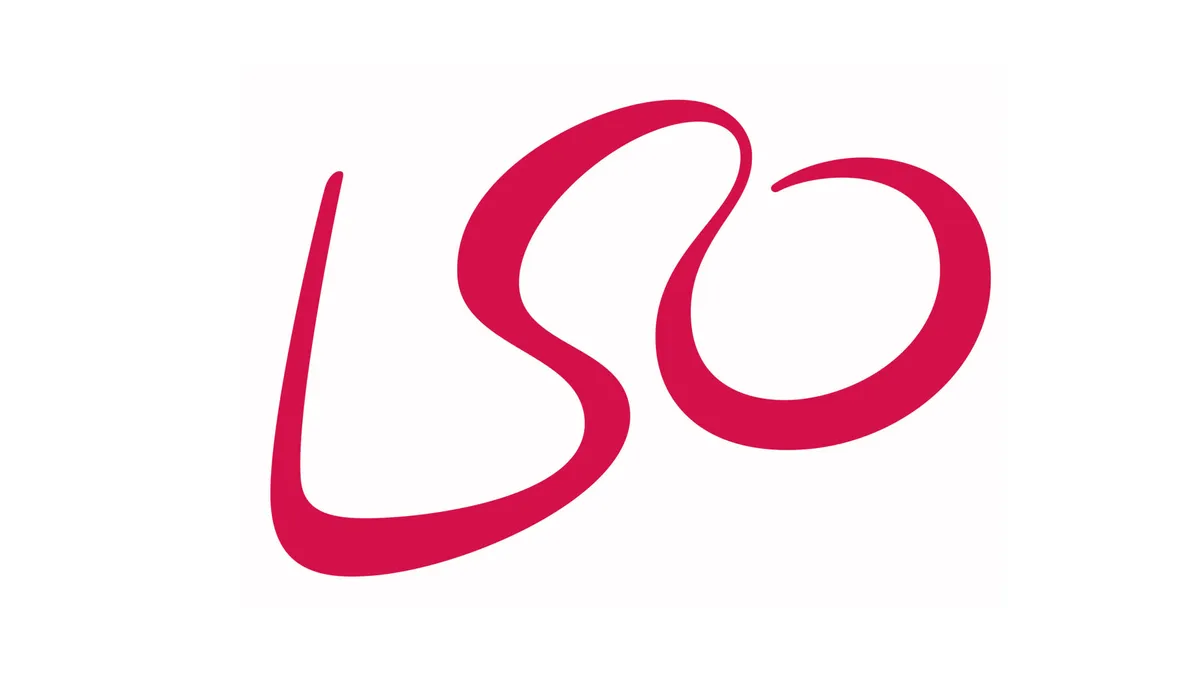
Not as well-known as IBM, Yves Saint Laurent or, indeed, MTV, the LSO might be an unexpected choice as the best three-letter logo. However, this design isn’t just a three-letter representation of an organisation, it’s a mark that captures the very essence of an orchestra in a way that surprises the viewer. The letters were designed to appear as though they were drawn in the air by the tip of the conductor’s baton.
Designed by The Partners (now Superunion) in 2004, the logo is centred around the notion of motion. Two years ago, the agency returned to motion capture conductor Simon Rattle, taking the angles of his movements into custom lettering for the orchestra’s poster campaigns. If there was ever a way to use an identity to make classical music feel relevant and exciting, this is it (in fact, this could also be included in our pick of the best cursive logos).
Looking for more logo inspiration? See our guide to how to design a logo. And remember logos aren't only visual, as we see in our pick of the best sonic logos.

