The best monogram logos are so effective, you may have accepted them without giving it much thought. The traditional monogram – usually someone’s initials woven together to create a form – remains a powerful tool in modern identity design. If you can find a way of connecting two or more letters so that they remain recognisable while at the same time creating a memorable new shape, it can create a powerful identity.
A killer monogram logo arises when the letter-based form is intriguing but legible, and its aesthetic qualities express something about the brand’s values or unique selling points. Of course, these are the same qualities that make good logos in general (see how to design a logo and our picks of the best logos all time and the best 21st century logos.)
Everyone has their own favourite monogram logos, and debates about which are best will rage until the end of time. But we’ve brought what we think our nine of the best monogram logos we've seen, many of which have lasted decades. While some of them may have iterated and been updated, there’s a monogram element at their core retaining a clever message and, if not that, then instant recognisability at least. For more logos made from letters, see our feature on the best 3-letter logos.
01. Roger Federer monogram logo

As with Alan Fletcher’s legendary V&A logo, sometimes what makes the best monogram logos so recognisable is what's left out. In this case, the vertical strokes of both the 'R' and the 'F' in champion Swiss tennis player Roger Federer’s monogram are missing and yet every sports fan in the world recognises the remaining elements to be his mark.
According to Federer, this little piece of design genius is based on a scribble jotted down by his wife, Mirka, in 2003. However, it seems that Nike finalised the monogram in 2010. When he became sponsored by Uniqlo, the athlete took legal action to to reclaim his monogram logo from Nike.
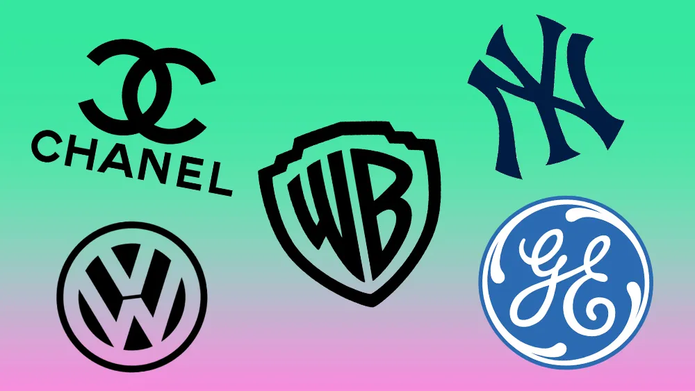
02. The New York Yankees monogram logo

There’s some fascinating folklore behind the development of this iconic American sports brand. Prior to 1909, the New York Yankees logo was simply the letters 'N' and 'Y' side-by-side on their caps. The inspiration to overlap them came from part-owner Bill Devery, a former policeman who had seen the design on a medal of honour presented to an officer shot dead in the line of duty. That medal, it so happens, was made by Tiffany & Co in 1877. While it isn’t the team’s official logo, the Yankees’ NY monogram is one of the most recognised sports emblems in the world and still appears on the players’ jerseys and caps.
03. Chanel monogram logo

Like the New York Yankees, Chanel also owes its interlocking Cs monogram to an earlier design genius. The story goes that Gabrielle 'Coco' Chanel first saw the emblem in 1925 while visiting Château de Crémat, a castle built in Nice in 1906. Two 'C's, crossed over, can be seen to this day in the stained-glass windows of the chateau. However, recreating this device in a geometric modernist typeface and cleverly using it – for instance on the clasps of handbags – the designer and her proteges have turned it into a worldwide icon for French fashion.
04. General Electric monogram logo

One of the most powerful monogram logos created, the GE logo sits as comfortably in its circle at the tip of a lightbulb as it does emblazoned on the side of an enormous wind turbine generator. Although Wolff Olins reworked GE’s global brand architecture for the company in 2005, adding a typeface inspired by the monogram, for example, the script-based 'G' and 'E' remained within their embellished circle, relatively untouched. There’s an interesting rundown on the GE brand and monogram on the company’s website.
05. Grant Associates monogram logo

Designed for the international landscape architects Grant Associates, this monogram locks up two mirror-image letters – a lowercase g and lowercase a – quite brilliantly. In a brand redesign centred on the concept of connecting people and their environment, Supple Studio conveyed GA’s ethos in its monogram. The modern, rounded lettering emits an organic vibe also reflected in a typeface that the studio modified for the client, and a set of icons to represent the various fields the practice works in.
06. Warner Bros monogram logo

To film viewers, the Warner Bros logo seems timeless. A golden shield bearing the letters 'WB', three dimensional and floating – usually in front of a pleasant-looking sky. In fact, the company has changed its logo dozens of times (see our piece on the most recent Warner Bros logo update in 2023). In the 1970s, Saul Bass gave the company a modernist 'W' with no shield at all. Earlier, when the company was bought by Seven Arts Inc, it had an emblem merging a 'W' and the numeral '7'.
However, it has always returned to the protection of the shield, the upward horizontal of the 'W' straightened to parallel the vertical stroke of the 'B'. This design has been tweaked and changed plenty. Indeed, the company has encouraged filmmakers to adapt it in their productions. And yet the basic shield design it uses, commonly seen in online logo templates, has retained its timeless quality, for Warner Bros, at least.
07. H&M monogram logo

The Swedish department store Hennes bought a rival chain and became Hennes & Mauritz in 1968, and the hand-rendered H&M logo was born. Today, shoppers know it only as H&M and while the youthful, free-and-easy style of the H&M monogram was redrawn in 1999 by BVD to look more balanced, it still feels well-proportioned, with enough space about it to breathe and feel impactful over time.
Some would even call it under-designed. However, it has proven highly successful in the 60 countries where H&M has opened shops, putting the logo on shopping bags at scale. This translates to free, mobile advertising care of an effective monogram logo.
08. PlayStation monogram logo

While the more recent PS5 logo has been ridiculed for its lack of innovation, let’s not overlook the very clever design work that went into the original PlayStation monogram. Launched in 1994, the gaming console’s logo was designed by Manabu Sakamoto. With the 'S' lying down as though it is a shadow of the upright 'P', which stands at an angle, the overall design embodies the original product’s key selling point – its 3D graphics capability. The red, yellow, green and blue express the vibrancy of the product and its games, though it works beautifully in mono as well.
09. Volkswagen monogram logo

The VW monogram has been a part of the Volkswagen identity since the company was founded in Germany, under the Nazis, in 1937. Indeed, early iterations don’t just look mechanical, they look positively militaristic. After the War, the monogram, stacking a 'V' within the upper half of a 'W' and capturing the form in a circle, has been modernised in line with automobile technology on average every six years.
Created in 2019 by VW’s chief of design, Klaus Bischoff, the latest iteration is with a clean, slim and flat. Interestingly, the points of the 'W' don’t quite touch the bottom of the circle as they do in earlier versions. This version gets back to basics while feeling very modern at the same time.

