Medieval famous logo redesigns are the best thing you'll see all day
These are ingenious.

Sign up to Creative Bloq's daily newsletter, which brings you the latest news and inspiration from the worlds of art, design and technology.
You are now subscribed
Your newsletter sign-up was successful
Want to add more newsletters?
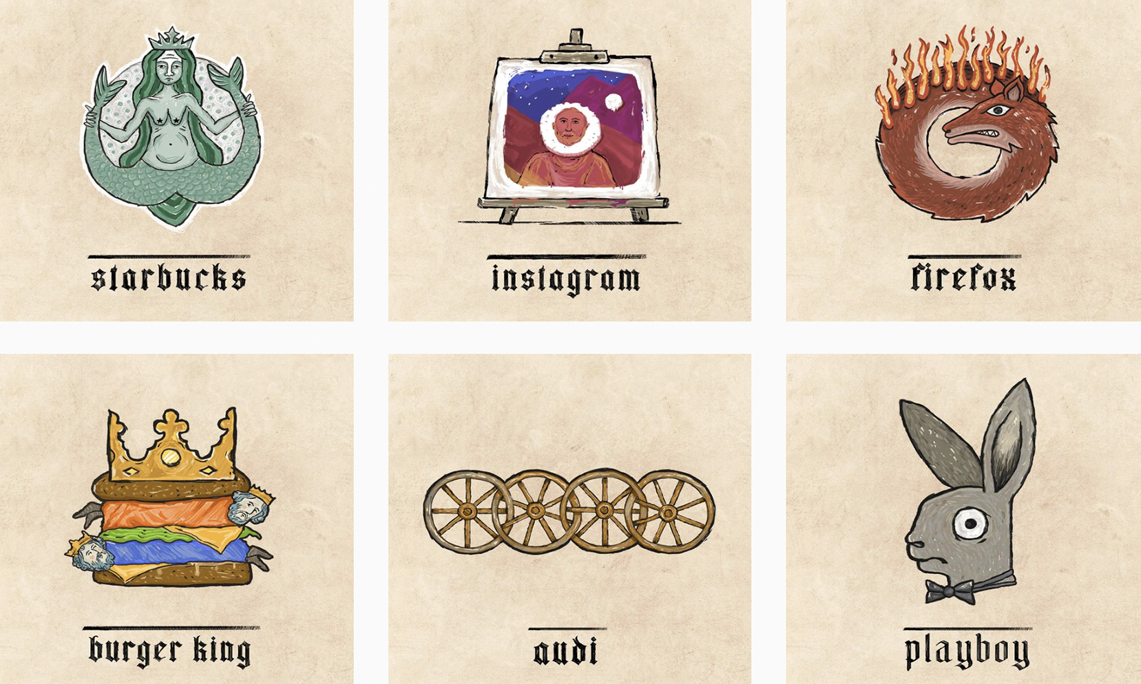
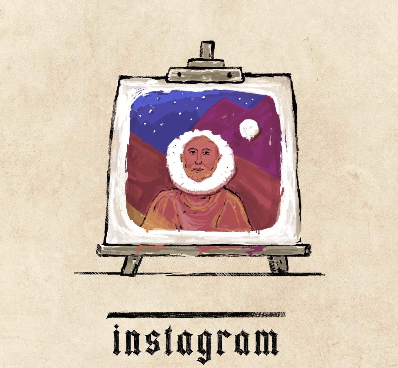
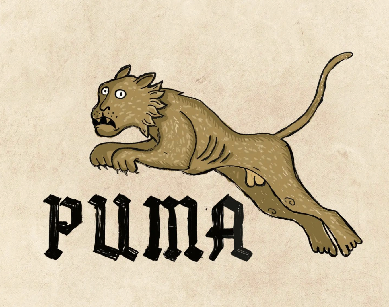
We see plenty of reimagined logos, but it isn't often we get a glimpse of how the Burger King symbol would have looked in the Middle Ages. An ingenious new design project had re-rendered some of the most famous brand designs in a medieval style, and the results are delightful.
Illustrator Ilya Stallone has reimagined 10 of today's most iconic logos as part of his 'Medival Branding' collection, and the designs have left the internet both delira and excira (they're medieval words for 'delirious' and excited', obviously). Looking for more inspiration? Check out the best logos of all time.


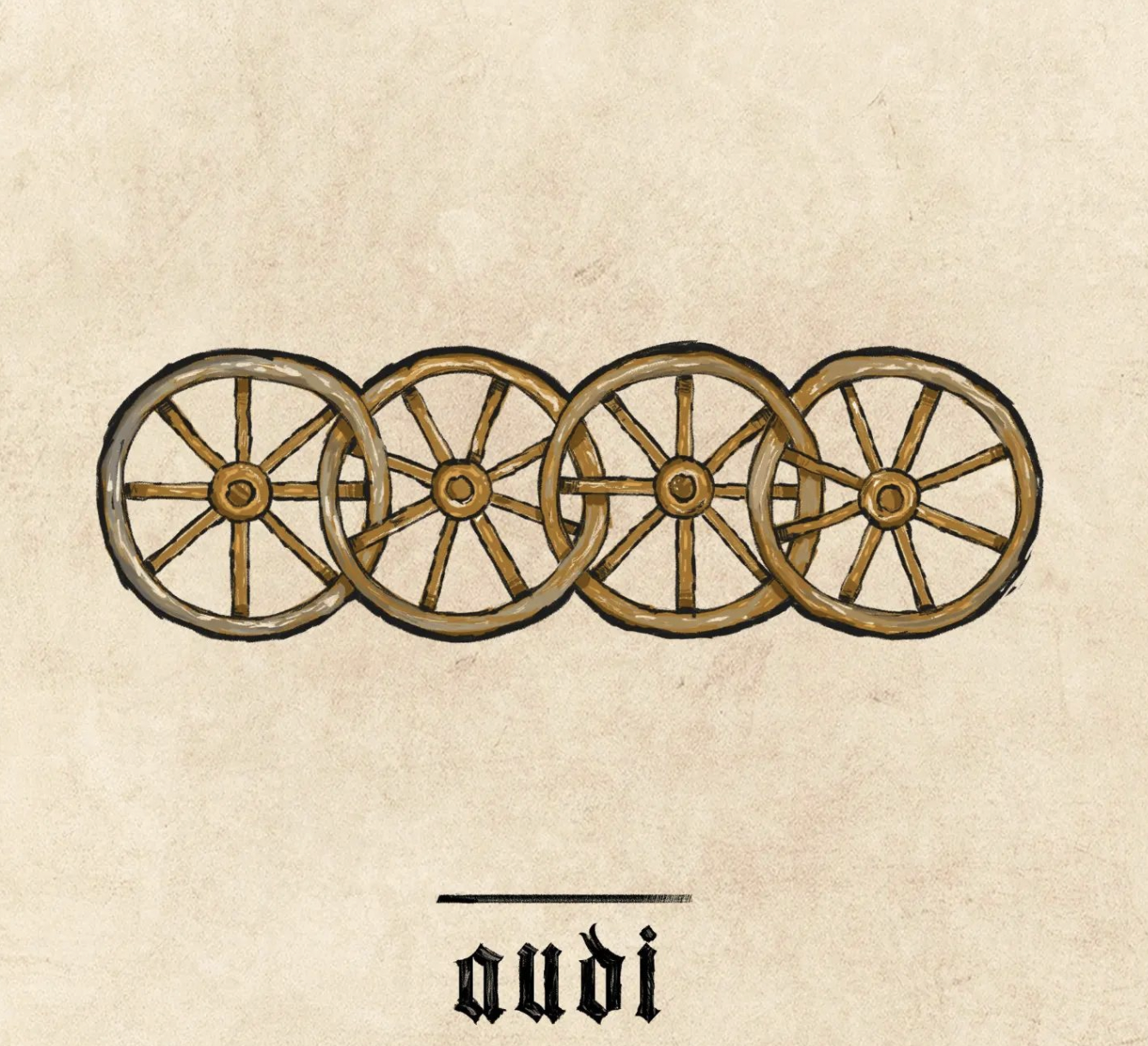
Perhaps the best designs are those that take the concept literally, such as Audi's four wheels that now look like, well, four medieval wheels. And then there's the Microsoft Windows logo, which turns the ultra-minimal four-square design into something that actually looks like a window – albeit a very old one. And the brand names have of course been recreated in a dramatic Old English (and presumably hand-drawn) typeface. Check out the best free fonts if you're looking for your own retro style.
Article continues belowA post shared by Ilya Stallone (@ilya_stallone_artist)
A photo posted by on
The logos are going down a storm online. "This is one of the best posts I’ve ever seen on Reddit!" one user comments, while another adds, "Really cool. I love how artists are making manuscript illumination into pop culture." And many have pointed out that some, such as Windows and Firefox, would make pretty awesome desktop icons.
Just last week we saw 6 logos recreated in 6 different art styles, and we'll always have time for a retro redesign. But we have to hand it to Stallone – these medieval reimaginings are about as retro as it gets. If you're inspired to create your own design, check out today's best Adobe Creative Cloud deals below.
Read more:
- Frightful new City of Florence logo scores an F online
- Lamborghini's first NFT is ludicrous (and we love it)
- Nightmarish new Spider-man logo is an epic design fail
Sign up to Creative Bloq's daily newsletter, which brings you the latest news and inspiration from the worlds of art, design and technology.

Daniel John is Design Editor at Creative Bloq. He reports on the worlds of design, branding and lifestyle tech, and has covered several industry events including Milan Design Week, OFFF Barcelona and Adobe Max in Los Angeles. He has interviewed leaders and designers at brands including Apple, Microsoft and Adobe. Daniel's debut book of short stories and poems was published in 2018, and his comedy newsletter is a Substack Bestseller.
