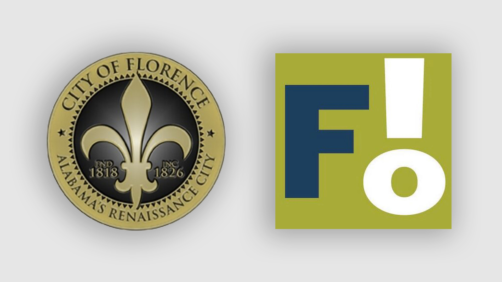
Frightful new City of Florence logo scores an F online
We can't believe this is real.
Sign up to Creative Bloq's daily newsletter, which brings you the latest news and inspiration from the worlds of art, design and technology.
You are now subscribed
Your newsletter sign-up was successful
Want to add more newsletters?
Ah, place logos. No piece of graphic design is guaranteed to get people riled up than that made for a town or city – when the designer gets it wrong, residents (of both the place itself and the internet) will let them know about it. And that's exactly what's happening in the city of Florence, Alabama.
The city caused a stir on social media when it revealed a brand new logo, leaning into its common nickname 'Flo'. But the new design couldn't be further away from the previous symbol – and if you like one of them, you're probably going to hate the other. (That said, neither are best logos of all time material).

In a Facebook video, the city revealed a new logo featuring a capital 'F' along with an 'L' and an 'O' placed vertically to create what looks like an exclamation mark. Oh, and an unflattering snot-green background. Compared with the previous city seal, which focussed on the city's role as Alabama's Renaissance city, this one looks positively cartoonish. But the Mayor claims it took a lot of hard work.
Article continues below“As you can see, a great deal of time and effort was taken to ensure the integrity of Florence was revealed,” Mayor Andy Betterton told WAFF. “We are so excited about the future of Florence. I couldn’t be more pleased with the work of this project and excited about what it says about our future.”

As you can imagine, it hasn't exactly gone down well. “Gotta admit, it’s really impressive y’all made a decision so bad that people of all political beliefs can actually agree how awful it is," one Facebook user (among thousands) comments, while another adds, "This is a travesty, I’m embarrassed for the city. What has to happen to make this go away?".
And the design has even earned that all-important marker of an internet disaster: a change.org petition. Currently on 5,800 signatures, the petition complains that not only did the logo allegedly cost $25,000, but rather than given to a local design studio, it was outsourced to a company in Birmingham (also in Alabama).
From the disastrous Aberdeen rebrand to the frankly hilarious St Francois logo, plenty of geographical branding attempts have got the internet talking over the last few months. But rarely is the design so ironically matched to the response – we have a feeling a few Florence residents shouted "F!" when setting eyes on this abomination. Next time, the designers would do well to check out our guide to logo design – just a thought.
Sign up to Creative Bloq's daily newsletter, which brings you the latest news and inspiration from the worlds of art, design and technology.
Read more:

Daniel John is Design Editor at Creative Bloq. He reports on the worlds of design, branding and lifestyle tech, and has covered several industry events including Milan Design Week, OFFF Barcelona and Adobe Max in Los Angeles. He has interviewed leaders and designers at brands including Apple, Microsoft and Adobe. Daniel's debut book of short stories and poems was published in 2018, and his comedy newsletter is a Substack Bestseller.
