Some might say a key requisite for a successful brand name is the ability to read and pronounce it correctly. But it seems that wasn't a concern when it came to the recent rebrand for Standard Life Aberdeen, which saw the removal of all vowels from its name. Yup, the financial firm is now (too) simply known as 'Abrdn'. The move has left the whole endeavour subject to confusion and, we're sorry to say, ridicule.
Many assumed the rebrand was so ridiculous it couldn't possibly last – but here we are, a whole week in, and the brand remains vowel-less beyond that initial 'a' – with a total of three 'e's dropped altogether. It certainly can't be considered one of the world's best logos due to the fact people are likening the whole thing to a typo. So why did this happen in the first place?
Wolff Olins is responsible for the controversial rebrand. It's worth mentioning that this is an agency that's no stranger to controversy (remember the furore over the London 2012 Olympic logo?) but while public opinion has shifted on that graphic, we think the tide is unlikely to turn with this rebrand.
Since the merger of Standard Life and Aberdeen Asset Management in 2017, the brand has been floundering and in need of a refresh. Plus, since the name Standard Life was sold to financial heavyweight Phoenix, only the name Aberdeen was left – and this is already taken (by the city, natch). By choosing the abbreviated name, the team hoped to turn the company into a 'modern, agile, digitally-enabled' brand ready for the future (which apparently contains no letter 'e').

Of course, many brands have dropped their 'e's in recent times, with considerably less fuss than Abrdn has encountered. There's Flickr, Grindr, Scribd and Tumblr to name just four. So why the resistance here? Well, in dropping three 'e's rather than just the one, Adbrdn may have taken it too far – rendering the name virtually unpronounceable (a pretty big deal, some might say). It may pack a visual punch but people will still need to say it, let alone write it in official documents (which we'd imagine there are a whole bunch of in the financial world).
And that is the other issue – the positioning of the brand in the consumer space. After all, this isn't a dating app, or a photo sharing app (or an app at all, actually). It's a financial services company (and one with a rich history, at that). When people are dealing with their money, they want to know they're in serious hands so the 'txt speak' (and lack of capital letter in the logo, of course) jar somewhat.
Folk did not hold back in their derision, with some mocking, yet brilliant, memes and opinions. In fact, every time the word Aberdeen is mentioned on Twitter, you'll find a comment responding with a variation on 'abrdn, surely'.
Twinned with Abrdn. https://t.co/qUEj9YPropApril 27, 2021
"Another consonant please Rachel..." #abrdn pic.twitter.com/7CotVUngvOApril 26, 2021
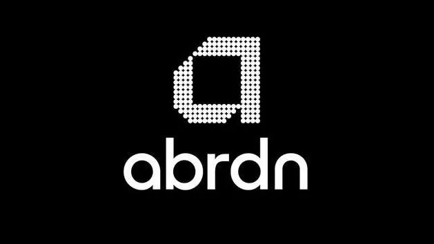
It's a shame as the logo is pretty striking in itself, with a clear, rounded and balanced font sitting under an eye-catching graphic (check out our best free fonts if you're looking for inspiration). And we guess the rebrand solves the SEO issue with using the word 'Aberdeen' (if you can fluidly type it into Google in the first place, that is).
Anyway, it's an awful lot of free publicity for the brand – when consumers think finances, they're now likely to remember Abdrdn, if only for the convtroversy. If this has whet your appetite for some more drama, check out these super-controversial rebrands, which really shook things up in the branding space. We also ask the question has branding become boring.
Read more:

