American broadcaster NBC has updated its branding for the 2020 Tokyo Olympics, and it's left us more than a little confused. Before we go into why, we should also point out that in NBC's defence, It's not just the logo that's confusing, but the naming system of the next Olympic Games in general.
Just in case you hadn't already heard, the 2020 Olympics have now been cancelled, with the games slated to start on 23 July next year, and the Paralympics beginning on 24 August, 2021. But the Olympic committee has decided to stick with the 2020 branding, so the Tokyo 2020 Olympic games will take place in 2021. We hope so anyway, some are doubting that the event will take place even next year.
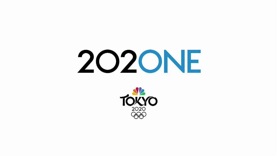
Assuming the games are to go ahead in 2021, sticking with the 2020 does identity make sense, but it's a decision that's also bound to cause all sorts of confusion (changing your name can cause all sorts of problems, as our logo design guide attests). Enter NBC, which has its own branding for the coverage of the sporting event. This consists of 'Tokyo 2020' in a rather elegant script, with the Olympic rings below it and the NBC logo above it. But now, above all that, there's a new addition: 202ONE.
Tokyo 2020NE, here we come.#TokyoOlympicspic.twitter.com/oAitog3dlLApril 3, 2020
The 2020NE is...well... quite tricky to unpick. Whichever way we look at it, whichever way we turn our heads, we're still left baffled. Does it mean 2020 - NE? If so, what the hell does NE stand for? (Is it NBC's smaller, younger relative that we don't know about?)
Is it supposed to signify 202 - ONE? In which case, what is 202? It reminds us of a 404 page, used when something has gone wrong and you've lost your way, which feels appropriate (see our favourite 404 pages here).
Or maybe you read it 20 - two - one, which makes it sounds like a clock, or an ominous countdown. Will this be the new race starter, instead of three - two - one?
Surely, we'll concede, it is supposed to read: 2020 - ONE, but then isn't it missing a '0' or an 'o'? Or is this a ridiculously clever trick that we're just not appreciating? Is this the new way to say both years in one? And how do we pronounce it, exactly? Just 2021? 2020-and 1? 2020-all-in-1? It's safe to say we have a lot of questions.

The original NBC branding was created by MOCEAN, in partnership with illustrators Aya Kotake, Burke Miles, Stanley Ng and Jamie Givens. We haven't had any confirmation as to who created this add-on, though the typography, which doesn't exactly match the crafted curves of the 'Tokyo', suggests that perhaps this was not created by the same team.
Some people, however, were in favour of the 2020NE branding decision.
I love the 202ONE rebrand for Tokyo.It’s perfection for someone like me who loves minimalist design w blue! pic.twitter.com/ZtNXr8Ulg4April 19, 2020
So perhaps lockdown is just getting to us and we don't know what's good anymore. Roll on 202ONE.
Read more:

