Paris 2024 Olympic logo is mercilessly mocked
Is it a hair salon? Is it a condom advert? No, it's the Olympic logo!

Sign up to Creative Bloq's daily newsletter, which brings you the latest news and inspiration from the worlds of art, design and technology.
You are now subscribed
Your newsletter sign-up was successful
Want to add more newsletters?
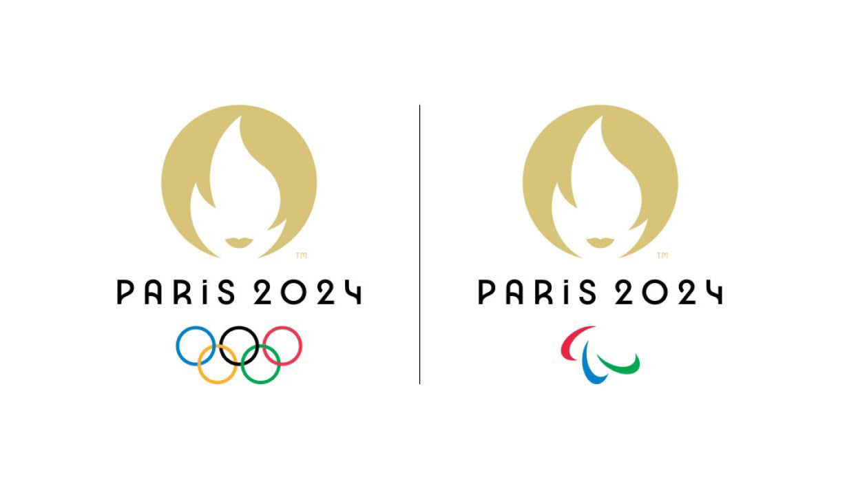
The logo for the Paris 2024 Olympics has been revealed, and it's made up of three symbols that will be familiar to most. There's the Olympic rings, naturally, there's the Olympic flame, and then there's Marianne, who is a symbol of Republican France. And these three symbols have come together in a logo that plays cleverly with negative space.
Look at the logo design one way, and you get a flame, that basically looks like it has lips. So, a hot flame. And look at it the other way and you get a woman with a bob and some lips, so, a hot woman. Oh là là. Needless to say, the design has been pretty much universally mocked on Twitter (more on that later).
The gold design (apart from representing gold medals), custom-designed typeface and Art Deco styling is a nod to the last time Paris hosted the games, in 1924. "Its pure, understated lines and its original typeface take their inspiration from Art Deco, the first complete artistic movement, which reached its height at the 1924 Games in Paris," says a statement announcing the logo.
Article continues belowLe logo des Jeux Olympiques 🏅 de #Paris2024 est là ! pic.twitter.com/092gZjExL0October 21, 2019
For the first time in Olympic history, this symbol will be used for both the Olympics and the Paralympics, the only difference will be the Olympic gold rings or the Paralympic agitos, which are underneath the logo.
The Paris 2024 website says that "The Olympic and Paralympic Games represent two halves of the same project, symbolised by a single emblem and a shared vision that sport changes lives." This seems like a good idea to us, why have two lots of logos when you could have one?
So... what do we think? Honestly? We're not sure quite yet. The Paris 2024 website has some examples of the logo and typeface in context, and like most logos, it looks much better in use than it does in isolation (see our guide to logo design), and there are lots of nice uses for the typeface that make it look even better. Although confusingly, in the video below, there's a capital 'I' instead of the lowercase one used in the logo.
And we're sorry to say it, but we can't help but think it looks like either a) the Tinder app logo, aka a sexy flame b) a condom packet or c) a hair salon logo. There's nothing about it that makes us want to jump off the sofa/out of bed/away from our screen to do the javelin or the long jump or pursue some other Olympic dream.
Sign up to Creative Bloq's daily newsletter, which brings you the latest news and inspiration from the worlds of art, design and technology.
Does it make us want to go to Paris? Maybe. But we already like visiting Paris.
Here are some more reactions from the web, where as mentioned above, a lot of people are mocking the new Olympic logo.
Swiping left on this Olympics logo #Paris2024 pic.twitter.com/k3eXF9e5q0October 22, 2019
...I think the #Paris2024 logo would like to speak to the manager pic.twitter.com/QjlCfsF9zLOctober 21, 2019
When you order something online vs. when it arrives #Paris2024 pic.twitter.com/7KRCiOF7kCOctober 21, 2019
Los Simpson predicen el logo de #Paris2024 pic.twitter.com/0KI20XcQ0WOctober 22, 2019
#Paris2024 really missed an opportunity to be truly iconique pic.twitter.com/OeQRADYcrWOctober 21, 2019
Read more:

Rosie Hilder is Creative Bloq's Deputy Editor. After beginning her career in journalism in Argentina – where she worked as Deputy Editor of Time Out Buenos Aires – she moved back to the UK and joined Future Plc in 2016. Since then, she's worked as Operations Editor on magazines including Computer Arts, 3D World and Paint & Draw and Mac|Life. In 2018, she joined Creative Bloq, where she now assists with the daily management of the site, including growing the site's reach, getting involved in events, such as judging the Brand Impact Awards, and helping make sure our content serves the reader as best it can.
