Is this Tokyo 2020 logo better than the official design?
New Olympic logo concept splits designers.

Sign up to Creative Bloq's daily newsletter, which brings you the latest news and inspiration from the worlds of art, design and technology.
You are now subscribed
Your newsletter sign-up was successful
Want to add more newsletters?
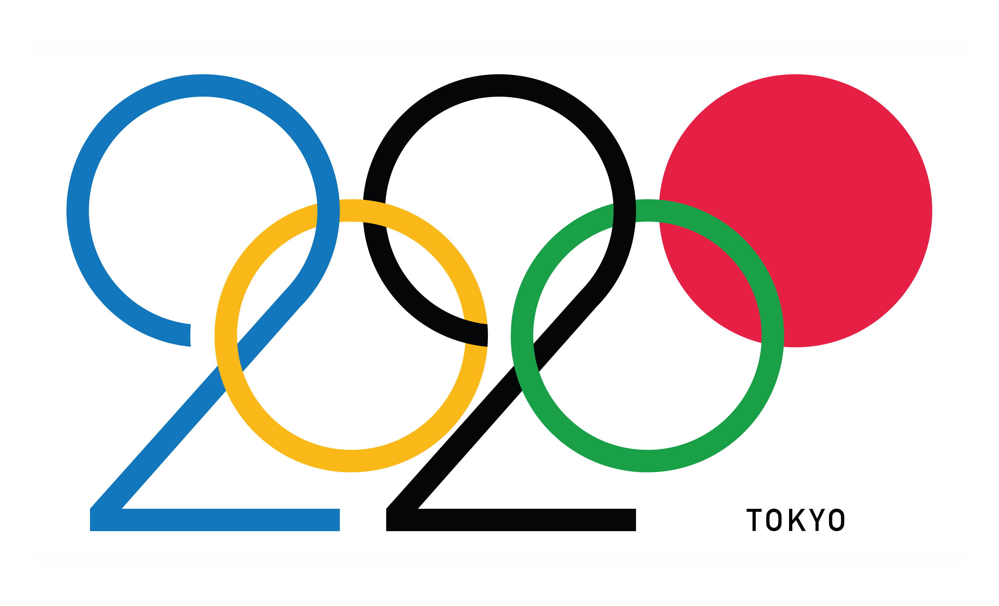
A concept logo for the Tokyo 2020 Olympic games (above) has got creatives debating the merits of its design. The unofficial logo, created by designer Daren Newman, has been praised for elegantly capturing the spirit of the games and the Japanese city, although it's also prompted people to defend the actual Tokyo 2020 identity.
The idea for the logo was recently posted by Newman on his social media channels. The design plays with the shapes of the Olympic rings and makes them read '2020'. It also fills in the red ring to make it look like the rising sun disc found on Japan's flag.
Our guide to logo design stresses the importance of shape and symbolism, so we can see why Newman's idea, which plays with familiar imagery, has been warmly received by some. Reddit user DiImmortalesXV said that it: "Perfectly encapsulates the modernity and simplicity that it wishes to convey. Beautiful." And people on Twitter even had some nice things to say about it.
Article continues belowSo much going right in Darren Newman's Tokyo 2020 logo pic.twitter.com/6DG9xot0e9
The 2020 Tokyo Olympic logo is a masterclass in design. pic.twitter.com/l3ve0sNEVE
However some Twitter users have been less favourable with their feedback.
Yes, it’s beautiful. Elegant. A really nice concept. Would make a great poster/artwork, but a terrible logo. #tokyologo pic.twitter.com/YUXjgimi7c
That fake Tokyo 2020 logo is really terrible – it would look awful next to the actual Olympic rings logo (which it would appear alongside 99% of the time, so double-boring) and would never be authorised because the IOC is NUTS about protecting the rings branding.
That Tokyo Olympics graphic going around isn't an official logo - but these ones are, and they are cool https://t.co/QNK15ecCOi
The massive reaction took Newman by surprise. "I just put it out there on my Instagram feed expecting it to just get lost in the sea of other posts," Newman tells Creative Bloq, "but the opposite happened and it has since gone a bit bonkers!"
"I’ve had people getting in touch with me from all over the globe. I wasn’t sure why this was happening, and then a few people got in touch to tell me it was on Reddit and it had created a bit of a storm. And then a fair few people on Twitter started reposting it!"
"There has been a lot of positive response to it which is great. There have also been a fair few negative responses, which I’m more than willing to accept – I’m just overwhelmed with the response to it."
Sign up to Creative Bloq's daily newsletter, which brings you the latest news and inspiration from the worlds of art, design and technology.
So why has Newman's concept logo split the opinion of designers?
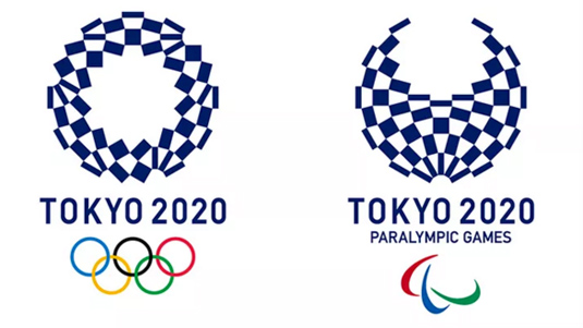
Perhaps it's to do with the way the logo has been shared. Plenty of places, including this thread on Reddit, don't make it crystal clear that Newman's idea is a concept design. In fact the official design for the Tokyo 2020 Olympic games (below) was created by Asao Tokolo.
This isn't the first time the game's identity has whipped up a dispute either. There's a controversial story behind the Tokyo 2020 logo in that the original official design, created by Kenjiro Sano, was scrapped due to accusations of plagiarism.

Logo designs are often incredibly personal and controversial things. Back in 2012 the London Olympics logo came in for a lot of flack, but we've spoken to designers who defend it.
So ultimately it's up to you whether you think this design is better or worse than the official logo. Beyond personal preference though, Newman's design does run into a few usability issues. That's because the Olympic rings have to adhere to some specific usage guidelines, which this Tokyo 2020 concept don't follow.
For example, the Olympic rings should not be distorted into other shapes, and their width should not be adjusted. So while you could argue that Newman's concept is at least a succinct and neat way to communicate Tokyo 2020, it unfortunately wouldn't hold up in an official capacity.
There's plenty to enjoy in both this concept and the official logo though. And considering that Tokolo's geometric design was chosen by a public vote, it looks like a lot of people like the Tokyo 2020 identity just as it is.
Related articles:

Dom Carter is a freelance writer who specialises in art and design. Formerly a staff writer for Creative Bloq, his work has also appeared on Creative Boom and in the pages of ImagineFX, Computer Arts, 3D World, and .net. He has been a D&AD New Blood judge, and has a particular interest in picture books.
