Leading publisher DK – formerly known as Dorling Kindersley – has had a modern rebrand courtesy of Angus Hyland at Pentagram. The update encompasses a new tagline ('For the curious'), refreshed brand narrative, and a clean, confident new visual identity.
The striking new DK logo is a particularly welcome update. The previous brand marque (below) – also designed by Pentagram – was starting to look a little overthought and old-fashioned. The detailed, multicolour design was also not well suited to use in digital contexts.
While you're here, you might also want to check out our roundups of essential books for graphic designers, and the best branding books of 2020.

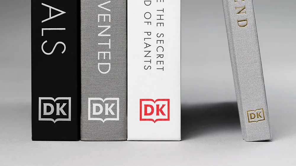
This cleaner version keeps the same format – an open book motif housing the ‘DK’ monogram – but makes it simpler and bolder, with bespoke new letterforms. This redesigned logo (below) is more flexible for use in both print and digital contexts, to fit changing demands.

Taking an iterative approach rather than opting for something completely new is a smart move, capitalising on the brand's existing reputation (the original logo is recognised around the world). We're also pleased to see the monogram's serifs have endured in this era of bland sans-serif rebrands.
The pared-back DK logo is designed to scale well and work effectively on multiple platforms and applications. The single-colour approach also means it's much more flexible, and can be featured in a variety of colours and finishes to suit different contexts, and fit more seamlessly into the company's different book cover designs.

DK is an award-winning British multinational publishing house and an imprint of Penguin Random House. It specialises in illustrated reference books and non-fiction for adults and children, on subjects including travel, lifestyle and science. The new tagline – 'For the curious' – captures the DK's mission to encourage exploration and discovery.
Find out more on the Pentagram case study page.
Read more:

