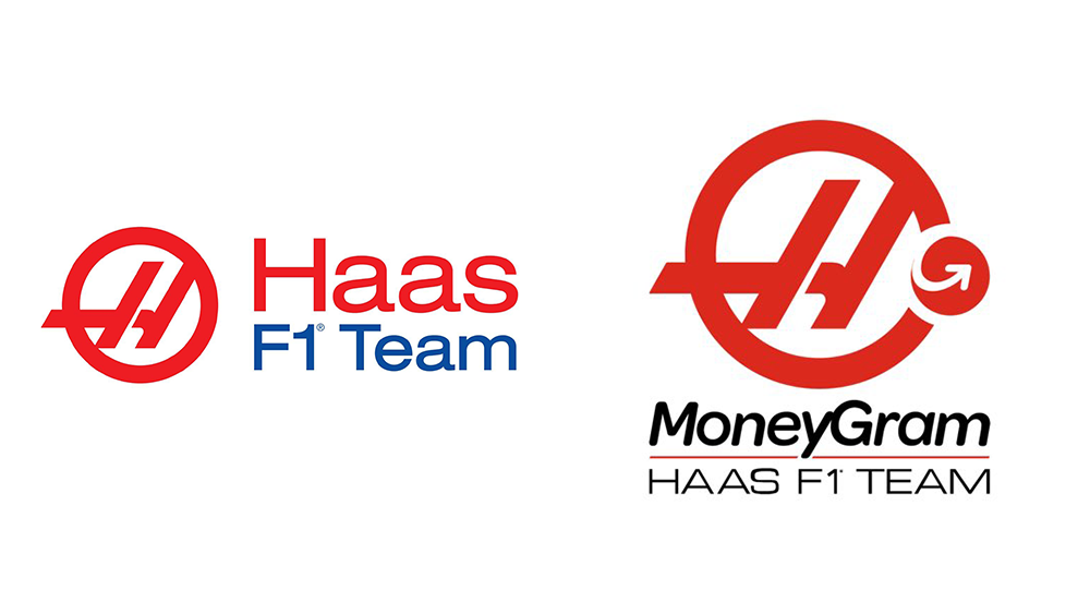
The new Haas F1 logo isn't a winner
Sign up to Creative Bloq's daily newsletter, which brings you the latest news and inspiration from the worlds of art, design and technology.
You are now subscribed
Your newsletter sign-up was successful
Want to add more newsletters?
Logo redesigns for sports teams are always dangerous ground. We've seen plenty of controversies over the years, but few compare to the reaction to the new logo for the Formula 1 team Haas.
The new Haas logo basically parks the mark of new sponsor MoneyGram on the edge of team's existing logo while changing up the font. The result is a bit of a mess to say the least, and it seems that on Twitter pretty much everyone thinks they can do a better job (kit up with the best graphic design software if you want to join the pile on).
Introducing the bold new @MoneyGram Haas F1 Team 🔴⚫⚪#HaasF1 #MoneyGramDrivesYou pic.twitter.com/Ryuj9xM38EJanuary 4, 2023
Sponsorship is obviously massively important in sports, but it sometimes becomes a little too visible when the principal sponsor also gets team naming rights. The Haas F1 team is now the MoneyGram Haas F1 Team thanks to a deal with the global money transfer company, and it's decided the sponsors paying enough to even get its logo added into the team's own brand identity.
The result is a patchwork of a logo in which 'MoneyGram' wins in the hierarchy of elements, while the brand's own arrow logo becomes a logo within a logo parked on the edge of the design. Most fans seem to think it looks awful, and we have to agree.

"If I knew nothing about motorsports and you showed me that new Haas logo, I would’ve been convinced Haas is a delivery service," one person responded on Twitter. Others compared it to everything from the logo for food delivery companies to Skol beer.
fica ai o questionamento sobre a nova logo da haas pic.twitter.com/pFA39idq6nJanuary 5, 2023
Sponsorship going too far? When you've got two logos in one, there's almost always going to be too much going on, and it's hard for one identity not to interfere with the other. With the new Haas logo there's been an attempt to find harmony in the matching brand colours, but there's no convincing people that this isn't just too logos squished together.
Some fans think there are more clever ways that the logos could have been fused if it was really necessary. "Why not turn the horizontal H line into the arrow," one person suggested on Twitter. "The MoneyGram logo shoulda been the entire circle with the Haas H inside. The arrow coulda been the H crossbar," someone else suggested. Many fans have already been sharing their own proposals.
Sign up to Creative Bloq's daily newsletter, which brings you the latest news and inspiration from the worlds of art, design and technology.
This is my attempt at the new MoneyGram Haas F1 logo. What do people think? @HaasF1Team #haas #HaasF1 #haaslogo #haasf1logo pic.twitter.com/VWTXP9M2RqJanuary 5, 2023
I had a go at redesigning the new Moneygram Haas logo. Thoughts?#f1 #formula1 #f12023 #haas #haasf1 pic.twitter.com/TnvDYXe4GOJanuary 4, 2023
Everyone hating on the new HAAS logo so I tried a quick attempt at my own concept for a Moneygram HAAS logo, thoughts? :) pic.twitter.com/cOWZftfZUhJanuary 4, 2023
For logo designs that work, see our roundup of the best car rebrands and the best logos of all time. But unfortunately, the Haas logo is more likely to feature in a roundup of the worst logo fails.
Read more:

Joe is a regular freelance journalist and editor at Creative Bloq. He writes news, features and buying guides and keeps track of the best equipment and software for creatives, from video editing programs to monitors and accessories. A veteran news writer and photographer, he now works as a project manager at the London and Buenos Aires-based design, production and branding agency Hermana Creatives. There he manages a team of designers, photographers and video editors who specialise in producing visual content and design assets for the hospitality sector. He also dances Argentine tango.
