Car rebrandings seem to come at a rate of almost one a month these days. Over the past year, we've seen new car logos from Aston Martin, Citroen Dacia, Skoda – and of course Kia. The last of those is an example for another roundup since it doesn't seem to be working very well. In this piece, we're recapping the car logo redesigns that got it right.
In most cases car rebranding these days means simplifying and flattening the existing logo to make it look more modern and also make it more practical to use in small placements like app icons and favicons. Sometimes that can make for a boring rebrand, but we've seen examples of car brands that handled it well, creating sleek new looks that respect their legacies. Here's our pick of the best recent examples. For more design inspiration, see our pick of the best graphic design books of all time.
Aston Martin

The new Kia logo shows just what can go wrong when car logos are redesigned to make them more modern. The Aston Martin logo redesign is a different story. Designed by Peter Saville, the new Aston Martin logo revealed in July shows how sometimes a subtle change is what's needed.
Saville followed a trend we've seen in other car brands, simplifying the winged Aston Martin badge. He replaced the gradient background with a solid racing green and ditched the fussy semi-circular line on the wings. While it might seem like a simple transformation, it gets things just right, respecting the brand's heritage while also looking totally contemporary. It's earned a place in our pick of the best car logos on the road today.
Citroen

The new Citroen logo achieved something that might seem an impossible contradiction. It looks simultaneously more modern and more traditional than the previous design. To do that, the company went full circle, or rather full oval, travelling back a century to revisit its original oval-shaped logo from 1919.
With a few tweaks and a more modern colour palette, the result is a logo that's both leaner and more in keeping with the brand's heritage. They do say that you have to go backwards to go forwards, although don't try that behind the wheel.
Skoda

The new Skoda logo was a bit more divisive, but it was generally seen as a winner. it flattened its winged arrow symbol, developed a new wordmark and updated Škoda's traditional green with two new shades: emerald and electric.
The type logo also aims to resolve the issue of the inverted circumflex accent, or caron, over the S in the brand's name. Now we didn't really see this an issue at all, but the company thinks it was confusing for a global audience. It's solution was a little strange, trying to sit on the fence by keeping the accent there but hiding it inside the S, so you can decide if you want to see it or not. Strange, the design does look more sleek, if a little Tesla-like.
Dacia

Now Dacia's a car brand that can take more liberties in overhauling its image since it doesn't have such a long legacy in many countries. That meant it could take a radical departure for a more modern, geometric look that could almost convince us that it's a higher-end brand. It's a refreshing transformation for a value-focused carmaker that Renault bought from the Romanian government just over 20 years ago.
Renault describes the design as communicating "pared-back and cunning character." I'm not sure cunning is what we want from a car, but sure, OK. It scrapped the closing strokes on the ‘D’ and ‘A’ , leaving minimal mirror-image forms for a simple, geometrical look with a mechanical feel. The accompanying emblem is derived from the logotype, bringing together the ‘D’ and ‘C’, to form a symmetrical link.
There's a new earthy colour palette too, evoking "the brand’s closeness to nature", although that's an association that can be controversial for car brands as Mercedes found out last year.
BMW
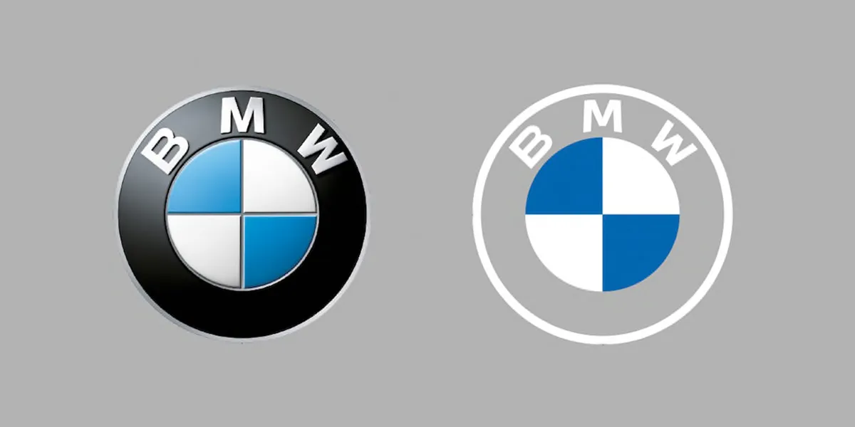
This one's going further back, but it's worth remembering as a masterclass in logo updates. Unveiled in March 2020, the new BMW logo is a transparent, flat reimagining of the previously metallic emblem. The classic black outer ring was made completely transparent, and the 3D and lighting effects have been removed to create a minimal new look that retains the white and blue colours of the company's home state of Bavaria.
We remain big fans of the clean design, which feels modern and adapts to new technology but acknowledges the brand's century-old heritage. There was initially some scepticism online, but the design's now been proven to work well in both physical applications as well as digital.
Rolls Royce


Rolls Royce also got its car rebranding right with the redesign of its iconic emblem back in 2020. The company promoted its Spirit of Ecstasy figurine to a more prominent position in its branding after flipping it to face the right and paring back the details to make it work in digital uses. The car brand also changed the font of its type logo to make it more in keeping with a contemporary luxury brand, with a slim, sophisticated all-caps logotype.
If you're looking for design tips for your own logo designs, see our guide to how to design a logo. Make sure you also have the best graphic design software.
Read more:

